|
This document is referring to a past Scout release. Please click here for the recent version. Looking for something else? Visit https://eclipsescout.github.io for all Scout related documentation. |
About This Release
Eclipse Scout 6.0 is part of the Eclipse Neon release (release schedule). The latest stable version of this release is Neon.3 (6.0.300.1).
You can see the detailed change log on GitHub.
Obtaining the Latest Version
Runtime (Scout RT)
Scout RT artifacts are distributed via Maven:
-
6.0.300.1 on Maven Central
Usage example in the parent POM of your Scout application:
<dependency>
    <groupId>org.eclipse.scout.rt</groupId>
    <artifactId>org.eclipse.scout.rt</artifactId>
    <version>6.0.300.1</version>
    <type>pom</type>
    <scope>import</scope>
</dependency>
Eclipse IDE Tooling (Scout SDK)
You can download the complete Eclipse IDE with Scout SDK included (EPP) here:
Eclipse for Scout Developers
Service Release Change Log
Neon.3 (6.0.300)
Detailed change log: https://github.com/eclipse/scout.rt/compare/6.0.200.0…6.0.300.RC2
Neon.2 (6.0.200)
Detailed change log: https://github.com/eclipse/scout.rt/compare/6.0.100.RC4.2…6.0.200.0
Neon.1 (6.0.100)
Detailed change log: https://github.com/eclipse/scout.rt/compare/6.0.0.RC4…6.0.100.RC4.2
The HTML UI
With the previous Scout release 3 UIs were available: SWT and Swing for rich clients and Rap for web clients. The fact that every change in the Scout model resulted either in a huge effort to adjust every UI or in a divergence of the UIs if the effort could not be taken, led us to a radical step: We deleted these 3 UIs and replaced them with a complete new one: The HTML UI.
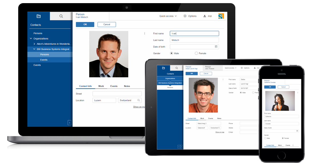
As the name implies it is a UI for a web client based on state of the art web technologies: HTML 5, CSS 3 and JavaScript. Without the restrictions of the old UIs we were able to create a new UI tailored to the needs of the Scout users. And because it perfectly fits the Scout model no compromises had to be made.
The new HTML UI not only gives your application a modern look & feel, it also gives you more possibilities regarding styling and customizing.
From OSGi to Plain Java
With the Neon release, Scout changes from an Eclipse/OSGi based runtime to a pure java project. The reasons for this change were
-
to bring simplicity back to Scout
-
integrate easier with Java EE containers
-
build projects with Maven only, express project dependencies with Maven only
-
integrate third party libraries directly via Maven Central
Project Structure
The project structure is now typically converted to the standard maven project structure.
Platform
OSGi services and extension points have been replaced by beans managed by the Scout bean manager. Applications are replaced by platform listeners provided by the Scout platform.
Various Changes
-
org.eclipse.scout.commonsreorganized, classes moved toorg.eclipse.scout.rt.platformand other projects
Job Framework
The eclipse job framework has been replaced by a new job framework based on Java executors framework.
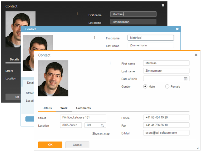
New Styling Possibilities With CSS
It is now finally possible to use the full power of CSS to style your application. To make it more maintainable Scout uses LESS which you can use as well.
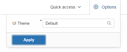
Theming
With the new theming support you can create a custom theme for your application instead of taking the default one provided by Scout. Or you could even define multiple themes and offer them to your users.
IStylable
Every form field and some other widgets now provide a new property called CssClass. It accepts one or more css classes separated with a space.
This makes it possible to adjust the style of a specific form field and even a table cell or tree node. Look for the interface IStyleable for stylable widgets.
Better HTML Support at Java Level
IHtmlCapable
Certain widgets support html content instead of plain text, like ILabelField or IColumn.
To prevent HTML injection and cross-site scripting you need to enable the interpretation of HTML explicitly using the property htmlEnabled. See IHtmlCapable for details.
HTML
Use the class org.eclipse.scout.rt.platform.html.HTML to build HTML content instead of concatenate the strings manually. This not only is an easy and type safe way of building HTML, but also a way to create safe HTML because the content is encoded.
HTMLUtility
org.eclipse.scout.rt.platform.html.HTMLUtility and org.eclipse.scout.rt.platform.html.CSSPatch were deprecated because they contained only legacy code of doubtful quality. Do not use them anymore — they will be removed in the next Scout release. The support for most of the contained methods was dropped, because they are not required anymore with the new UI. A slightly improved version of the getPlainText() method is available on the new bean org.eclipse.scout.rt.platform.html.HtmlHelper.
Keyboard Shortcut Visualization
Keyboard shortcuts are an important tool for power users. To make them more accessible it is now possible to show the currently available shortcuts just by pressing F1. Currently available means that the focused element as well as the enabled state is respected so that only those shortcuts which really can be executed are shown.
Font Icons
The new UI uses font icons instead of bitmap icons because they are scalable, can be colored using CSS and can be loaded with one request. It is suggested that you use font icons as well. Scout provides the font scoutIcons which contains the icons used by Scout itself. If they are not sufficient you can either create a custom font with only the icons you need, or include a pre-built one like FontAwesome.
Anyway, bitmap icons are still supported.
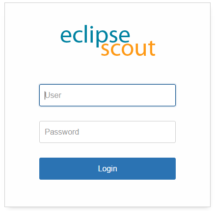
Login Page
Compared to the previous web ui, adding a form based login page is now a lot simpler. Scout provides a login.html which can either used as it is or adjusted to your needs.
UI Debugging Using URL Hints
The new UI provides url hints for easier debugging: ?cache, ?compress, ?minify, ?debug, ?inspector.
By default they only enabled in development mode. This behavior can be controlled using the property scout.urlHints.enabled.
New and Better Widgets
Beside the new look of every widget, most of them got new functionality as well.
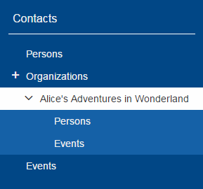
Desktop
New Layout
The new desktop consists of three areas: The navigation, the header and the bench.
The navigation shows the outline, the header may contain tools and the bench shows the detail content of the outline (table/form) or forms opened as views.
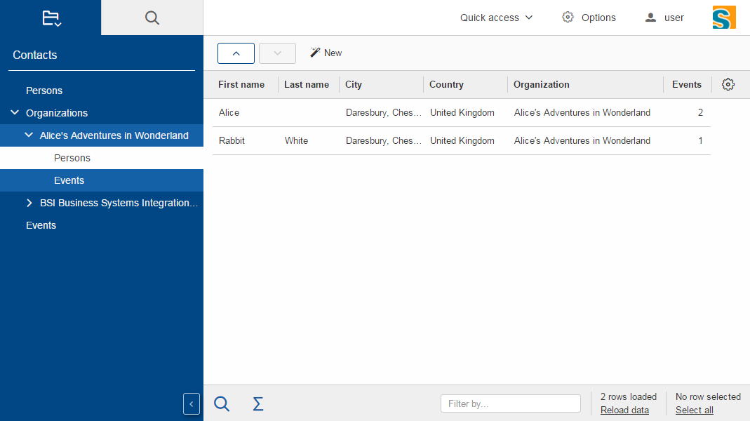
Compared to previous Scout releases, there are no forms required anymore to show the outline and its table. Therefore, DefaultOutlineTreeForm and DefaultOutlineTableForm have been removed.
If you want to show more than one form at a time you can still do it using the properties displayHint and displayViewId of IForm. These forms will be shown in the bench area.
To adjust the desktop layout you can use these new properties:
-
navigationVisible: Hide/Show the navigation pane -
navigationHandleVisible: Hide/Show the handle which allows the user to toggle the visibility of the navigation -
headerVisible: Hide/Show the header -
benchVisible: Hide/Show the bench -
DisplayStyle: More or less controls the above properties. WithDISPLAY_STYLE_BENCHonly the bench is visible, withDISPLAY_STYLE_COMPACT(which is used for mobile devices) either the navigation or bench and header are visible.
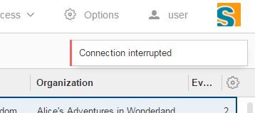
Notifications
The desktop may now display toast notifications on the top right corner.
Various Changes
-
Menus of a page are now added to the detail form. This was necessary because the outline tree does not show any menus anymore. See also method
AbstractPageWithNodes.enhanceDetailFormWithPageMenus. -
Added
AbstractDesktop.getConfiguredSelectViewTabsKeyStrokesEnabled: It is possible to change view tabs with modifier+number. The number is generated by the ui. 9 is reserved to jump to the last tab, 0 to jump to the first tab. This functionality can be disabled by setting this property to false.-
getConfiguredSelectViewTabsKeyStrokeModifier: if the above property is set totruethe modifier specified by this property is used in combination with a number to change to the specific tab.
-
-
AbstractDesktop.isOutlineChangingadded. -
The methods
traverseFocusNext()andtraverseFocusPreviouswere removed from IDesktop because traversing is not supported by the HTML UI. (Neither was it supported by the former RAP UI). The corresponding DesktopEvent types (TYPE_TRAVERSE_FOCUS_NEXT,TYPE_TRAVERSE_FOCUS_PREVIOUS) were removed as well.
Outline
New search outline
The intention of the ISearchOutline is to provide a search over several table pages. The AbstractSearchOutline provides a frame, the search itself has to be implemented by the project.
Default Detail Form
It is now possible to configure a default detail form for outlines. The default detail form gets shown when no page is selected.
API Notes:
getConfiguredDefaultDetailForm, execInitDefaultDetailForm, createDefaultDetailForm, startDefaultDetailForm.
Navigate Buttons
The new navigate buttons may be used to navigate through the outline.
If you don’t need them you can remove them using the property navigateButtonsVisible.

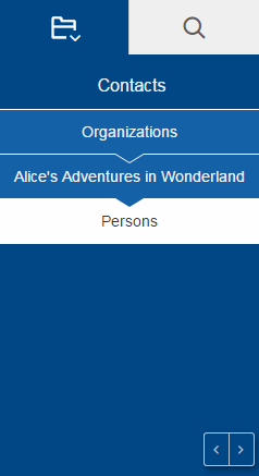
Bread Crumb Style
The outline (and actually every tree) can now be displayed as a bread crumb tree which arranges the nodes in a different way than a classic tree.
Various Changes
-
Added
getConfiguredTableStatusVisibleonIPageWithTable: It is now possible to configure whether the table status should be visible for a table page. Until now table status was set visible by theOutlineTableForm. -
Improved page search form disposal: Search form is now closed when the page gets disposed.
Form
Form Tabs
It is now possible to stack multiple forms and switch between them using tabs. This already worked with SWT and Rap but not with the Swing UI.
Just set the property displayHint to DISPLAY_HINT_VIEW and use the same displayViewId.
Form Menu
It is now possible to embed a form in a menu using IFormMenu.
Various Changes
-
Added
IForm.start(): Mainly useful for forms with just one handler (detail forms, tool forms etc.). May be implemented by the concrete form. The default implementation at AbstractForm uses getHandler() to start the form. -
Forms are now cached in the UI until they are closed. Make sure to close unused forms to free up memory.
Form Field
New Status, Menu and Tooltip Visualization
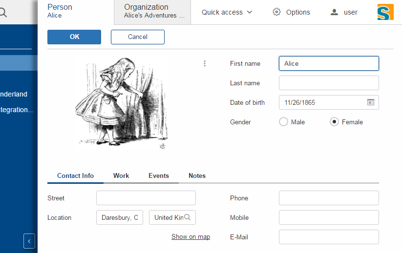
On the right side of every form field there is space reserved for the status (info, warn, error), the menu or the tooltip of the field. This means it is now apparent to the user whether the field has a tooltip or a menu.
The visibility of that space is controllable using the property statusVisible. Setting it to false will make the field using the whole space, but if there is a status, tooltip or menu it will be shown anyway.
Group Box
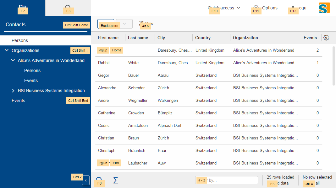
Table
New Table Controls
Table controls are controls on the bottom of the table. Default controls are SearchFormTableControl which shows the search form and AggregateTableControl which shows aggregation details for number columns.
API Notes:
-
ITableControl,IFormTableControl -
List<ITableControl> getTableControls() -
<T extends ITableControl> T getTableControl(Class<T> controlClass)
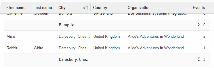
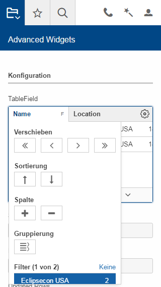
Grouping and Aggregation Functionality
The table now provides a possibility to group the data by multiple columns. Additionally, there are aggregation functions available on number columns like SUM or AVG which may be used in combination with the grouping functionality and the AggregationTableControl.
API Notes:
-
AbstractColumn.getConfiguredGrouped -
AbstractNumberColumn.getConfiguredAggregationFunction
Background Effect
Number columns may now have a background effect to visualize numeric data.
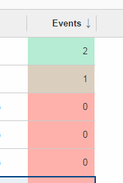
API Notes:
-
AbstractTable.getConfiguredBackgroundEffect
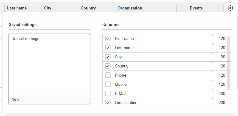
Table Settings
The user may now have multiple table settings. These settings may be managed using the revised OrganizeColumnsForm.
Possibility to Reload the Table.
The table may show a link to let the user reload the table. To make this work the table needs to provide a IReloadHandler. Default reload handlers are PageReloadHandler and TableFieldReloadHandler.
New Table Status
The table status was moved from ITableField to ITable so that the status may be shown in the detail table used in an outline as well.
API Notes:
-
boolean isTableStatusVisible() -
void setTableStatusVisible(boolean visible)
New Table Filters
In addition to the column based filters there is now a single text filter available to filter the whole table data.
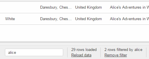
To make the filtering as fast as possible, the filtering does now happen in the UI and not in the Java model anymore. To make this happen the table filters have been reworked.
See TableUserFilterManager for details.
Responsive Table (since 6.0.100)
With release 6.0, the columns of a table got very small if autoResizeColumns was set to true. The content was not readable in many cases. This has been improved with 6.0.1: The configured width is not only used as ratio to calculate the real width anymore, it now acts as minimum width as well. It is not a hard minimum, the user can still make the column smaller. See also the Migration Guide for more information.
Furthermore, the table header menu is now responsive as well. If there is not enough space the menu gets smaller and vertically scrollable.
Tree
Default Icon ID
The difference between the new property defaultIconId and the property iconId is as follows: DefaultIconId is used as default for all tree nodes that don’t have an icon on their own. IconId may be used in the same way as the title, e.g as outline icon.
Auto Check Child Nodes
If this new property is set to true, every check of a node automatically checks its child nodes as well.
Lazy Expansion
Nodes may now be expanded in a lazy way. This means only those child nodes are visible which are expanded as well and the parent gets a '+' symbol. If the user clicks on this symbol all child nodes gets visible. The model can define whether child pages of a page should be added immediately to the outline tree or lazily.
Concerns only IOutline:
-
Node pages never add child pages lazily. Table pages add child nodes lazily when they have more than a specific number of child pages (default 1).
-
The behavior may be controlled using:
-
boolean getConfiguredLazyAddChildPagesToOutline()→ defaultfalse, forAbstractPageWithTablethe default istrue. -
int getConfiguredLazyAddChildPagesToOutlineThreshold()→ setting forAbstractPageWithTable, after how many child pages the lazy setting should be active (default 1)
-
File Chooser
File upload size is always limited now (otherwise server might run out of memory if too large files are sent). Default size is 50 MB, but every field might specify lower/higher sizes:
-
org.eclipse.scout.rt.client.ui.IDNDSupport.setDropMaximumSize(long) -
org.eclipse.scout.rt.client.ui.IDNDSupport.getDropMaximumSize() -
org.eclipse.scout.rt.client.ui.basic.filechooser.IFileChooser.setMaximumUploadSize(long) -
org.eclipse.scout.rt.client.ui.basic.filechooser.IFileChooser.getMaximumUploadSize() -
org.eclipse.scout.rt.client.ui.form.fields.filechooserfield.IFileChooserField.setMaximumUploadSize(long) -
org.eclipse.scout.rt.client.ui.form.fields.filechooserfield.IFileChooserField.getMaximumUploadSize() -
Also added
getConfigured…()methods were applicable for properties above.
Smart Field
Removal of SmartFieldContainerForm
Smart fields used to open a form containing a tree or a table. This overhead was removed. Instead it just displays the table or tree directly.
Nevertheless you still have the possibility to provide a custom table or tree using an inner class at AbstractContentAssistField. See IContentAssistFieldTable and IProposalChooser for details.
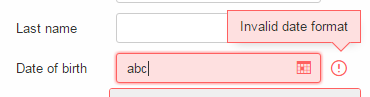
Date Field
Date Prediction
New new date field tries to predict the date the user is about to enter. The predicted date is shown with a brighter color and may be accepted using the return or tab key.
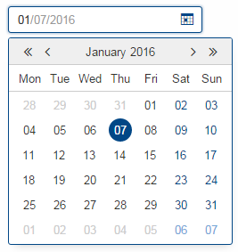
Allowed Dates
You may now restrict the available dates in a date field using setAllowedDates. If the list is empty all dates are allowed. Otherwise the dates are not selectable.
Parsing
The date field no longer inherits from BasicField. Instead it inherits directly from ValueField. This means that the PROP_UPDATE_DISPLAY_TEXT_ON_MODIFY is no longer supported on date fields. The reason for this change was the separation of UI (Browser) and UI-Server (Java). To get a good performance, fast date predictions and offline capability, the parsing must be done in the UI and not on the server. Because the "update on modify" flag had no effect anyway, it was completely removed from the UI. (More details in the Migration Guide).
Split Box
Absolute Splitter Positions
Split boxes now support absolute splitter positions. The old relative position is the default, which uses a value between 0 and 1 for the splitterPosition. By changing the property splitterPositionType, the interpretation of the splitterPosition value can be changed to pixels (either fixed for the first or the second inner box).
Collapsible Split Box
AbstractSplitBox now provides a collapse state for one of the two fields. When a field is marked as collapsible, the UI shows a toggle-button which allows to collapse and expand that field. The following methods and configurations are new:
-
Class<? extends IFormField> getConfiguredCollapsibleField()returns the class of the field which should be collapsible. Default is null. -
boolean getConfiguredFieldCollapsed()returns whether or not the field is initially collapsed. Default is false. -
String getConfiguredCollapseKeyStroke()returns the key-stroke used to trigger the collapse button. Default is null. -
At runtime use the methods
setCollapsedField(IFormField),setFieldCollapsed(boolean)andsetCollapseKeyStroke(String)to change the properties described above.
Various Changes
AbstractSplitBox now returns IFormField.FULL_SIZE in getConfiguredGridW() by default. Reason: The split box widget does not really have a representation of its own, but is more like a container for other fields. It can never have label, mandatory indicator etc. Its layout should behave like a group box or a tab box, therefore the default gridW value was adjusted accordingly.
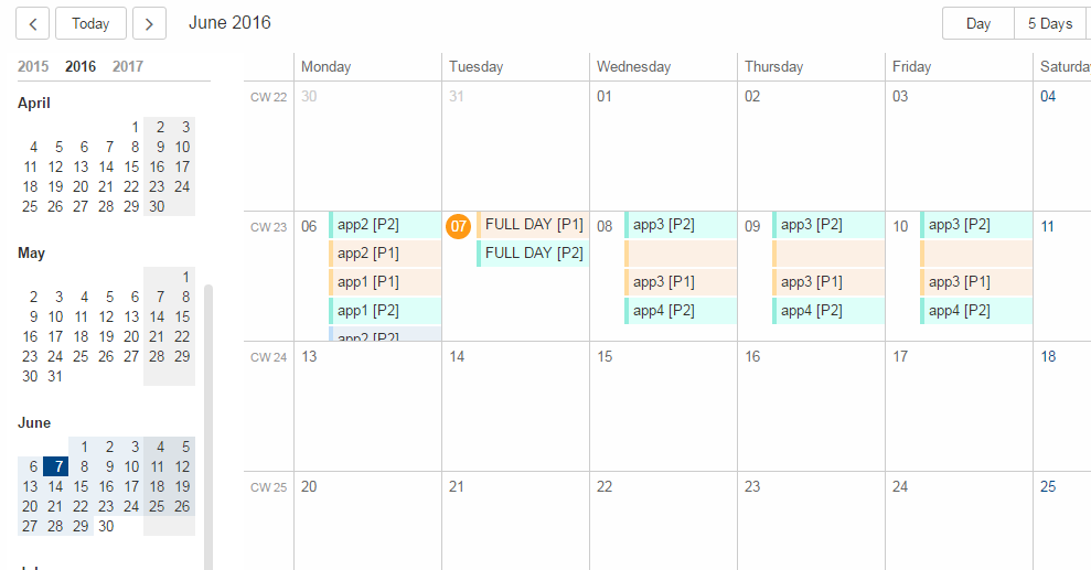
Calendar
The calendar got a complete new modern look and new functionality like the year panel.
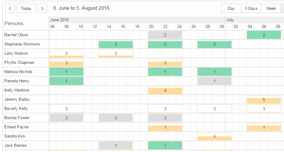
Planner
The planner used to be a combination of a table and an activity map. This has been reworked to make it simpler to use.
Bean Field / Bean Column [New]
The new IBeanField and IBeanColumn are used for advanced visualization as an alternative to the IHtmlField. As the name suggests the datatype is a plain java bean.
Compared to the IHtmlField the visualization does not happen in the model but in the UI layer using HTML/CSS/JavaScript, where it actually belongs to.
The bean field is mainly intended for a custom visualization of data. If you want to provide interactive functionality you probably need to create a custom widget.
Security
MalwareScanner
Facility used to scan files and resources for malware. The new @Bean MalwareScanner assumes that an appropriate malware scanner is in place on the webapp deployment machine and is configured to scan the TEMP folder (as used by File#createTempFile) using a realtime filesystem scan strategy. Malware should therefore immediately be removed or blocked by the malware implementation when placed in that folder. The new MalwareScanner is used in the ui.html file upload handler and thus checks every uploaded file.
IMimeTypeDetector [New]
The new interface IMimeTypeDetector provides multiple ordered implementations that can detect mime types PrimaryMimeTypeDetector with order 0 defines important webapp mime types ServletContextMimeTypeDetector with order 10 uses ServletContext.getMimeType JavaNioMimeTypeDetector uses java.nio Files.probeContentType
UploadRequestHandler [Added features]
The UploadRequestHandler checks for malware and limits the file types that can be uploaded. == Session Cookie (JSESSIONID Cookie) configuration validation The HTML UI checks if the application is configured safe by validating some flags set on the session cookie. For more details on how to configure your session cookie please refer to the Scout Documentation chapter "Session Cookie (JSESSIONID Cookie) Configuration".
UserIdAccessControlService [Removed]
org.eclipse.scout.rt.shared.services.common.security.UserIdAccessControlService was removed in M7. When creating a new Scout project via SDK, an own implementation of AbstractAccessControlService is now explicitly created in shared, named AccessControlService (as replacement for the removed UserIdAccessControlService). The class generated at the server side now replaces (@Replace) the new one generated in shared (class name of server side changed from AccessControlService to ServerAccessControlService).
Improved iOS Homescreen Mode (since 6.0.300)
If the app is running in iOS home screen mode the HTTP session will be lost whenever the user leaves the app (e.g. switches to another app or just downloads a file). This means he has to login again and navigate to the previous location, again. To avoid this a persistent mode has been introduced. This means if the app is running in the home screen mode, a persistent session cookie is created so that the same http session may be used the next time the app is activated. Also, the client session id will be put in the local storage instead of the session storage. This makes sure the same client session as before is used. Deep link handling is deactivated in that case otherwise it would always navigate to the url which was active when "add to home screen" was pressed.
This persistent mode is only active when the app is running on iOS with the home screen mode.
| Do you want to improve this document? Have a look at the sources on GitHub. |