|
This document is referring to a past Scout release. Please click here for the recent version. Looking for something else? Visit https://eclipsescout.github.io for all Scout related documentation. |
Introduction
This technical guide documents the Scout JS architecture and describes important concepts.
|
This is the guide to Scout JS, the JavaScript part of Eclipse Scout. If you are looking for the Java part please see the technical guide for Scout Classic. |
|
This document is not complete. Contributions are welcome! If you like to help, please create a pull request. Thanks! |
+
Repository:
https://github.com/bsi-software/org.eclipse.scout.docs
1. Overview
A classic Scout application has a client model written in Java, and a UI which is rendered using JavaScript. With this approach you can write your client code using a mature and type safe language. Unfortunately you cannot develop applications which have to run offline because the UI and the Java model need to be synchronized.
With Scout JS this will change. You will be able to create applications running without a UI server because there won’t be a Java model anymore. The client code will be written using JavaScript and executed directly in the browser.
You still don’t have to care about how the model will be rendered. There isn’t a strict separation of the UI and the model anymore, but that doesn’t mean you have to write HTML and CSS. You can of course, if you want to. But typically you will be using the Scout widgets you already know.
Scout JS is used in classic Scout applications as well. This means if you understand the concepts of Scout JS, writing custom widgets will be a lot easier.
2. Widget
A widget is a component which may be rendered. It may be simple like a label, or more complex like a tree or table. A form is a widget and a form field, too. A widget contains the model, which represents the state of the widget. In a Scout Classic application, that model will be sent from the UI server to the browser and the Scout UI will use that model to create the widget. In a Scout JS app, the model may be provided using JSON or directly with JavaScript.
2.1. Lifecycle
Every widget has a lifecycle. After a widget is instantiated, it has to be initialized using init. If you want to display it, you have to call the render method. If you want to remove it from the DOM, call the remove method. Removing a widget is not the same as destroying it. You can still use it, you can for example change some properties and then render it again. If it is really not needed anymore, the destroy method is called (typically by Scout itself).
So you see the widget actually has 3 important states:
-
initialized
-
rendered
-
destroyed
The big advantage of this concept is that the model of the widget may be changed any time, even if the widget is not rendered. This means you can prepare a widget like a form, prepare all its child widgets like the form fields, and then render them at once. If you want to hide the form, just remove it. It won’t be displayed anymore, but you can still modify it, like changing the label of a field or adding rows to a table. The next time it is rendered the changes will be reflected. If you do such a modification when it is rendered, it will be reflected immediately.
Destroying a widget means it will detach itself from the parent and destroy all its children. Typically this is done by Scout itself e.g. when closing a form.
If you want to destroy a widget yourself, it is recommended to do that by deleting it in its owner or parent (e.g. a GroupBox has a method deleteField which will destroy the field if the GroupBox is its owner).
If you have attached listeners to other widgets at initialization time, now is the time to detach them. After a widget is destroyed it cannot be used anymore. Every attempt will result in a Widget is destroyed error.
2.2. Creating a Widget
A widget may be created using the constructor function or scout.create. Best practice is to always use scout.create which gives you two benefits:
-
You don’t have to call
initby yourself. -
The widget may be extended (see Chapter 3 for details).
The following example creates a StringField.
var field = scout.create('StringField', {
  parent: groupBox,
  label: 'hello',
  value: 'world'
});
The first parameter is the object type, which typically is the name of the constructor function preceded by the name space. StringField belongs to the scout name space which is the default and may be omitted. If the string field belonged to another name space called mynamespace, you would have to write the following:
scout.create('mynamespace.StringField', {})The second parameter of scout.create is the model. The model is the specification for your widget. In case of the StringField you can specify the label, the max length, whether it is enabled and visible and more. If you don’t specify them, the defaults are used. The only needed property is the parent. To see what the defaults are, have a look at the source code of the widget constructor.
Every widget needs a parent. The parent is responsible to render (and remove) its children. In the example above, the parent is a group box. This group box has a property called fields. If the group box is rendered, it will render its fields too.
You don’t need a group box to render the string field, you could render it directly onto the desktop. But if you want to use a form, you need a group box and create the form, group box and the field. Doing this programmatically, meaning creating each widget separately using scout.create, is time consuming, that is why we suggest to use the declarative approach.
2.3. Creating a Widget Declaratively
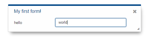
Have a look at the above example again. The second parameter, the model, defines some properties of the string field. This actually already is the declarative approach, because you could also set each property manually after creating the string field using the according methods. In order to create a form, we need to specify multiple widgets, respectively a widget hierarchy, at once. The following example defines a form with a group box and a string field.
export default {
  title: 'My first form!',
  rootGroupBox: {
    id: 'MainBox',
    objectType: 'GroupBox',
    fields: [
      {
        id: 'MyStringField',
        objectType: 'StringField',
        label: 'hello',
        value: 'world'
      }
    ]
  }
}
To keep things nice and clean we separate the model from the code by putting this description of the form in a separate file called MyFormModel.js. Typically you would create a file called MyForm.js as well, which contains the logic to interact with the fields. But since we just want to open the form it is not necessary. Instead you can use the following code to create the form:
import model from './MyFormModel';
var form = scout.create('Form', $.extend({parent: desktop}, model));
Now you can open the form using form.open() and it will look like this:
As soon as you would like to add some code that interacts with the fields or maybe just want to not always load the model manually when creating the form, you should create a file called MyForm.js. The content of that file would be a class MyForm that extends the Form from Scout and a method called _jsonModel that returns our model.
import {Form} from '@eclipse-scout/core';
import model from './MyFormModel';

export default class MyForm extends Form {
  _jsonModel() {
    return model;
  }
}
Creating the form is now possible using the following code (assuming your namespace is called 'example' and you’ve added the file MyForm.js to your index.js).
var form = scout.create('example.MyForm', {parent: desktop});2.3.1. Using constants in a JSON model
In previous Scout versions, the model was defined in a JSON file. Even though it is still possible, it is not recommended anymore, because writing the model using JavaScript is much more convenient. One advantage is, that you can use constants the same way as in your regular JavaScript code.
import {FormField} from '@eclipse-scout/core';
export default {
  ...
  labelPosition: FormField.LabelPosition.TOP
}
If you use a JSON based model, you cannot reference Scout’s JavaScript enums/constants and you’d have to write the following to assign the constant value:
{ "labelPosition": 2 }Obviously this makes the JSON code harder to read and understand and the developer has to lookup the enum/constant definition first. This is where the ${const:NAME} tag comes to help. A widget can define a list of properties that can be used with the const-tag. The widget defines in which enum/constant the name provided by the tag is resolved. Using the const-tag, the JSON example now looks like this:
{ "labelPosition": "${const:ON_FIELD}" }When you want to provide const-tag support for a custom widget, you need to call scout.Widget#resolveConsts in the _init function of your widget and for each supported property specifiy the property name and the object that contains the enum/constant definition.
2.4. Finding a Widget
In the example from the previous chapter we have seen how to create a widget, in that specific case we created a form. Typically it is not sufficient to just create a form, you most likely want to interact with the fields, like reading the values the user entered. In order to do that you need access to the fields. The easiest way is to use the IDs specified in the JSON.
Let’s have a look at our example form again:
export default {
  title: 'My first form!',
  rootGroupBox: {
    id: 'MainBox',
    objectType: 'GroupBox',
    fields: [
      {
        id: 'MyStringField',
        objectType: 'StringField',
        label: 'hello',
        value: 'world'
      }
    ]
  }
}
In this example we have 3 widgets: the form, the root group box and a string field. These widgets are linked to each other which enables us to find the string field starting from the form. This can be done by using the following command:
var stringField = form.widget('MyStringField');
Now you can read its value, change properties, add event handlers and so on.
2.5. Properties
As seen before, every widget has a model representing its state. This model is written onto the widget at the time it is being instantiated. The properties of that model are now available as properties of the widget. So in order to access such a property, just call widget.yourProperty. If you want to modify the property, just call widget.setYourProperty(value).
var field = scout.create('StringField', {
  parent: parent,
  labelVisible: false
});
console.log(field.labelVisible); // prints false

field.setLabelVisible(true);
console.log(field.labelVisible); // prints true
It is important to always use the setter to modify a property, because calling it does not just change the value. Instead it will call the method setProperty(propertyName, value) which does the following:
-
It will check if the property has changed at all. If the value is still the same, nothing happens. To compare the values
objects.equalsis used, which uses===to compare and if that returns false, uses the equals methods of the given objects, if available. -
If the values are not equal, the model is updated using the method
_setProperty(notice the_). Beside setting the value it also notifies every listener about the property change. So if another widget is interested in that property it may attach a listener and will be informed on every property change (see also the Events for details). -
In order to reflect the property change in the UI, the
_rendermethod is called, if available. The name of this method depends on the property name, it always starts with_renderand ends with the property name. Example:_renderLabelVisible. If the widget does not implement such a method, nothing happens.
It is worth to mention that the behavior of step 2 may be influenced by the widget. If the widget provides a method called _setPropertyName (e.g. _setLabelVisible, notice the _), that method will be called instead of _setProperty. This may be useful if something other should be done beside setting the property. If that is the case, that new function is responsible to call _setProperty by itself in order to set the property and inform the listeners. That method may also be called by the _init method to make sure the additional code is also executed during initialization (calling the public setter in _init would not have any effect due to the equals check at the beginning).
2.6. Widget Properties
A widget property is a special kind of a property which references another widget.
Defining a property as widget property has the benefit that the widget is created automatically. Lets take the group box as an example. A group box has a widget property called fields. The fields are widgets, namely form fields. If you create a group box, you may specify its fields directly:
import {StringField} from '@eclipse-scout/core';
var groupBox = scout.create('GroupBox', {
  parent: parent,
  label: 'My Group Box',
  fields: [{
    objectType: 'StringField',
    label: 'My String Field'
  }]
});
// check if the string field was created as well
console.log(groupBox.fields[0] instanceof StringField);
In the above example the group box is created using scout.create. After creating the group box you can access the property fields and you will notice that the string field was created as well, even though scout.create has not been called explicitly for the string field. This is because the property fields is defined as widget property. During the initialization of the group box it sets the property fields and because the value is not a widget yet (resp. the elements in the array), scout.create will be called.
This will also happen if you use a setter of a widget property. You can either call the setter with a previously created widget, or just pass the model and the widget will be created automatically.
In addition to creating widgets, calling such a setter will also make sure that obsolete widgets are destroyed. This means if the widget was created using the setter, it will be destroyed when the setter is called with another widget which replaces the previous one. If the widget was created before calling the setter, meaning the owner is another widget, it won’t be destroyed.
So if a property is defined as widget property, calling a setter will do the following:
-
It checks if the property has changed at all (same as for regular properties).
-
If the values are not equal,
_prepareWidgetPropertyis called which checks if the new value already is a widget and if not creates it. It also destroys the old widget unless the property should not be preserved (see_preserveOnPropertyChangeProperties). If the value is an array, it does so for each element in the array (only widgets which are not part of the new array will be destroyed). -
If the widget is rendered, the old widget is removed unless the property should not be preserved. If there is a custom remove function (e.g. _removeXY where XY is the property name), it will be called instead of removing the widgets directly. Note that the widget may have already been removed by the destroy function at the prepare phase.
-
The model is updated (same as for regular properties).
-
The render method is called (same as for regular properties).
2.7. Events
Every widget supports event handling by using the class EventSupport. This allows the widgets to attach listeners to other widgets and getting informed when an event happens.
The 3 most important methods are the following:
-
on: adds a listener -
off: removes a listener -
trigger: triggers an event
So if a widget is interested in an event of another widget, it calls the function on with a callback function as parameter. If it is not interested anymore, it uses the function off with the same callback function as parameter.
The following example shows how to handle a button click event.
var button = scout.create('Button', {
  parent: parent,
  label: 'click me!'
});
button.render();
button.on('click', function(event) {
  // print 'Button "click me!" has been clicked'
  console.log('Button "' + event.source.label + '" has been clicked');
});
Every click on the button will execute the callback function. To stop listening, you could call button.off('click'), but this would remove every listener listening to the 'click' event. Better is to pass the same reference to the callback used with on as parameter for off.
var button = scout.create('Button', {
  parent: parent,
  label: 'click me!'
});
button.render();
var callback = function(event) {
  // print 'Button "click me!" has been clicked'
  console.log('Button "' + event.source.label + '" has been clicked');

  // stop listening, a second click won't print anything
  button.off('click', callback);
};
button.on('click', callback);
If the callback function is bound using bind(), the bound function has to be used when removing the listener using off. This is because bind() returns a new function wrapping the original callback.
|
In order to trigger an event rather than listening to one, you would use the function trigger. This is what the button in the above example does. When it is being clicked, it calls this.trigger('click') (this points to the instance of the button). With the second parameter you may specify additional data which will be copied onto the event. By default the event contains the type (e.g. 'click') and the source which triggered it (e.g. the button).
trigger('click', {
  foo: 'bar'
});

// callback
function(event) {
  console.log(event.foo); // prints bar
}
2.7.1. Property Change Event
A special kind of event is the property change event. Whenever a property changes, such an event is triggered.
The event has the following properties:
-
type: the type of the event which is alwayspropertyChange -
source: the widget which triggered the event -
name: the name of the property -
newValue: the new value of the property -
oldValue: the old value of the property
Listening to such an event works in the same way as for other events, just use the type propertyChange. The listening below shows how to handle the property change event if the selected property of a toggle button changes.
import {Button} from '@eclipse-scout/core';
var button = scout.create('Button', {
  parent: parent,
  label: 'click me!',
  displayStyle: Button.DisplayStyle.TOGGLE
});
button.render();
button.on('propertyChange', function(event) {
  if (event.propertyName === 'selected') {
    // prints 'Property selected changed from false to true'
    console.log('Property ' + event.propertyName + ' changed from ' + event.oldValue + ' to ' + event.newValue);
  }
});
button.setSelected(true);
The above propertyChange handler ist executed for ALL property changes of that button.
This makes it necessary to check for the right property name inside the listener as it is done here with the if statement at the start of the listener.
Because this is a very common pattern there is a shortcut available.
You can listen for a specific property change with the following notation: propertyChange:propertyName.
|
button.on('propertyChange:selected', function(event) {
  // This listener is only executed when the 'selected' property changes
  console.log('Property ' + event.propertyName + ' changed from ' + event.oldValue + ' to ' + event.newValue);
});
button.setSelected(true);
2.8. Icons
See chapter Section 2.8 for a general introduction to icons in Scout.
Widgets that have a property iconId (for instance Menu) can display an icon. This iconId references
an icon which can be either a bitmap image (GIF, PNG, JPEG, etc.) or a character from an icon-font. An example
for an icon-font is the scoutIcons.ttf which comes shipped with Scout.
Depending on the type (image, font-icon) the iconId property references:
-
Image: iconId is an URL which points to an image resource accessible via HTTP.
Example:
/icons/person.png -
Font-icon: iconId has the format
font:[UTF-character].Example:
font:\uE043, references a character in scoutIcons.ttfExample:
font:fooIcons \uE109, references a character in custom font fooIcons.ttf -
Icon Constants: iconId has the format:
${iconId:[constant]}, where constant is a constant in the moduleicons.js. This format is especially useful when you configure a Scout widget with a JSON model. The value of the constant is again either an image or a font-icon as described above.Example:
${iconId:ANGLE_UP}usesicons.ANGLE_UP, icons predefined by ScoutExample:
${iconId:foo.BAR}usesfoo.icons.BAR, use this for custom icon constant objects
2.9. Parent and Owner
As seen in the previous chapters, the creation of a widget requires a parent. This establishes a link between the child and the parent widget which is necessary for several actions.
-
Rendering a widget into the container of the parent
If you callwidget.render()you don’t have to specify the HTML container to which the widget should be appended. It takes the container of the parent widget by default which isparent.$container. You can still pass a custom$parentif you like. -
Removing a widget and its children
Ifwidget.remove()is called, the widget will be removed from the DOM. Even though removing the parent HTML node would be sufficient in order to make the children disappear from the screen, every child widget will be removed as well. This gives the child widgets the possibility to clean up their rendering state and detach listeners. This is necessary because the widgets still exist after removal and their data can still be updated. Such cleanup actions are typically done by overridingwidget._remove(). Remember to call the_removeof the super class as well. -
Finding child widgets
This is something you will have to do very often if you specified your widgets in a JSON file. If you want to access these widgets from JavaScript you need to get them first. This is easy due to the linkage of the widgets. You can just use the functionwidget(id). See also chapter Section 2.4 for more details. -
Establishing a link independent of the DOM structure
Normally a child widget contains HTML elements which are children of the parent’s HTML elements. Even though this is the regular case it is not a must. Amongst others the following widgets have HTML elements appended to the HTML element of the desktop rather than their actual parents: dialogs, popups, tooltips. The main reason is because these widgets lay on top of every other widget. In order to not get into the z-index hell it is a lot easier to put these widgets on the top level of the DOM structure. But since the HTML elements are now separated, the only link is the parent/child hierarchy.
Imagine you have a string field which displays a tooltip. The parent of the tooltip is the string field but the HTML element is appended to the HTML element of the desktop. Removing the string field will now remove the tooltip as well even though their HTML elements are not linked.
Or think about the following case: there is a popup open which contains a smart field. The smart field shows a popup by itself displaying the proposals. The HTML elements of the main popup and the smart field popup are siblings meaning they are on the same level in the DOM. Normally a popup gets closed when an element not belonging to the popup is clicked. But why is the main popup not closed if the user clicks into the smart field popup even though their HTML elements are not linked? Exactly, because the smart field popup is a child of the smart field and therefore a child of the main popup.
So far we have learned what the parent is. But what is the owner? The owner is the only one which is allowed to destroy its children. Normally, the parent and the owner are the same, that is why you don’t have to specify the owner explicitly when creating a widget. The owner will be different if you specify it explicitly or if you use setParent() to temporarily change the parent of a widget. In that case the owner points to the old parent. This means if the new parent were destroyed, the newly linked child would not be destroyed, only removed from the DOM.
This comes in handy if you want to temporarily give the control over rendering/removal to another widget (like a popup) but don’t let the other widget destroy your widget (e.g. when the popup is closed) because you want to use your widget again (e.g. display it on another popup).
3. Object Factory
As seen in the Section 2.2 a widget may be created using scout.create. When using this function, the call is delegated to the ObjectFactory.
The ObjectFactory is responsible to create and initialize a Scout object. A typical Scout object has an objectType and an init function. But actually any kind of object with a constructor function in the scout or a custom namespace may be created.
By default, objects are created using naming convention. This means when calling scout.create('scout.Table', model), the scout namespace is searched for a class called Table. Since scout is the default namespace, it may be omitted. So calling scout.create('Table', model) has the same effect. If there is such a class found, it will be instantiated and the init function called, if there is one. The model is passed to that init function. So instead of using scout.create you could also use the following code:
import {Table} from '@eclipse-scout/core';
var table = new Table();
table.init(model);
This will work fine, but you will loose the big benefit of the ObjectFactory: the ability to replace existing classes. So if you want to customize the default Table, you would likely extend that table and override some functions. In that case you need to make sure every time a table is created, your class is used instead of the default. To do that you have to register your class in the ObjectFactory with the objectType Table. If scout.create('Table') is called the object factory will check if there is a class registered for the type Table and, if yes, that class is used. Only if there is no registration found, the default approach using the naming convention is performed.
In order to register you class, you need a file called objectFactories and add that to your JavaScript module (e.g. index.js). The content of that file may look as following:
import {CustomTable} from './index';
import {scout} from '@eclipse-scout/core';

scout.addObjectFactories({
  'Table': () => new CustomTable()
});
This will simply add a new factory for the type Table the the list of existing factories. From now on yourproject.CustomTable will be instantiated every time a Table should be created.
4. Form
A form is typically used for two purposes:
-
Allowing the user to enter data in a structured way
-
Displaying the data in a structured way
This is achieved by using Chapter 5s. Every form has one root group box (also called main box) which has 1:n form fields. The form fields are layouted using the logical grid layout, unless no custom layout is used. This makes it easy to arrange the fields in a uniform way.
A form may be displayed in various ways, mainly controlled by the property displayHint.
The following display hints are available by default:
-
view: the form will be opened in a tab and will take full width and height of the bench
-
dialog: the form will be opened as overlaying dialog and will be as width and height as necessary
-
popup-window: the form will be opened in a separate browser window (please note that this feature does not work properly with Internet Explorer)
To display the form, just set one of the above display hints and call form.open().
Beside opening the form as separate dialog or view, you can also embed it into any other widget because it is actually a widget by itself. Just call form.render() for that purpose.
4.1. Form Lifecycle
When working with forms, you likely want to load, validate and save data as well. The form uses a so called FormLifecycle to manage the state of that data. The lifecycle is installed by default, so you don’t have to care about it. So whenever the user enters some data and presses the save button, the data is validated and if invalid, a message is shown. If it is valid the data will be saved. The following functions of a form may be used to control that behavior.
-
open: calls
loadand displays the form once the loading is complete. -
load: calls
_loadandimportDatawhich you can implement to load the data and then marks the fields as saved to set their initial values. Finally, apostLoadevent is fired. -
save: validates the data by checking the mandatory and validation state of the fields. If every mandatory field is filled and every field contains a valid value, the
exportDataand_savefunctions are called which you can implement to save the data. After that every field is marked as saved and the initial value set to the current value. -
reset: resets the value of every field to its initial value marking the fields as untouched.
-
ok: saves and closes the form.
-
cancel: closes the form if there are no changes made. Otherwise it shows a message box asking to save the changes.
-
close: closes the form and discards any unsaved changes.
-
abort: called when the user presses the "x" icon. It will call
closeif there is a close menu or button, otherwisecancel.
If you need to perform form validation which is not related to a particular form-field, you can implement the _validate function. This function is always called, even when there is no touched field.
If you embed the form into another widget, you probably don’t need the functions open, ok, close, cancel and abort. But load, reset and save may come in handy as well.
Because it is quite common to have a button activating one of these functions (like an 'ok' or 'cancel' button), the following buttons (resp. menus because they are used in the menu bar) are available by default: OkMenu, CancelMenu, SaveMenu, ResetMenu, CloseMenu.
5. Form Field
A form field is a special kind of a widget. It is mainly used on forms but may actually be added to any other widget.
Every form field contains of the following parts:
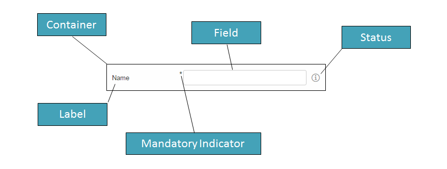
Typical form fields are StringField, DateField or TableField. All these fields have the API of FormField in common (like setLabel(), setErrorStatus(), etc.) but also provide additional API.
Some form fields are actually just a wrapper for another widget. This is for example the case for the TableField. The Table itself may be used stand-alone, just call scout.create('Table', {}). But if you want to use it in a GroupBox, which is a form field, you have to use a TableField wrapping the Table.
6. Value Field
A value field extends the form field by the ability to store a value. Typical form fields are StringField, NumberField, DateField or SmartField. All these fields provide a value which is accessible using field.value and may be set using field.setValue(value).
6.1. Parser, Validator, Formatter
The value always has the target data type of the field. When using a StringField the type is string, when using a NumberField the type is number, when using a DateField the type is date. This means you don’t have to care about how to parse the value from the user input, this will be done by the field for you. The field also validates the value, meaning if the user entered an invalid value, an error is shown. Furthermore, if you already have the value and want to show it in the field, you don’t have to format the value by yourself.
This process of parsing, validating and formatting is provided by every value field. The responsible functions are parseValue, validateValue and formatValue. If a user enters text, it will be parsed to get the value with the correct type. The value will then be validated to ensure it is allowed to enter that specific value. Afterwards it will be formatted again to make sure the input looks as expected (e.g. if the user enters 2 it may be formatted to 2.0). If you set the vaue programmatically using setValue it is expected that the value already has the correct type, this means parse won’t be executed. But the value will be validated, formatted and eventually displayed in the field.
Even though the fields already provide a default implementation of this functionality, you may want to extend or replace it. For that purpose you may set a custom parser and formatter or one or more validators.
6.1.1. Custom Parser and Formatter
Typically you don’t have to add a custom parser or formatter for a NumberField or DateField. They work with a DecimalFormat or DateFormat which means you can specify a pattern how the number or date should be represented. By default, it uses the pattern of the current locale, so you don’t even have to specify anything.
For a StringField on the other hand, adding a custom parser or formatter could make sense. Let’s say you want to group the text into 4 digit blocks, so that if the user inputs 1111222233334444 it should be converted to 1111-2222-3333-4444. This could be done using the following formatter.
function formatter(value, defaultFormatter) {
  var displayText = defaultFormatter(value);
  if (!displayText) {
    return displayText;
  }
  return displayText.match(/.{4}/g).join('-');
};
Keep in mind that you should call the default formatter first unless you want to replace it completely.
To make your formatter active, just use the corresponding setter.
field.setFormatter(formatter);Formatting the value is most of the time only half the job. You probably want to set a parser as well, so that if the user enters the text with the dashes it will be converted to a string without dashes.
function parser(displayText, defaultParser) {
  if (displayText) {
    return displayText.replace(/-/g, '');
  }
  return defaultParser(displayText);
};
Use the corresponding setter to activate the parser.
field.setParser(parser);6.1.2. Custom Validator
The purpose of a validator is to only allow valid values. This mostly depends on your business rules, this is why the default validators don’t do a whole lot of things.
See the following example of a validator used by a DateField.
import {dates} from '@eclipse-scout/core';
function(value) {
  if (dates.isSameDay(value, new Date())) {
    throw 'You are not allowed to select the current date';
  }
  return value;
};
This validator ensures that the user may not enter the current date. If he does, en error status will be shown on the right side of the date field saying 'You are not allowed to select the current date'.
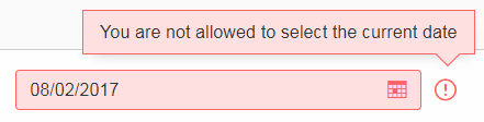
As you can see in the example, in order to mark a value as invalid just throw the error message you want to show to the user. You could also throw an error or a Status object. In that case a generic error message will be displayed.
In order to activate your validator, you can either call setValidator to replace the existing validator. In that case you should consider calling the default validator first, like you did it for the formatter or parser. Or you can use addValidator which adds the validator to the list of validators of the field.
field.addValidator(validator);Compared to parse and format you may have multiple validators. When the value is validated, every validator is called and has to aggree. If one validation fails, the value is not accepted. This should make it easier to reuse existing validators or separate your validation into tiny validators according to your business rules.
If you now ask yourself, why this is not possible for parsing and formatting, consider the following: Validate takes a value and returns a value, the data type is the same for input and output. Parse takes a text and creates a value, format takes a value and creates a text. The data type is likely not the same (besides for the StringField). If you had multiple parsers, the output of the previous parser would be the input of the next one, so depending on the index of your parser you would either get the text or the already parsed value as input. Confusing, isn’t it? So in order to keep it simple, there is only one parser and only one formatter for each field.
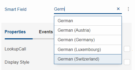
7. Lookup Call
A Lookup Call is used to lookup a single or multiple Lookup Rows. Several widgets like Smart Field, List Box or Tree Box take advantage of that concept in order to provide their proposals.
The most important parts of a Lookup Row are the key and the value. The key can be of any type, the text must be of type String. In addition to the key and the text a Lookup Row can also define an icon, a tooltip text, CSS classes and more.
Like in a classic Scout application each Smart Field in Scout JS references a LookupCall class. The lookup call is in charge of querying a data source and returning results for that query. Example: when you type "f" into a Smart Field, a lookup call could return a result which contains lookup rows starting with "F", like "Faz" and "Foo".
The lookup call may return static (hard-coded) data which is already available in the browser, or may fetch an external data-source via HTTP, typically some kind of REST API. Depening on how your Smart Field is configured and used, the Smart Field will call different methods on the LookupCall instance and pass data to that method, like the search text the user has typed into the field. These methods are: getAll, getByText, getByKey and getByRec.
-
getByKey(): Retrieves a single lookup row for a specific key value. Used by Smart Fields and Smart Columns to get the display text for a given key value.
-
getByText(): Retrieve multiple lookup rows which match a certain String. Used by Smart Fields when the user starts to enter some text in the field.
-
getAll(): Retrieves all available lookup rows. Used by Smart Fields when the user clicks on the field.
-
getByRec(): This can only be used for hierarchical lookup calls. It retrieves all available sub-tree lookup rows for a given parent.
You must implement these methods. Start with creating a sub class of LookupCall(.js). Sub class StaticLookupCall(.js) when you need a simple lookup call that operates on data that is available locally. Sub class RemoteLookupCall(.js) when you must fetch lookup data from a remote server. This class is also used in Scout Classic to start a lookup on the Scout UI Server.
Note that the lookup call works with Deferreds. This means the lookup call runs in the background and does not block the UI. When the lookup call is done eventually the Deferred is resolved and the Smart Field will process the result returned by the lookup call.
8. Styling
Beside JavaScript for business logic and for the models, every Scout JS app probably needs some CSS code at some point in time. If you are writing custom widgets, you need it for sure. But also if you are just using the given widgets you might have the need to adjust the look here and there.
Scout uses LESS as CSS preprocessor. It has a lot of advantages to pure CSS: variables, mixins, functions, imports etc. If you use the default build infrastructure provided by Scout, you cannot only use LESS easily without getting a headache on how to integrate it in your build system, you get access to all the LESS constructs used by Scout itself. This means you can use variables for colors, icons and sizes, mixins for animations and to avoid browser specific prefixes. You can import whole Scout LESS files for your custom themes and you get a lot of sample code in the Scout code base because Scout itself uses the same concepts.
In order to get started you need a place to put all your LESS code. The recommendation is to create one LESS file for each widget. That means if your widget is called MyWidget.js you would create a file called MyWidget.less. Even if you adjust the look of an existing widget you can create a file called let’s say StringField.less and put the rules there. If you only have a few rules or non widget specific rules you can create a file called main.less and put them there. However, these are only recommendations, you can always do it as you like.
The creation of these files won’t make them load automatically. You have to register them in your index file. This file should be put into your src/main/js folder and named index.less. Just include your new files using the LESS @import keyword.
@import "style/colors";In addition to this index file you normally also have a theme file which will be used as entry point in your webpack.config.js and included in the index.html. The intention of the theme file is to group individual index files and make one file in order to load all rules at once within one request.
Now that we have all the infrastructure set up, we can start adding some rules. As already said, you can use all the LESS variables from Scout. The variables can be found in the scout/style folder of the @eclipse-scout/core module. If you have a look at the file colors.less you find all the colors you can use or customize. Let’s say you want to change the background color of the navigation, you can redefine the variable @navigation-background-color.
@navigation-background-color: @palette-red-4;That’s it! As you can see, changing this variable not only changes the background color of the navigation, it also changes the background colors of the view-buttons on the top left and the navigation-handle on the bottom, because they are supposed to have the same color. You could do the same by using CSS rules, but you would have to write several selectors to achieve the same.
In this example a color from the Scout color palette is used. You can also use a custom hex code instead of @palette-red-4 or define a custom color palette, if you want to use the same colors for different rules.
Beside colors there are some other files in the style folder of the Scout module: animations.less, fonts.less, icons.less, mixins.less and sizes.less. All these files contain variables or mixins which are used by various Scout widgets and may be used by your project as well.
Redefining a variable is the simplest way of customizing. If you need more control you can always write a custom CSS rule. Keep in mind that these rules need to be more specific than the default CSS rules of Scout, otherwise they won’t be executed (see https://developer.mozilla.org/en-US/docs/Web/CSS/Specificity for details). We cannot guarantee that your custom rules will still work when migrating to a newer Scout version, because changing only a small part of the rule might make it more specific so that your rule won’t work anymore. That only applies to custom rules which are supposed to change existing look or behavior. If you are writing a custom widget without overriding default Scout rules there shouldn’t be any problems regarding migration.
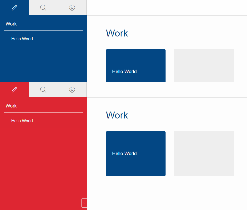
8.1. Themes
Scout applications support styling via CSS/LESS themes. Scout comes with two themes by default: the default theme with blue colors and the dark theme with gray/black colors. Technically a theme has a name and a set of LESS files.
In Scout Classic a theme is activated by calling the method AbstractDesktop#setTheme(String name). This causes the browser to reload the page and loads the CSS theme for that name, like myapp-theme.css for the default theme or myapp-theme-dark.css for the dark theme. The default theme is activated by passing a null value as name.
In Scout JS you do the same thing by calling the method Desktop#setTheme(name).
If you have multiple themes and you want to start with a defined theme by default, you can set a property in the config.properties file on the Scout UI server. In the following example the theme rainbow will be activated, which means the Scout application tries to load the CSS file myapp-theme-rainbow.css on start-up:
scout.ui.theme=rainbow
Note that Scout only provides an API to switch between themes. If the user of your Scout application should switch between various themes, your application must provide an UI element to do that. Scout provides no standard UI element for that. However, the Widgets apps for Scout Classic and Scout JS give you an idea of how you could implement that feature.
You have two options to customize CSS styles in your Scout project:
-
Change CSS properties (or LESS variables) by overriding styles from the default theme
-
Provide your own theme with a unique name like
rainbow
If your Scout application should have only a single theme, option 1 is the way to go. If users should have the option to switch between various themes, you should go with option 2. In this chapter we will focus on the latter option.
In order to understand Scout themes, take a look at the myapp-theme.less file which has been generated for your project by the Scout archetype. In the following examples we assume that the name of your project is myapp.
@import "~@eclipse-scout/core/src/index";
@import "./src/main/js/index";
As you can see the theme bundles various LESS modules. Line 1 imports the LESS module from the Scout core. This module contains style definitions for all UI elements provided by Scout. Line 2 imports the LESS module from your application. This module contains style definitions for custom widgets used in your project. The build creates a single CSS file myapp-theme.css, which is used as theme for your project.
We recommend making an index file for each Scout module. These index files import each single LESS file which belongs to that module. This excerpt from Scouts index.less shows how we import all distinct LESS files required to style the desktop or the LESS variable definitions for all colors used in the stylesheet:
...
@import "desktop/Desktop";
@import "desktop/DesktopLogo";
@import "desktop/DesktopDense";
@import "desktop/bench/DesktopBench";
@import "desktop/bench/BenchColumn";
@import "style/colors";
...
How does the dark theme for your Scout application look like? Like for the default theme, we create a LESS file myapp-theme-dark.less, but this time we import the index-dark modules.
@import "~@eclipse-scout/core/src/index-dark";
@import "./src/main/js/index-dark";
Let’s take a look at the details in the index-dark.less file from the Scout core:
@import "index";
@import "style/colors-dark";
@import "desktop/outline/Outline-dark";
As you see, the first thing we do on line 1 is to import the default theme 'index'. This means the dark theme inherits all style definitions from the default theme. The dark theme only extends new additional style and LESS variables or overrides styles or LESS variables from the default theme. This is what happens on line 2: colors-dark.less overrides some variables defined in the colors.less file from the default theme, like the gray colors:
...
@palette-gray-1: #e4e4e6;
@palette-gray-2: #999999;
@palette-gray-2-1: #79818d;
@palette-gray-3: #495465;
@palette-gray-4: #394051;
@palette-gray-5: #2d3748;
...
Note that all variables except @palette-gray-2-1 override variables from colors.less. @palette-gray-2-1 is a variable which is only defined and used in the dark theme.
8.1.1. Build and Runtime
Scout uses Webpack to run the LESS parser and build the CSS themes. Your application needs at least one default theme. The Scout archetype adds this theme to your webpack.config.js. If your application needs to work with multiple themes you must add them to the list of config entries. In this example we add the two themes dark and rainbow:
config.entry = {
  'bsicrm': './src/main/js/myapp.js',
  'login': './src/main/js/login.js',
  'logout': './src/main/js/logout.js',
  'myapp-theme': './src/main/js/myapp-theme.less',
  'myapp-theme-dark': './src/main/js/myapp-theme-dark.less',
  'myapp-theme-rainbow': './src/main/js/myapp-theme-rainbow.less'
};
When you use a Scout UI server as backend for your Scout JS application the class WebResourceLoader is responsible for supplying the requested CSS theme file to the browser. This class uses the current theme name as provided by the UiThemeHelper, which checks if a theme name is set by a cookie, the HTTP session or by an HTTP request parameter. These are good starting points for debugging, in case something unexpected happens while developing themes.
9. Extensibility
9.1. How to extend Scout objects
The extension feature in Scout JS works by wrapping functions on the prototype of a Scout object with a wrapper function which is provided by an extension. The extension feature doesn’t rely on subclassing, instead we simply register one or more extensions for a single Scout class. When a function is called on an extended object, the functions are called on the registered extensions first. Since a Scout class can have multiple extensions, we speak of an extension chain, where the last element of the chain is the original (extended) object.
The base class for all extensions is Extension. This class is used to extend an existing
Scout object. In order to use the extension feature you must subclass Extension and
implement an init function, where you register the functions you want to extend. Example:
import {Extension, StringField} from '@eclipse-scout/core';

export default class MyExtension extends Extension {
  init() {
    this.extend(StringField.prototype, '_init');
  }
}
Then you implement functions with the same name and signature on the extension class. Example:
_init(model) {
  // Call the original _init() method of the StringField class
  this.next(model);
  // Extend the instance with a new property called bar with the value foo
  // -> EVERY string field now has this new property
  this.extended.setProperty('bar', 'foo');
}
The extension feature sets two properties on the extension instance before the extended method is called. These two properties are described below. The function scope (this) is set to the extension instance when the extended function is called.
- next
-
is a reference to the next extended function or the original function of the extended object, in case the current extension is the last extension in the extension chain.
- extended
-
is the extended or original object.
All extensions must be registered in the _installExtensions function of your App (make sure to use the namespace which is defined in your index.js instead of custom).
Example:
import {App, Extension} from '@eclipse-scout/core';

export default class MyApp extends App {
  _installExtensions() {
    Extension.install([
      'custom.MyExtension'
    ]);
  }
}
9.2. Export Scout model from a Scout classic (online) application
With the steps described here you can export model-data (e.g. forms, tables, etc.) from an existing classic, online Scout application into JSON format which can be used in a Scout JS application. This is a fast and convenient method to re-use an existing form in a Scout JS application, because you don’t have to build the model manually. Here’s how to use the export feature:
-
Activate the
TextKeyTextProviderServicein your Scout classic application. You can do this either by calling the staticregisterMethod at runtime (using the Debugger) or by setting the config property scout.texts.showKeys. Once the TextProvider is active, it returns text keys instead of localized texts. The format of the returned string is${textKey:[text-key]}. Strings in this format are interpreted browser side by Scout JS and are resolved and localized in texts.js. -
Call the Scout classic web application with the URL parameter
?adapterExportEnabled=true. This parameter is checked by Scout JS and the effect of it is that Scout JS keeps adapter-data loaded from the server, so we can use it for a later export operation. Usually Scout JS deletes adapter-data right after it has been used to create an adapter instance. -
Start your browsers developer tools (F12) from your running Scout classic app, inspect the form or another adapter you’d like to export, and search for the ID of that adapter by looking at the
data-idattribute in the DOM. Then call the following JavaScript function from the console:JSON.stringify(scout.exportAdapter([id])). The console will now output the JSON code for that adapter. Copy/paste that string from the console and tidy it up with a tool of your choice (for instance jsoneditoronline.org or jsonformatter.org). -
Now the formatted JSON code is ready to be used in your Scout JS project. Simply store the JSON to a .json File and load it in the
_jsonModelfunction of your widget by callingscout.models.getModel('[ID of json model]'). Most likely you must edit the JSON file and apply some changes manually. For instance:-
Replace numeric adapter IDs by human-readable, semantic string IDs. You will need these IDs to reference a model element from the JSON model in your JavaScript code, e.g. to register a listener on a Menu.
-
Maybe you’ll have to adjust objectType and namespace of some widgets in the JSON. This needs to be done for widgets that do not belong to the default scout namespace.
-
Remove form fields and menus which are never used in your Scout JS app
-
Remove unused menu types from the menuTypes property of a
Menu
-
Note: The function exportAdapter can be used not only for forms, but for any other widget/adapter too.
10. Widget Reference
This chapter describes some of the widgets available in Scout. At the moment most of the widgets are not described yet, but they are already available at the Scout JS Widgets Application. With this application you can try the widgets out and get a feel of what they are capable of and how they are used.
10.1. Smart Field
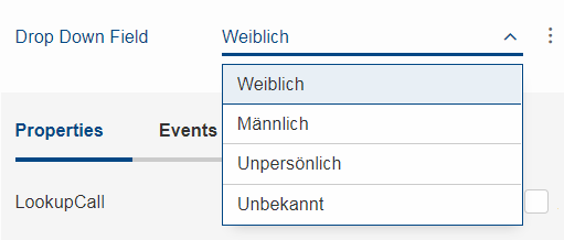
A Smart Field provides a list of proposals the user can choose from to pick one single value. In contrast to a common drop down list, the Smart Field provides search as you type which is especially useful for large lists. A very common case is to call a REST service and lookup the proposals while typing. This combination of a drop down list and a search field is the reason why it is called smart.
If you don’t need the search as you type feature, you can switch it off by setting the property displayHint to dropdown so that it behaves like a regular drop down list. This means the user cannot filter the values anymore using key board and can choose the values only by mouse / touch.
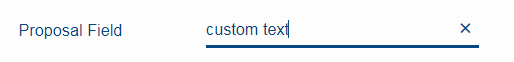
Another type of Smart Field is the so called Proposal Field. A Proposal Field does not require the user to choose from the available proposals but allows him to enter custom text as well.
In order to provide the proposals you can either use a Chapter 7 or a Code Type.
In a Scout JS application you can use SmartFields like in a classic Scout application. Any REST service can be used to provide results for a SmartField lookup call. However, the SmartField expects the result to have a defined structure. If the REST service API is in your hands, you can simply return a JSON response with the right structure. This means less work to do for you in the JavaScript layer, because you don’t have to transform the response to a structure the SmartField can process. If you must use a service which API you cannot change, you have no other choice than doing some kind of transformation in JavaScript.
Here’s how the response for a lookup call should look like in order to be processed by the SmartField:
{
  "queryBy": "ALL|TEXT|KEY|REC", # lookup type, as requested by the client
  "text": "foo", # [optional] only set when queryBy=TEXT, contains the requested search text
  "key": "123",  # [optional] only set when queryBy=KEY, contains the key of the requested lookup row
  "rec": "234",  # [optional] only set when queryBy=REC, contains the key of the requested parent lookup row
  "lookupRows": [ # the result set of this lookup, contains 0-n lookup rows
    {
      # key and text are mandatory properties, all other properties are optional
      "key": "unique lookup row key",
      "text": "lookup row text",
      "iconId": "person.svg",
      "tooltipText": "foo",
      "enabled": false,
      "active": false,
      "cssClass": "special-format",
      "backgroundColor": "#cc00ee", # deprecated, use cssClass instead
      "foregroundColor": "#333333", # deprecated, use cssClass instead
      "font": "Dialog-PLAIN-12",    # deprecated, use cssClass instead
      "parentKey": "234",           # only used for hierarchical smart fields
      "additionalTableRowData": [   # only used for table like lookup results with multiple columns
                                    # contains 0-n objects with arbitrary properties
        {
          "foo": "bar"
        }
      ]
    }
  ],
  "exception": "something went wrong" # [optional] only set when an error occurred during the lookup request
}
Here’s how the request for a Scout JS SmartField lookup call could look like. Your request to a REST API can look completely different. This example just gives you an idea of how to implement your own LookupCall.
{
  "type": "lookupByAll|Text|Key|Rec", # lookup type
  "text": "foo", # [optional] only set when type=lookupByText, contains the requested search text
  "key": "123",  # [optional] only set when type=lookupByKey, contains the key of the requested lookup row
  "rec": "234",  # [optional] only set when type=lookupByRec, contains the key of the requested parent lookup
}
11. HTML Document Parser
The HTML document parser is only available in the Scout UI server. If your Scout JS application uses a different backend, you cannot use the features described in this chapter.
The class HtmlDocumentParser is used by the Scout UI server in order to create dynamic HTML output on the server-side. Like JSP the parser supports a set of tags that are processed by the sever. The main purpose of the parser is to provide functions used for login.html and index.html, like bootstrapping and localization before JavaScript can be executed in the browser.
Note: some tags like scout-version and scout-text will be removed from the DOM once the Scout App is initialized.
11.1. scout:base
Outputs the context-path (or the root-directory) of the deployed web application as base tag in the HTML document.
Example:
<scout:base>
Output:
<base href="bsicrm_16_1/">
11.2. scout:include
This tag is used for server-side inlcudes, which means you can embed the HTML content of another file into the current HTML document. This avoids unnecessary code duplication by referencing the same fragement in multiple HTML documents.
Example:
<scout:include template="head.html" />
11.3. scout:message
Depending on the current user language provided by the browser, this tag outputs a list of localized text strings. The texts are used to display error-messages during login in the correct language, because at this point we don’t have a Scout session and thus no user language. The parser replaces the message tag through scout-text tags. These tags will be read by scout.texts#readFromDOM.
Example:
<scout:message style="tag" key="ui.Login" key="ui.LoginFailed" key="ui.User" key="ui.Password" />
Output:
<scout-text data-key="ui.Login" data-value="Anmelden"></scout-text>
11.4. scout:script
Converts the tag to a regular script tag in the HTML document so that the referenced JavaScript bundle can be loaded by the browser. Prior to that, the file name will be augmented depending on Scout’s runtime properties: if caching is enabled an additional fingerprint is added to the filename. If minifying is enabled the suffix ".min" is appended to the filename.
Example:
<scout:script src="yourapp.js" />
Output:
<script src="yourapp-98aea5b3.min.js"></script>
11.5. scout:stylesheet
Converts the tag to a regular style tag in the HTML document so that the referenced CSS bundle can be loaded by the browser. Prior to that, the file name will be augmented depending on Scout’s runtime properties: if caching is enabled an additional fingerprint is added to the filename. If minifying is enabled the suffix "-min" is appended to the filename.
Example:
<scout:stylesheet src="yourtheme.css" />
Output:
<link rel="stylesheet" type="text/css" href="yourtheme-98aea5b3.min.css">
12. Build Stack
JavaScript and CSS assets of a typical Scout application are built by Webpack using npm and Node.js. In order to make the building as easy as possible for you, there is a CLI module available. That module contains a default webpack and karma configuration and several build scripts you can use. The goal is to reduce the time you need to setup your build to a minimum. If you have created your Scout project using a Scout archetype, it should all be already setup for you. Nevertheless, you will get to a point where it is important to know how the building works in detail and how the several build tools are wired together. If you are there, this chapter should help you out.
12.1. Dependency Management
In every modern application you will have dependencies to other modules, either modules you created to separate your code, or third party modules like Scout. Such dependencies to other JavaScript modules are managed by the Node Package Manager (npm). So every module containing JavaScript or Less code needs to be a Node module with a package.json file that defines its dependencies.
This setup gives you the possibility to easier integrate and update 3rd party JavaScript frameworks available in the huge npm registry.
Scout itself is also published to that registry and will therefore be downloaded automatically once you execute npm install, as long as your package.json contains a Scout dependency. You will recognize a Scout module based on its name: all official Scout modules are published using the scope @eclipse-scout. The most important one is @eclipse-scout/core which contains the core runtime functionality. Other modules are @eclipse-scout/cli for the building support, @eclipse-scout/eslint-config for our ESLint rules, or @eclipse-scout/karma-jasmine-scout for enhanced testing support.
12.1.1. ES6 Modules
In addition to Node module dependencies, a Scout application uses ES6 imports to define dependencies between each JavaScript files. So if you want to use a class or utility from @eclipse-scout/core, you’ll need to import that class or utility in your own JavaScript file.
import PersonFormModel from './PersonFormModel';
import {Form, models} from '@eclipse-scout/core';

export default class PersonForm extends Form {

  _jsonModel() {
    return models.get(PersonFormModel);
  }
}
In the code above there are two imports defined: the first one imports the file PersonFormModel into the variable PersonFormModel. The second one imports the class Form and the utility models from the scout core module. Notice that the first import directly addresses a specific file while the second import addresses the node module itself. This is possible because Scout provides an index file specifying all available exports. That file is linked in the package.json. If your application contains more than one Node modules as well, you can do the same.
12.2. Webpack Configuration
Scout provides a default Webpack configuration containing all the necessary settings for Webpack and the plugins needed for a typical Scout application setup. To make your application use the Scout defaults, you need to create a file called webpack.config.js in your Node module and reexport the Scout configuration.
const baseConfig = require('@eclipse-scout/cli/scripts/webpack-defaults');
module.exports = (env, args) => {
  return baseConfig(env, args);
};
If you don’t like the defaults you can easily adjust them by customizing the object returned by the baseConfig(env, args) call.
Beside using the default configuration, you’ll need to configure some small things in order to make your application work. In this chapter we’ll have a look at these things you have to configure and the things that are provided by default.
12.2.1. Bundling
The main purpose of Webpack is to bundle the many small source files into one or a few larger JavaScript or Less files which are included in the HTML files as <script> resp. <style> tags and therefore loaded by the browser. There are a lot of different strategies and opinions on how to bundle correctly. If you have a strong opinion about it you can use your own bundling strategy. If not you should be fine with the Scout defaults which are as follows:
There are 4 JavaScript bundles:
-
eclipse-scout.js: contains all official Scout code (from modules with scope @eclipse-scout). -
jquery.js: contains the jQuery code. -
vendors.js: contains all other third party code (libraries in the node_modules folder). This file is only created if you have other third party code. This is not the case for a newly created Scout app so your index.html may not include it yet. -
your-app.js: contains all the code from your app.
There are some reasons why we chose this strategy:
-
Optimal caching: the bundles can be reused by different HTML files, e.g.
eclipse-scout.jsandjquery.jscan be used byindex.html,login.htmlandlogout.html. The browser only has to load the files once and can reuse them for the other HTML pages. -
Keep it simple: we think that this approach is simple to understand.
-
Security: the login page should only load the code it needs to display the login page and should not reveal the application code. That is why
login.htmlincludes its own entry point (login.js) and does not useyour-app.js.
To let Webpack know about your entry files you need to specify them in your webpack.config.js.
const baseConfig = require('@eclipse-scout/cli/scripts/webpack-defaults');

module.exports = (env, args) => {

  config.entry = {
    'helloworld': './src/main/js/index.js',
    'helloworld-theme': './src/main/js/theme.less',
    'helloworld-theme-dark': './src/main/js/theme-dark.less'
  };

  return config;
};
In this example the application is called helloworld and there is a bundle created with the same name. In order to create the bundle, Webpack uses the entry file, which is index.js in this case, follows all the ES 6 imports and includes these files. It then extracts chunks into separate files based on predefined rules. Scout already defines some rules in order to create 3 chunks mentioned above (eclipse-scout, jquery, vendors). So you don’t have to care about these chunks unless you want to further split them (maybe extract your own framework code into a separate bundle).
Also notice that the same applies to CSS files. The above example defines 2 CSS bundles in addition to the JavaScript bundle: helloworld-theme.css and helloworld-theme-dark.css. There are no predefined chunks for CSS files, we just put all the CSS code in one big file.
12.2.2. Static Web Resources
In addition to JavaScript and CSS resources bundled by webpack, your application will probably also require resources like images or fonts. Such resources should be placed in a resource folder, e.g. src/main/resources/WebContent if you use the Maven module structure, or just res otherwise. Because there are multiple modules that could provide such resources, you need to specify them in your webpack.config.js using the resDir array.
const baseConfig = require('@eclipse-scout/cli/scripts/webpack-defaults');

module.exports = (env, args) => {

  args.resDirArray = ['src/main/resources/WebContent', 'node_modules/@eclipse-scout/core/res'];

  return baseConfig(env, args);
};
In the snippet above the resDir array contains a folder of your module and a folder of Scout itself. The resource folder of Scout mainly contains the scoutIcons.woff, which is the icon font used by some Scout widgets.
When the build runs all the folders specified by the resDir array are visited and the resources collected. These resources are then available under / (if you use the Scout backend). If you want to know how to start the build, have a look at the Section 12.4.
12.2.3. EcmaScript Transpiler
In order to use the latest EcmaScript features like the Section 12.1.1 but still support older browsers, Scout uses Babel to transpile ES6+ code into ES5. The transpiler is enabled by default if you use the Webpack configuration provided by Scout, so you don’t have to configure it by yourself.
12.2.4. CSS Preprocessor
The CSS preprocessor used by Scout is Less, so the default webpack configuration already supports it by using the less-loader plugin. In order to profit from Scout`s less variables (see Chapter 8) we recommend to use Less as well. Since it is already configured, you won’t have to do anything but to write your CSS rules.
12.3. Karma Configuration
Scout uses Karma as test runner for its unit tests. The tests itself are written with the test framework Jasmine. We also use some plugins like karma-jasmine-jquery, karma-jasmine-ajax or karma-jasmine-scout to make writing tests for a Scout application even easier.
All this is configured in the file karma-defaults.js. If you want to use them too, you need to provide your own Karma file called karma.conf.js and import the defaults, similar to the Section 12.2. You can now adjust or override the defaults or just leave them as they are. To let Karma know about your tests, you need to define the entry point.
const baseConfig = require('@eclipse-scout/cli/scripts/karma-defaults');
module.exports = config => baseConfig(config, './src/test/js/test-index.js');
In the snippet above you see two things: The Scout defaults are imported and the entry point test-index.js is defined. This is all you need to do in this file if you are fine with the defaults.
The file test-index.js defines where your unit tests are and what the context is for the Webpack build. Because a unit test is called a spec when using Jasmine, a typical test-index.js looks like this:
import {JasmineScout} from '@eclipse-scout/testing';

let context = require.context('./', true, /[sS]pec\.js$/);
JasmineScout.runTestSuite(context);
This code tells the karma-webpack plugin to require all files ending in Spec.js. This will generate one big test bundle, but since source maps are enabled, you can debug the actual test files easily. The last line installs the given context and also runs a Scout app so that the Scout environment is properly set up.
12.3.1. Reporting
After running the tests, all results are put in a folder called test-results. There is a sub folder for each browser that executed the tests containing a file called test-results.xml. Since the karma-defaults.js uses the junit reporter, the file can be interpreted by any tool supporting the junit format, e.g. Jenkins.
12.4. Command Line Interface (CLI)
The Scout CLI is a bunch of npm-scripts that help you building and testing your application. In order to use them you need to add a devDependency to @eclipse-scout/cli to the package.json of your module. We also suggest to add some scripts to make the execution easier. If you use the Scout archetype, the following will be created for you.
"scripts": {
  "testserver:start": "scout-scripts test-server:start",
  "testserver:stop": "scout-scripts test-server:stop",
  "test:ci": "scout-scripts test:ci",
  "build:dev": "scout-scripts build:dev",
  "build:prod": "scout-scripts build:prod",
  "build:all": "scout-scripts build:dev && scout-scripts build:prod",
  "build:dev:watch": "scout-scripts build:dev:watch"
},
"devDependencies": {
  "@eclipse-scout/cli": "10.0.0"
}
12.4.1. Building
Before you can open your application in the browser, you need to build it. The build takes all your source code and resources and creates the artifacts needed for the browser according to your Section 12.2. Once the build is complete all the produced artifacts are put in the dist folder.
The dist folder contains three sub folders:
-
dev: contains not minified versions of the JS and CSS bundles with Source Maps. The source maps are necessary to map the bundles to the actual source files which makes debugging a lot easier. The Scout server delivers such bundles if it runs in dev mode (
scout.devMode=true). -
prod: contains minified versions of the JS and CSS bundles with restricted source maps (the maps don’t contain the actual source code, only the information necessary to create meaningful stack traces, see also the devtool property
nosources-source-map). Content hashes are generated and added to the bundles for optimal cashing. The Scout server delivers such bundles if it runs in production mode (scout.devMode=false). -
res: contains all static resources from the various resource folders specified by the
resDirarray, see Section 12.2.2.
If the property scout.urlHints.enabled is set to true, the dev files can be requested on the fly even if the server does not run in devMode. Just add the query parameter ?debug=true and the files in the dev folder instead of the ones in the prod folder are delivered. This can be very useful to debug a deployed application.
|
In order to start the build, use the following command:
npm run build:dev
This will fill the dev and res folders with the appropriate files. To make the files available to your browser you need to start a webserver. When using the Scout backend just start the class JettyServer. Once the build is complete and Jetty runs, you can open your application in the browser.
If you now make adjustments on your JS or CSS files, you would have to rerun the buid script, which could be time consuming and annoying. To make your developer life easier you can run the following script instead:
npm run build:dev:watch
This will also build your application but additionally starts a watcher that watches your source code. As soon as you change your code that watcher will notice and start a build. Since it knows which files changed, only these files need to be rebuilt which makes it a lot faster.
Arguments
The build commands accept some arguments you can use to adjust the build without modifying your webpack config file. The following arguments are available:
-
mode: 'development' or 'production'. This argument is set automatically when using build:dev or build:prod.
-
clean: true, to clean the dist folder before each build. Default is false if watcher is enabled (build:dev:watch), otherwise true.
-
progress: true, to show build progress in percentage. Default is true.
-
profile: true, to show timing information for each build step. Default is false.
-
resDirArray: an array containing directories which should be copied to dist/res.
-
stats: object to control the build output. There are some presets available as shortcuts (e.g. 'detailed' or 'errors-only'), see also: https://webpack.js.org/configuration/stats/.
In order to set an argument make sure to separate the arguments using -- from the command. Example:
npm run build:dev -- --progress false
All arguments are passed to the webpack config file as parameter args which is the second parameter. The first parameter called env is actually just a convenience accessor to args.env and does not contain system environment variables. If you want to access them just use the regular node syntax process.env.
12.4.2. Testing
Before you can run your unit tests you need to properly setup the files as described in Section 12.3.
If all is setup correctly, you can run your tests using the following command:
npm run test:ci
This will execute all unit tests with the headless browser. The default headless browser is Chrome, so you need to make sure Chrome is installed. This includes your Continuous Integration Environment, if you plan to automatically run the tests on a regular basis (e.g. with Jenkins).
The above command will execute the tests once and does not watch for changes. This is typically not desired during development. When you are actively developing a component and want to run your tests while you are developing, you can use the following command:
npm run testserver:start
This will start a real browser and enable the watch mode. This means every time you adjust your code and save it, the web pack build is started, the browser reloaded and your tests executed.
| If you don’t like the automatic browser reloading, you can press debug on the top right corner of the browser or manually navigate to http://localhost:9876/debug.html. |
Arguments
The test commands accept some arguments you can use to adjust the karma runner without modifying your karma config file. All passed arguments are merged with the karma config object, so all karma configuration options are available (see http://karma-runner.github.io/4.0/config/configuration-file.html).
Example usage:
npm run test:ci -- --junitReporter.outputDir=custom-out-dir
Please note that no type conversion happens which is especially relevant for boolean arguments. If you for example want to disable the watcher, you cannot use --auto-watch false. Instead, you would have to use --no-auto-watch.
|
In addition to the karma configuration options you can also pass the webpack arguments (checkout Section 12.4.1.1 for a list of available arguments). To do that, you need to use the argument called webpackArgs. Example:
npm run testserver:start -- --webpackArgs.progress=false
| test:ci automatically disables the webpack progress because you don’t want the progress when the tests run on a continuous integration server. |
12.4.3. Test prod scripts on your local machine
In case you need to test the files built by build:prod locally, follow this procedure:
-
Stop the UI server.
-
Run
npm run build:prod, this script will copy minified script files to the /dist folder. -
Start the UI server. Stopping and starting the UI server makes sure the server-side script cache is cleared.
-
Start the application with the URL parameter
/?debug=false. -
Check your index.html in the browser. Each referenced script or CSS file should have a fingerprint, example:
yourapp-2c6053b2fdf5b816fae5.min.js.
12.5. ESLint
For the Scout code base we use ESLint to analyze the JavaScript code. The ruleset we use is stored in the module @eclipse-scout/eslint-config. If you like, you can use the same ruleset for your application, but you don’t have to. You can use your custom config or even a different linter.
| When using the Scout archetype to generate your app, the ESLint configuration is already setup for you and you don’t need to do the following steps. |
In order to use the Scout eslint-config, you need to add devDependencies to the modules @eclipse-scout/eslint-config and eslint in your package.json.
"devDependencies": {
  "@eclipse-scout/eslint-config": "10.0.0",
  "eslint": "6.8.0"
}
Then create a file called .eslintrc.js with the following content:
module.exports = {
  extends: '@eclipse-scout'
};
This tells ESLint to inherit the configuration from the Scout module. In order to run the analysis, you can either use an IDE that supports it (e.g. IntelliJ), or the command line.
npx eslint .
If the command takes very long and prints a lot of errors, you may have to ignore the dist folder, see Section 12.5.2.
|
The command above will analyze your current directory including all sub directories. Depending on your environment, it is likely that you’ll see some errors regarding linebreaks. This is because the Scout config enforces the UNIX format (LF). You can now either convert the linebreaks of your files to that format and adjust your editor to always use the UNIX format, or you can disable the rule. To do that, just add the following to your .eslintrc.js:
  rules: {
    'linebreak-style': 'off'
  }
Now run the command again to make the linebreak errors disappear.
If you plan to configure your IDE to use the UNIX linebreak format, we recommend having a look at Editor Config. The file can be interpreted by various IDEs. Just add end_of_line=lf to that file and you are done.
|
12.5.1. Babel Dependency
If you use some bleeding edge EcmaScript features that are not yet part of the official specification but already supported by Babel, you should add a dependency to the babel-eslint plugin. Otherwise the analysis will probably report an error regarding these features.
One example of such a feature is class properties. This allows the definition of static class members. Scout itself uses that feature, that is why the Scout CLI has a dependency to babel-plugin-proposal-class-properties.
class Example {
  static anObject = {};
}
If you plan to use such features too, you should enable the babel-eslint plugin. To do that, add the following devDependencies to your package.json:
"devDependencies": {
  "babel-eslint": "10.0.3",
  "eslint-plugin-babel": "5.3.0"
}
To enable it, configure your .eslintrc.js in the following way:
  plugins: ['babel'],
  parser: 'babel-eslint'
That’s it.
Remember: ESLint itself already supports a lot of modern EcmaScript code. You only need to enable the babel-eslint plugin if you want to use the latest features which are not yet supported by ESLint.
12.5.2. ESLint Ignore
Similar to .gitignore, you can create a file called .eslintignore to exclude specific files or directories from the analysis. Because analyzing the build output probably does not make any sense, we recommend to at least ignore the dist folder. The only thing you need to do is to create that file and add a line with the word dist.
For more details please see the official ESLint documentation at https://eslint.org/docs/user-guide/configuring#eslintignore.
13. Browser Support
The Scout HTML UI requires a web browser with modern built-in technologies: HTML 5, CSS 3, JavaScript (ECMAScript 5). Scout does its best to support all browsers widely in use today by making use of vendor-specific prefixes, polyfills or other workarounds. However, some older or obscure browsers are not supported deliberately, simply because they are lacking basic capabilities or the required effort would be beyond reason.
Here is a non-exhaustive list of supported browsers:
- Desktop
-
-
Mozilla Firefox >= 35
-
Google Chrome >= 40
-
Microsoft Internet Explorer 11 (see table below for known limitations)
-
Microsoft Edge >= 12 (see table below for known limitations)
-
Apple Safari >= 8
-
- Mobile
-
(Due to the nature of mobile operating systems, it is hard to specify exact versions of supported browsers. Usually, the screen size and the device speed are the limiting factors.)
-
iOS >= 8
-
Android >= 5
-
Windows Mobile >= 10
-
| Affected System | Description |
|---|---|
Internet Explorer |
If the browser is configured to enable the so-called "protected mode", the state of a popup window cannot be determined correctly. This is noticeable when a |
Internet Explorer and Edge |
Performance in popup windows (e.g. opening a form with |
14. How-Tos
This chapter provides various small technical guides to very specific Scout JS subjects.
14.1. How to Create a Custom Field
This cheat sheet shows how to implement your own custom field for a ScoutJS application. In this example we will write a FlipCard field that will show a playing card. Clicking on the card will flip it from one side to the other.
14.1.1. Setup
For this example we use the helloscout git repository, but you can easily create the field in your own code base as well. In case you want to use the helloscout repo, clone and import it into your favourite IDE:
git clone https://github.com/bsi-software/helloscout.git
Read the readme and start the hellojs application to make sure it works.
Add Empty JS and CSS Files
Create the following files in the folder org.eclipse.scout.hellojs.ui.html
-
src/main/js/flipcard/FlipCardField.jsThe JavaScript file representing the field. -
src/main/js/flipcard/FlipCardField.lessThe LESS file containing the styles of the field.
14.1.2. Minimal Code for a New FormField
Create a Minimal FormField
The FlipCard will inherit from FormField. Every form field consists of a container, a label, the actual field, a mandatory-indicator and a status.
FlipCardField.js
import {FormField} from '@eclipse-scout/core';

export default class FlipCardField extends FormField {
  _render() {
    // Create the container
    this.addContainer(this.$parent, 'flip-card-field');

    // Add a label
    this.addLabel();

    // Create the actual field. This will be your flip card.
    var $field = this.$parent.appendDiv('content');
    // add the field to the form field.
    this.addField($field);

    // Add other required form field elements
    this.addMandatoryIndicator();
    this.addStatus();
  };
}
Add the FlipCard to the HelloForm
HelloFormModel.js
{
  id: "hellojs.HelloForm",
  ...
  rootGroupBox: {
    ...
    fields: [
      {
        id: 'DetailBox',
        ...
        fields: [
          {
            id: 'NameField',
            ...

          },
          (1)
          {
            id: 'FlipCardField',
            objectType: 'hellojs.FlipCardField',
            label: 'Flip the card',
            gridDataHints: {
              h: 5,
              weightY: 0
            }
          },
          {
            id: 'GreetButton',
            ...
          }
        ]
      }
    ]
  }
}| 1 | The FlipCard field |
Now reload your browser and you should get the following result:
14.1.3. Full Featured Flip Card Field
FlipCard.js
import {FormField} from '@eclipse-scout/core';

export default class FlipCardField extends FormField {
    constructor() {
    super();
      this.$card = null;
      this.$front = null;
      this.$back = null;
      this.flipped = false;
      this.frontImage = null;
      this.backImage = null;
  }

  _render() {
    // Create the container
    this.addContainer(this.$parent, 'flip-card-field');
    // Add a label
    this.addLabel();

    // Create the actual field (1)
    var $field = this.$parent.appendDiv('content');
    // Create the card inside the field
    this.$card = $field.appendDiv('card')
      .on('mousedown', this._onCardMouseDown.bind(this)); //(2)
    this.$front = this.$card.appendDiv('front');
    this.$back = this.$card.appendDiv('back');
    // Add the field to the form field. It will be available as this.$field.
    this.addField($field);

    // Add other required form field elements
    this.addMandatoryIndicator();
    this.addStatus();
  }

  _renderProperties() { (3)
    super._renderProperties();
    this._renderFrontImage();
    this._renderBackImage();
    this._renderFlipped();
  }

  _renderFrontImage() {
    if (this.frontImage) {
      this.$front.append('<img src=\"' + this.frontImage + '\">');
    }
  }

  _renderBackImage() {
    if (this.backImage) {
      this.$back.append('<img src=\"' + this.backImage + '\">');
    }
  }

  _remove() { (4)
    super._remove();
    this.$card = null;
    this.$front = null;
    this.$back = null;
  }

  _onCardMouseDown() { (2)
    this.setFlipped(!this.flipped);
  }

  setFlipped(flipped) {
    this.setProperty('flipped', flipped);
  }

  _renderFlipped() {
    this.$card.toggleClass('flipped', this.flipped);
  }
}| 1 | Create the dom elements in the render function. |
| 2 | Add event handler which toggles the CSS class flipped. |
| 3 | Initial rendering of the properties. Applies the state to the DOM. |
| 4 | Keep the references clean. Reset DOM references when the field has been removed. |
HelloForm.json
export default {
  id: 'hellojs.HelloForm',
  ...
  rootGroupBox': {
    ...
    fields: [
      {
        id: 'DetailBox',
        ...
        fields: [
          {
            id: 'NameField',
            ...

          },
          (1)
          {
            id: 'FlipCardField',
            objectType: 'hellojs.FlipCardField',
            label: 'Flip the card',
            frontImage: 'img/card-back.jpg',
            backImage: 'img/card-front.jpg',
            gridDataHints: {
              h: 5,
              weightY: 0
            }
          },
          {
            id: 'GreetButton',
            ...
          }
        ]
      }
    ]
  }
}| 1 | FlipCard field is inserted after the name field. |
FlipCardField.less
.flip-card-field {

  .card {
    position: absolute;
    cursor: pointer;
    height: 100%;
    width: 152px;
    transition: transform 1s; (1)
    transform-style: preserve-3d;

    &.flipped {
      transform: rotateY( 180deg );
    }

    & > div {
      display: block;
      height: 100%;
      width: 100%;
      position: absolute;
      backface-visibility: hidden; (2)

      &.back {
        transform: rotateY( 180deg ); (3)
      }

      & > img {
        height: 100%;
        width: 100%;
      }
    }
  }
}| 1 | Animation of the card. |
| 2 | Ensure back side is not visible. |
| 3 | Rotation to back side. |
Finally, create a folder img in the WebContent folder (org.eclipse.scout.hellojs.ui.html.app/src/main/resources/WebContent) and paste the two images of the card into that folder. You should be able to find the images using Google ;-)
Appendix A: Licence and Copyright
This appendix first provides a summary of the Creative Commons (CC-BY) licence used for this book. The licence is followed by the complete list of the contributing individuals, and the full licence text.
A.1. Licence Summary
This work is licensed under the Creative Commons Attribution License. To view a copy of this license, visit https://creativecommons.org/licenses/by/3.0/ or send a letter to Creative Commons, 559 Nathan Abbott Way, Stanford, California 94305, USA.
A summary of the license is given below, followed by the full legal text.
You are free:
-
to Share ---to copy, distribute and transmit the work
-
to Remix---to adapt the work
-
to make commercial use of the work
Under the following conditions:
Attribution ---You must attribute the work in the manner specified by the author or licensor (but not in any way that suggests that they endorse you or your use of the work).
With the understanding that:
Waiver ---Any of the above conditions can be waived if you get permission from the copyright holder.
Public Domain ---Where the work or any of its elements is in the public domain under applicable law, that status is in no way affected by the license.
Other Rights ---In no way are any of the following rights affected by the license:
-
Your fair dealing or fair use rights, or other applicable copyright exceptions and limitations;
-
The author’s moral rights;
-
Rights other persons may have either in the work itself or in how the work is used, such as publicity or privacy rights.
Notice ---For any reuse or distribution, you must make clear to others the license terms of this work. The best way to do this is with a link to https://creativecommons.org/licenses/by/3.0/.
A.2. Contributing Individuals
Copyright (c) 2012-2014.
In the text below, all contributing individuals are listed in alphabetical order by name. For contributions in the form of GitHub pull requests, the name should match the one provided in the corresponding public profile.
Bresson Jeremie, Fihlon Marcus, Nick Matthias, Schroeder Alex, Zimmermann Matthias
A.3. Full Licence Text
The full licence text is available online at http://creativecommons.org/licenses/by/3.0/legalcode
| Do you want to improve this document? Have a look at the sources on GitHub. |