| Looking for something else? Visit https://eclipsescout.github.io for all Scout related documentation. |
About This Release
The latest version of this release is: 11.0.42.
You can see the detailed change log on GitHub.
Coming from an older Scout version? Check out the Migration Guide for instructions on how to obtain the new version and upgrade existing applications.
Demo Applications
The demo applications for this version can be found on the features/version/11.0.42 branch of our docs repository on GitHub.
If you just want to play around with them without looking at the source code, you can always use the deployed versions:
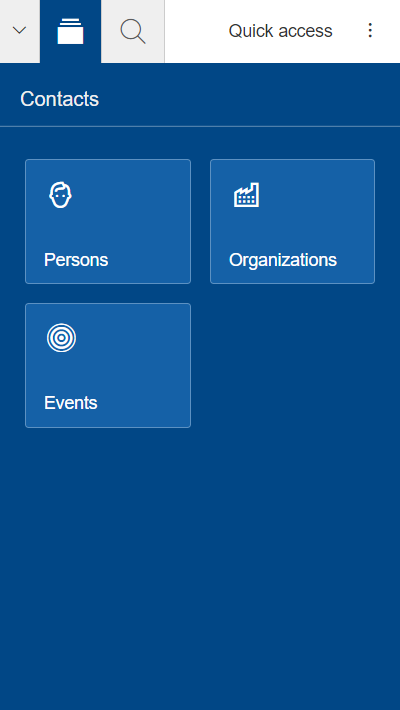
Mobile Improvements
Default Detail Form and Tile Overview
When no page is selected, the desktop client shows the default detail form, or if not available, the tile outline overview.
This feature was disabled on mobile, until now.
So if you startup your mobile Scout Classic app you will probably notice the new look.
If you don’t like it you can always disable it by not creating a default detail form (Outline#createDefaultDetailForm)
or by setting Outline#getConfiguredOutlineOverviewVisible to false.
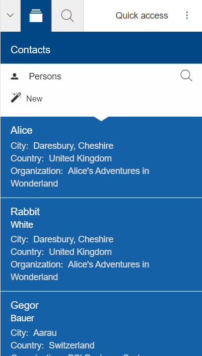
More Information in Outline
Until now, the outline in mobile mode displayed the same summary cell as in desktop mode. Even though you could already create a custom summary cell for mobile, doing so is time-consuming. This is why we decided to implement a different strategy for mobile to compute a better summary cell. It is enabled by default so that every table page will benefit right away.
Since this new strategy is based on the new feature introduced for tables (Table: New Property 'compact'),
it can be easily customized in the same way. If you don’t like it you can return to the previous strategy
by overriding AbstractTable#createSummaryCellBuilder, but why should you ;-) ?
New Style for Views
The device transformer now adjusts the style of a view so that it matches the style of a dialog. Also, the view tabs won’t be visible anymore. This should give a more consistent look and should make it easier to use.
If you don’t like that behavior, you can disable it in general or for specific forms:
BEANS.get(IDeviceTransformationService.class).excludeFormTransformation(this, MobileDeviceTransformation.USE_DIALOG_STYLE_FOR_VIEW);Fullscreen Dialogs
The device transformer now sets the property maximized of dialogs to true so that every dialog will
be displayed in full screen. See also Support Maximized.
If you don’t like that behavior, you can disable it in general or for specific forms:
BEANS.get(IDeviceTransformationService.class).excludeFormTransformation(this, MobileDeviceTransformation.MAXIMIZE_DIALOG);Wizard: Improved Progress Field
The progress visualization and step activation has been improved for smaller screens.
New MobilePopup
MobilePopup was only available on Scout JS but is now available for Scout Classic as well. A mobile popup slides in from the bottom. This is it, not more. It has already been used for search or tool forms on mobile.
New Tablet Transformation: Auto Hide Navigation
The navigation is now automatically hidden when a view is opened and shown again when the last view is closed. This was introduced because the space is very limited and the navigation mostly not needed when a view is open.
If you don’t like the change you can simply disable it by disabling the transformation TabletDeviceTransformation#AUTO_HIDE_NAVIGATION.
Check out the mobile chapter in the Tech Doc on how to do it.
New ESLint Settings
The eslint rules used by Scout have been adjusted to encourage the use of some great ES6 features.
The following rules have been turned on:
no-var, prefer-arrow-callback,prefer-rest-params, prefer-spread.
If you have a dependency to @eclipse-scout/eslint-config and you update to the latest version,
your project will use the new settings, too. This also means your JavaScript code may report some new warnings.
Have a look at the Migration Guide to learn how to handle them
(e.g. migrating code or disabling the rules).
Custom Webpack Config
If you have a lot of themes, working on a less file can be frustrating since every theme will be built.
To save time, it is now possible to control which themes should be built.
To do so, create a webpack.config.custom.js file (which can be added to .gitignore because not every developer has the same preferences).
Add the following content:
const baseConfig = require('./webpack.config');
module.exports = (env, args) => {
  args.themes = args.themes || ['default'];
  return baseConfig(env, args);
};
To make this work your base webpack config needs to register the themes using the function baseConfig.addThemes:
baseConfig.addThemes(config.entry, {
  themes: args.themes,
  availableThemes: ['default', 'dark'],
  generator: name => [`yourapp-theme${name}`, `./src/main/js/yourapp-theme${name}.less`]
});
Automatic Script Chunks
Before Scout 11 script (JavaScript and CSS) chunks have been declared explicitly. While you have full control on the output using this explicit definition, it is often not optimal concerning performance and might require modifications when a new module or library is added to the project. Therefore starting with version 11 Scout additionally supports automatic chunk creation for your script assets.
When using this new feature (which is the default configuration now), chunks are automatically created based on size and code usage (imports). Therefore, it is no longer necessary to list every chunk manually in the html file. Instead, Scout automatically inserts the necessary script tags according to the chunks created.
Have a look at the Migration Guide to learn how to use automatic script chunks.
Code Pen Support
Scout JS can now be used on https://codepen.io/ to share code snippets with the world.
To make this possible, some changes in the distribution of Scout assets were necessary. You will find all necessary assets (script, theme, fonts, texts, locales) in the dist folder of the scout modules. The modules itself are automatically published to various CDNs, like https://www.jsdelivr.com/.
You can either import the npm modules in your Code Pen and even activate Babel like it is done here.
Or you can work with the pre built assets. Learn how to do so with this tutorial.
New Widgets
Breadcrumb Bar Field
The new breadcrumb bar widget allows to display a hierarchical structure in a horizontal style. Each breadcrumb item is clickable. The breadcrumb can automatically shrink if there is not enough place available.

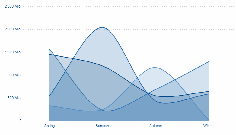
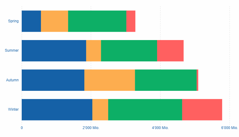
Chart
The new chart widget allows visualizing data in several ways. It can be used inside a chart field, a chart tile or as a plain chart. The supported chart types include bar (vertical and horizontal), line, bar and line combined, pie, doughnut, bubble, polar area, radar, fulfillment, salesfunnel, speedo and venn. All charts support different color schemes and themes.
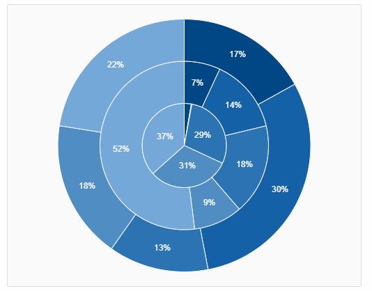
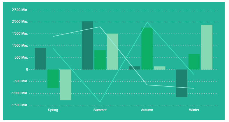
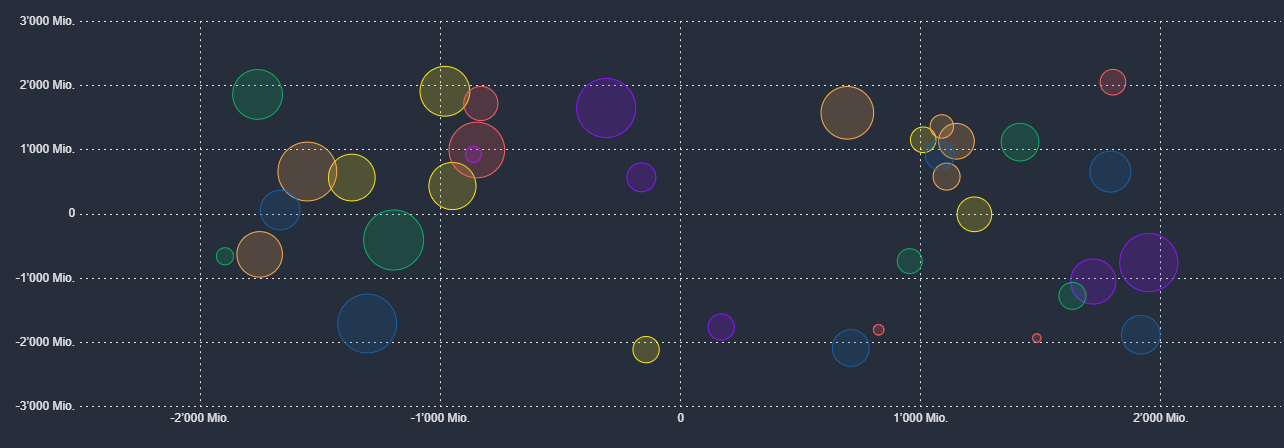
There are numerous styling options, e.g. tension and fill for line and radar charts, stacked bar charts or a transparent and a checkable mode.
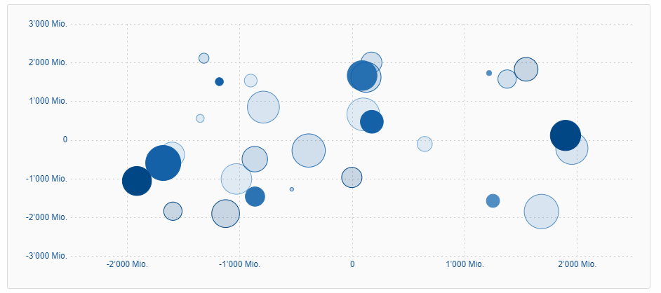
For more information about the chart widget see Technical Guide for Scout JS.
Widget Enhancements
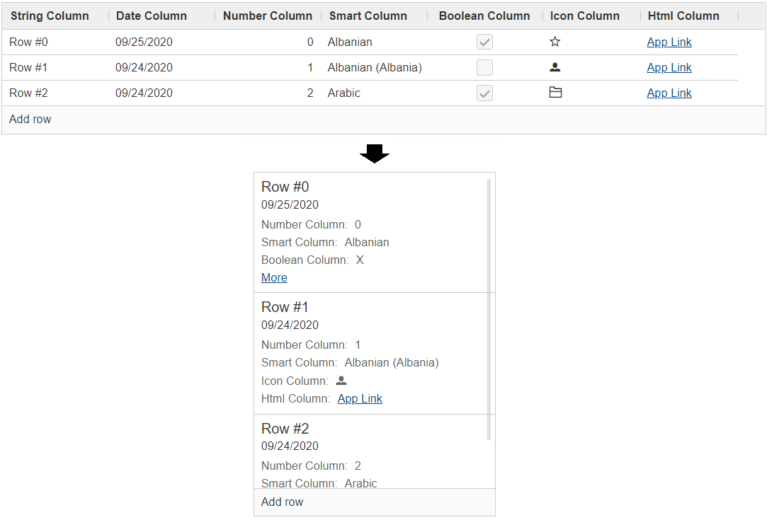
Table: New Property 'compact'
It is now possible to set a table into compact mode. This will hide all columns and insert a new one containing the content of every other column. The content will be displayed vertically which means the cells of a row will be put below each other. This new style is perfect if the width of the table is limited (e.g. on a mobile phone).
The table uses a so called ITableCompactHandler which does the conversion. If you don’t like how
the content is arranged you can easily control the conversion by adjusting the compact handler or by
writing your own one.
Menu: New Property 'textPosition'
With this new property, the text can be positioned on the bottom of the icon

Form
Widget
ExecFocusIn, ExecFocusOut
Every widget now supports focus events. You can either use a WidgetListener or implement execFocusIn and execFocusOut.
The currently focused element is available using IDesktop#getFocusedElement().
Important: the focus tracking needs to be explicitly activated before it can be used.
Just call IDesktop#setTrackFocus(true) to do so.
And remember to deactivate it again once you don’t need it anymore to not produce unnecessary requests.
TabBox: Support for LabelVisible
Setting the property labelVisible to false will now hide the tab area.
Until now, the property had no effect for tab boxes.
File Drop Support (JS)
Dragging a file and dropping it on a widget now works for Scout JS apps as well. This feature can be activated for every form field, and Table and Tree.
To do so, you need to set the dropType property to dragAndDrop.SCOUT_TYPES.FILE_TRANSFER.
You can then listen to the 'drop' event and handle it accordingly.
You may also want to adjust the dropMaximumSize to decrease or increase the allowed file size.
Scout SDK Enhancements for IntelliJ
Beside new Scout runtime features, the Scout SDK for IntelliJ got some new features as well.
Code Completion for Scout Classic
This enables you to easily create new Scout elements like form fields, menus, codes etc. directly from the editor.
Just press Ctrl + Space to see the available elements for the current location in the code, or simply start writing (e.g. Menu).
Code Completion for Scout JS
Similar to the code completion for Scout Classic, you can now easily add new elements in your Scout JS models. This is not limited to adding new widgets, you get code completion for all properties (like enabled, visible etc.).
National Language Support
Even though IntelliJ has a built-in NLS editor, the editor has some limitations.
With the new Scout NLS editor you will get the features you know well and love from the Scout NLS editor for Eclipse.
This includes being able to show inherited texts or sorting the texts alphabetically.
Just open the translation.nls file to open the Scout editor.
In addition to the editor, you also get:
-
Inspections for missing and unused translations.
-
Code completion for Scout translation keys in Java, JavaScript and HTML.
This allows you to easily select or even add new texts directly from the code. -
Tooltip documentation for Scout translation keys.
-
Code folding support for Scout translations with configurable display language.
Wizard to Create a New Scout Project
With the new wizard you can easily create a new Scout Classic or Scout JS project with just a few clicks.
If you want to try it out we recommend to either do the Hello Scout Classic or the Hello Scout JS tutorial.
| Do you want to improve this document? Have a look at the sources on GitHub. |