|
This document is referring to a past Scout release. Please click here for the recent version. Looking for something else? Visit https://eclipsescout.github.io for all Scout related documentation. |
About This Release
The Eclipse Scout 8.0 version is part of three simultaneous releases (release schedule):
-
The initial version of Eclipse Scout 8.0 was part of the Eclipse Photon release (June 27, 2018).
-
An updated version was released as part of the 2018-09 release (September 19, 2018).
-
An updated version was released as part of the 2018-12 release (December 19, 2018).
The latest version of this release is: 8.0.0.031
You can see the detailed change log on GitHub.
Service Releases
After the final Eclipse Photon release, there are no more Eclipse service releases (see the Simultaneous Release Cycle FAQ for details). Scout 8.0 will continue to be maintained for a while and a new build may be released from time to time. Beside bugfixes, these releases may even contain some minor features.
The following enhancements were made after the initial 8.0 release.
Simrel 2018-09 — Released on September 19, 2018
The initial release of this version was 8.0.0.021 (Maven: 8.0.0.021_Simrel_2018_09).
Simrel 2018-12 — Released on December 19, 2018
The initial release of this version was 8.0.0.031 (Maven: 8.0.0.031_Simrel_2018_12).
Obtaining the Latest Version
Runtime (Scout RT)
Scout RT artifacts are distributed via Maven:
-
8.0.0.031_Simrel_2018_12 on Maven Central
-
8.0.0.031_Simrel_2018_12 on mvnrepository.com
Usage example in the parent POM of your Scout application:
<dependency>
    <groupId>org.eclipse.scout.rt</groupId>
    <artifactId>org.eclipse.scout.rt</artifactId>
    <version>8.0.0.021_Simrel_2018_09</version>
    <type>pom</type>
    <scope>import</scope>
</dependency>
Eclipse IDE Tooling (Scout SDK)
You can download the complete Eclipse IDE with Scout SDK included (EPP) here:
Eclipse for Scout Developers Photon
To install the Scout SDK into your existing Eclipse IDE, use this update site:
http://download.eclipse.org/scout/releases/8.0/8.0.0/021_Simrel_2018_09/
Demo Applications
The demo applications for this version can be found on the features/version/8.0.0.021_Simrel_2018_09 branch of our docs repository on GitHub.
If you just want to play around with them without looking at the source code, you can always use the deployed versions:
Java 8 required
The required Java Runtime Environment (JRE) to run an Eclipse Scout application has changed: Starting with Eclipse Scout 8.0, a Java 8 runtime is required.
| The Scout 8.0 Runtime does not support Java 9 or Java 10 yet. The support for newer Java versions is planned for a later release. |
New browser version requirements
The supported browser versions have been updated. See https://eclipsescout.github.io/8.0/technical-guide-js.html#browser-support for the new list of supported browsers.
New SDK Feature in Eclipse: Search for missing NLS keys
If NLS keys are used in the code that do not exist in a properties file, an ugly placeholder is displayed to the user. To find such missing translations the new Menu Scout → Search missing text keys… may be handy.
The result is listed in the Eclipse Search view.
The search also takes the scope of each NLS key into account. So that the key is considered to be available there must be a TextProviderService with that key on the classpath of that module.
Reported false positives can be suppressed using the following comment at the end of the corresponding line: NO-NLS-CHECK. Matches on that line are then not reported in future searches anymore.
Config Properties
Descriptions
Config properties based on org.eclipse.scout.rt.platform.config.IConfigProperty include a description text. This description is stored in the new description() method.
The class org.eclipse.scout.rt.platform.config.ConfigDescriptionExporter can be used to export these descriptions. By default an AsciiDoctor exporter is included.
All Scout properties have been extended with descriptions. The same text is also part of the technical documentation.
Default Value
Config properties based on org.eclipse.scout.rt.platform.config.IConfigProperty include a default value. The default value is stored in the getDefaultValue() method.
The method was moved from org.eclipse.scout.rt.platform.config.AbstractConfigProperty<DATA_TYPE, RAW_TYPE> to the interface. Therefore the visibility has changed from protected to public.
Validation
The concrete implementation org.eclipse.scout.rt.platform.config.ConfigPropertyValidator which validates the configuration of config.properties files will also check if a configured value matches the default value.
In case it does a info message (warn in development mode) will be logged but platform will still start.
To minimize configuration files such entries should be removed from config.properties files.
Tree Traversal Engine Added
A tree (or graph) traversal engine has been added to the Scout Platform. The engine can traverse any tree- or graph-like structures.
See the package org.eclipse.scout.rt.platform.util.visitor especially the class org.eclipse.scout.rt.platform.util.visitor.TreeTraversals as entry point.
TreeTraversals.create(visitor, childrenSupplier).traverse(root);The root element can be of any type. The childrenSupplier is a Function that returns the child elements for a given parent.
The visitor can be a IBreadthFirstTreeVisitor for Breadth-First visiting strategy or a IDepthFirstTreeVisitor for a Depth-First visiting strategy supporting pre-order and post-order traversals.
Desktop Splitter Position Remembered Across Sessions
The position of the desktop splitter position (between the navigation and the bench) is now persisted across sessions, i.e. the previous setting will be restored even after you closed your browser. The position is stored in the HTML 5 local storage provided by the local browser. It is therefore a device-specific setting, which is especially useful when accessing the same application through screens with different resolutions.
In case the splitter position should never be remembered, the feature can be disabled globally by setting the property cacheSplitterPosition on the desktop to false.
Introducing Widget.java
On JavaScript side, there has been a class Widget.js for a long time now. With this release the counterpart Widget.java has been added. This gives all existing widgets like FormField, Form, MessageBox, Action (e.g. Menu), Tree, Table, Accordion, Calendar, Desktop, Tile, etc. a new common base class. It also helps creating widgets which aren’t necessarily form fields.
The new Widget class handles the widget lifecycle (initConfig, init, disposed) and offers methods to visit Widget hierarchies. See org.eclipse.scout.rt.client.ui.IWidget for more details.
New Widgets
TileGrid
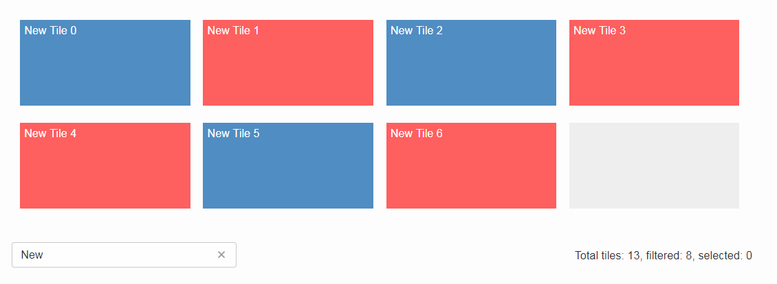
The new TileGrid widget arranges Tile s in a grid by using the LogicalGridLayout. This is the same layout as used for a GroupBox, so the same GridData object may be used to configure how the individual tiles should be arranged.
A Tile directly extends Widget and is not much more than a <div> with the CSS class tile. The easiest way to use a tile is to use a HtmlTile with the displayStyle DEFAULT. If you need more control over the styling, you can just set the displayStyle to PLAIN, so that the default CSS rules are not applied, and then add your own CSS rules. If you want even more control about the layout and content you can create a custom tile instead of using the HtmlTile. Just create a JS class lets say CustomTile.js which extends from Tile.js, create a Java class CustomTile.java which extends from AbstractTile.java and add some glue code to link them together. See the code of the demo widgets on GitHub for details. You could also use existing widgets as tiles. In that case instead of extending AbstractTile you would extend AbstractWidgetTile or AbstractFormFieldTile and set the property tileWidget accordingly.
In order to add the TileGrid to a form, you can use the class TileField which is basically a simple FormField wrapping the TileGrid. You cannot use the TileGrid directly because a GroupBox only accepts FormField s.
A demo of the widget can be found here: https://scout.bsi-software.com/widgets/?dl=widget-tilefield
And here for the JS only version: https://scout.bsi-software.com/jswidgets/#tilegrid
Virtual Scrolling (since Simrel 2018-12)
Similar to the virtual scrolling of the table and the tree, the tile grid now supports virtual scrolling as well. It can be enabled by setting the property virtual to true. Unlike for tree and table, it is not enabled by default.
Virtual Scrolling means only the tiles in the view port and some more will be rendered. The others will be rendered as soon as they will be moved into the view port, either by scrolling or by any other action like sorting, filtering etc.
This can lead to a big performance boost when having many tiles, especially on Internet Explorer, but other browsers benefit as well. To make Virtual Scrolling work, the real width and height needs to be known so that scroll bar position can be calculated correctly. This means Virtual Scrolling does only work if all tiles have the same size, so the following grid properties cannot be used: useUiWidth, useUiHeight, widthInPixel, heightInPixel, w, h, x, y.
If these preconditions are given, you can use the virtual mode and your grid will be able to handle a lot of tiles.
Accordion
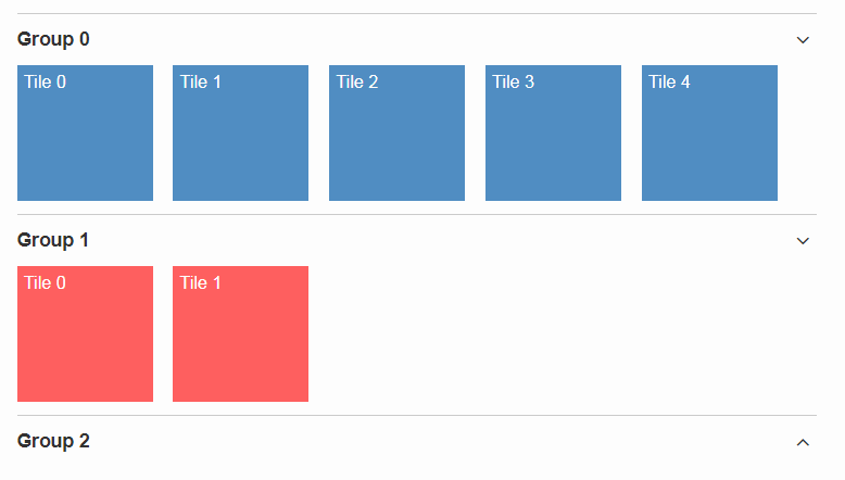
The Accordion displays several collapsible Group s. The default behavior is to collapse every other group if one group is expanded. Because that is not in any case desired, the behavior may be disabled by setting the property exclusiveExpand to false.
The Group is a simple widget containing of a header and a body. The body may be any other widget like the new TileGrid. Because having tiles in an accordion is a typical use case, there is a widget called TileAccordion which helps creating the groups and provides some delegate methods to easily access the tiles of every group. It also takes care that selecting multiple tiles across the individual groups works as there were only one single TileGrid.
A demo of the accordion can be found here: https://scout.bsi-software.com/widgets/?dl=widget-accordionfield
And here for the JS only version: https://scout.bsi-software.com/jswidgets/#accordion
A demo of the tile accordion can be found here: https://scout.bsi-software.com/widgets/?dl=widget-tileaccordionfield
And here for the JS only version: https://scout.bsi-software.com/jswidgets/#tileaccordion
File Chooser Button
The new AbstractFileChooserButton is a value field which opens the native file chooser dialog from the browser when a user clicks on the button. The value of the field is the selected file, a BinaryResource. The API of the field is identical to IFileChooserField. The button itself does not display the selected file / value, but it is easy to do something with the value when you implement the execChangedValue method. For instance you could display an uploaded image in an ImageField on the same form.

A demo of the file chooser button can be found here: https://scout.bsi-software.com/widgets/?widget-filechooserfield
Tag Field and Tag Bar
The new AbstractTagField is used to enter tags as used in typical "tag clouds". The value of the field is a Set of Strings, where each element is a unique tag. Like a SmartField the tag field has a LookupCall which returns available tag names when the user starts to type something into the text field. When the user picks a tag, it appears in the tag list on the left. The field is responsive: if the tag list is too long to fit into the field, some tags go into an overflow popup. This popup is opened by clicking on the arrow-down button on the left. When the field is enabled, each tag element has a remove icon, which removes the element from the list. When the field is disabled the user cannot enter text and elements cannot be removed. It’s a good idea to use the disabled tag field, if you only need to display tags.

Note: in Scout JS you can also use the scout.TagBar widget standalone, without the tag field. This widget renders only the tag elements and deals with responsive layout.
A demo of the tag field can be found here: https://scout.bsi-software.com/widgets/?dl=widget-tagfield
New Outline Overview
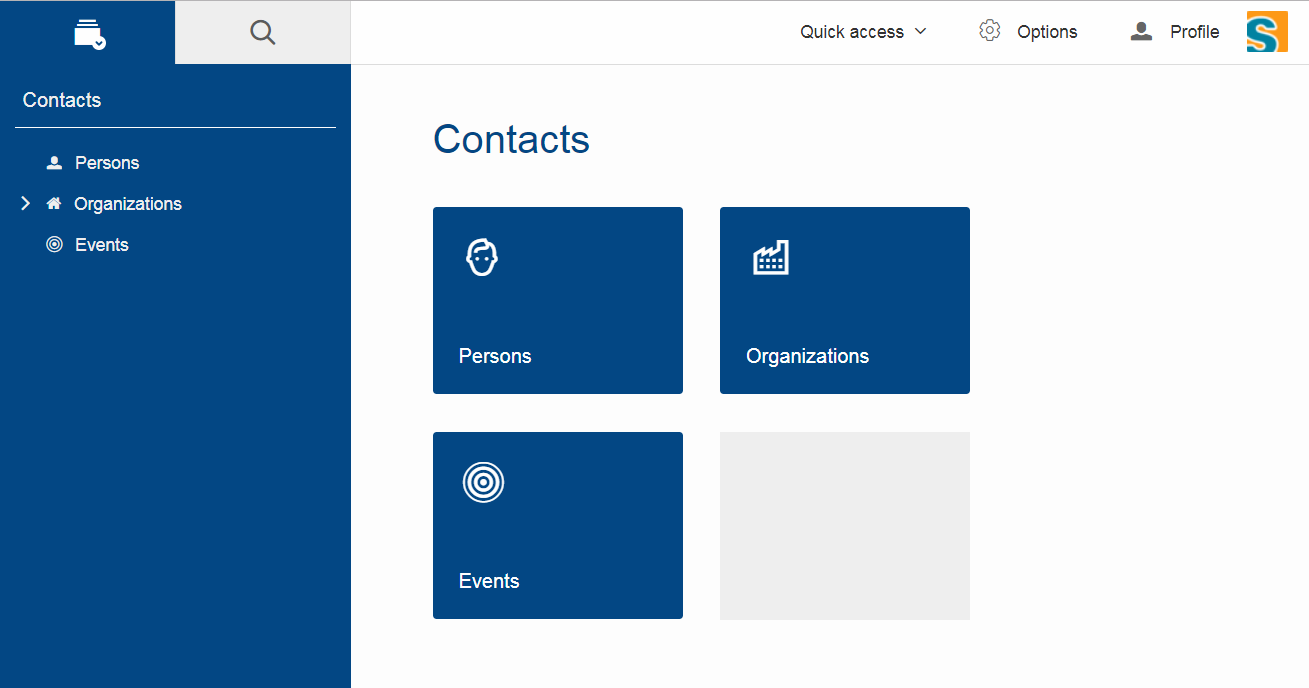
The OutlineOverview typically is the first thing a user sees when an outline based application starts. It is the widget displayed in the desktop bench when no page of the outline is selected. The previous OutlineOverview has been very simple, it basically just displayed the title and the icon of the outline. With this release a new widget has been added, it is called TileOutlineOverview.
As the name implies it is based on the new TileGrid and shows the top level pages of the current outline. The tiles itself are very simple: they show the name of the page and an icon. Because they look a lot more interesting with an icon we encourage you to set a distinct icon for each page. You can do this by using the property overviewIconId of a page. Note that this is not the same property as iconId, to be able to use different icons for the outline tree itself and the outline overview tiles.
The new outline overview is enabled by default. If you don’t like the new style you can either use a defaultDetailForm which will be used instead of the outlineOverview if it is set. Or you can use the old OutlineOverview or even create a custom one. Compared to defaultDetailForm, the outlineOverview can only be set using JavaScript.
Form Fields
New Field Style
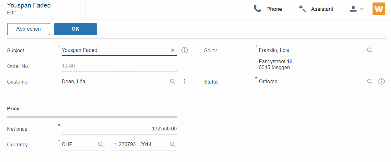
This release introduces a new field style called alternative. This is the new default style for every form field. The classic style is still available because it may be preferable in some circumstances, e.g. when used in a cell editor or on a form with background color like the search form. For these two cases the style is set to classic automatically but you can do it for your custom cases as well by setting the new property FieldStyle.
If you want to revert your whole application to the classic style you can create an extension to AbstractFormField and change the default of the FieldStyle property. For Scout JS applications you can set the variable scout.FormField.DEFAULT_FIELD_STYLE to scout.FormField.FieldStyle.CLASSIC;
New Top Label Style
Along with the new alternative field style comes a new style for top labels. Since the fields don’t have a top border anymore, it is not obvious that the label belongs to the field. With the new label style it is more clear and even looks better. Another advantage is that the height of the form field (incl. label) will be smaller, which is especially helpful on smaller screens.
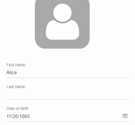
Improved Accessibility
The label and the input are now linked by using aria-labelledby. This allows screen readers to read the label if an input is focused.
Furthermore, clicking the label will now activate the field. This is especially helpful on mobile devices when the new alternative style is active, because the field boundaries are not obvious anymore.
Dynamic Fields
It is now possible to add and remove fields dynamically also when a form is already started. This feature is supported for GroupBoxes and TabBoxes.
The Java API orders the added fields considering the order member.
API:
-
TabBox.js
insertTabItem,deleteTabItem,setTabItems -
GroupBox.js
setFields,insertField,insertFieldBefore,deleteField -
ICompositeField.java
setFieldsand the already existingaddField,removeFieldmethods which don’t throw an exception anymore when a form is already initialized.
|
Menu and MenuBar Enhancements
Form Field in Menu
The menubar now supports form field menu items (FormFieldMenu). On the model side extend AbstractFormFieldMenu with a form field as an inner class to use a form field menu in any menu supporting environment.
New Property 'stackable'
The menu property stackable defines if a menu is stackable or not. A stackable menu will be moved to the ellipsis dropdown menu when there is not enough space in the menubar. The ellipsis menu is placed after the last stackable menu in the menubar. Right and left aligned menus will be moved to a single ellipsis menu per menubar. The horizontal alignment of the ellipsis menu is the same as the last stackable menu in the menubar.
GroupBox Enhancements
Layout Configuration
It is now possible to adjust the parameters of how the group box will be layouted. The following parameters may be set:
- hgap
-
the horizontal gap in pixels to use between two logical grid columns
- vgap
-
the vertical gap in pixels to use between two logical grid rows
- columnWidth
-
the width in pixels to use for a grid column
- rowHeight
-
the height in pixels to use for a grid row
- minWidth
-
the minimum width of the group box. If this width is > 0 a horizontal scrollbar is shown when the group box gets smaller than this value.
These values may be set using getConfiguredBodyLayoutConfig().
Sublabel
GroupBoxes got a new property called sublabel. The sublabel is displayed below the title in a very small font.
Notification
Add a INotification to a group box with the new property called notification.
Use IGroupBox.setNotification(INotification), getNotification(), removeNotification() to control it.
A notification has a IStatus which includes a severity and a message.
By default the notification is displayed at the beginning of the group box body.
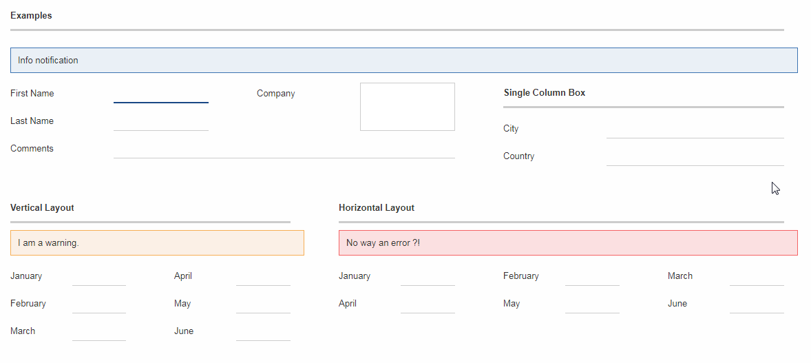
A demo can be found here: https://scout.bsi-software.com/widgets/?dl=widget-groupbox
And here for the JS only version: https://scout.bsi-software.com/jswidgets/#groupbox
TabBox Enhancements
Left Aligned Menu Items
The menubar of a tabbox now considers the menu alignments left and right. That means you can add menus directly on the right side of the last tab item (left aligned) or at the right side of the tab box header (right aligned).
Collapsible Menu Items
Menus in the menubar will be moved to an ellipsis menu in case there is not enough space in the tabbox header. The tab items are moved to an ellipsis menu when there is not enough space for all tabs. The collapse order is as following: all menus are collapsed first before the tabs will be collapsed from right to left.
A menu can be prevented from collapsing by setting the stackable (AbstractMenu.getConfiguredStackable) property to false.

Sublabel
TabItems got a sublabel property which is displayed in a very small font below the title (see also Sublabel).


Hierarchical Table Support
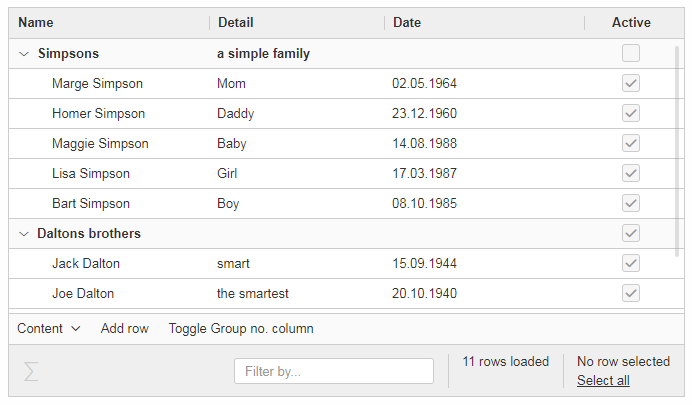
Scout now supports hierarchical tables. The property parentKey on IColumn is responsible for the linking between parent and child rows.
The property hierarchicalStyle on the table is used to switch between the default or structured style.
ImageField: Support for SVG Images and Image URLs
It’s now possible to use SVG images in the same way as bitmap images. Simply put the .svg file in the /icons folder of the client module and reference the SVG image in any widget that supports the iconId property. Example:
@Override
protected String getConfiguredIconId() {
  return "person.svg";
}
Additionally you can now reference an image by URL, for instance an image hosted on an external server. Use the property ´imageUrl` of the AbstractImageField to reference the image. Note: the AbstractImageField defines a priority for which one of the three image properties is used to render the image in the browser:
-
image (Binary resource)
-
imageUrl
-
imageId
CheckBoxField: Add Support for Key Strokes
The check box field (IBooleanField) got a new property called keyStroke. The property expects a string defining the key stroke, e.g. ctrl-b. When the key stroke is executed the check box value will be toggled. Other widgets like Button, RadioButton or Menu already support that feature in the same way.
RadioButtonGroup Enhancements
Layout Customizations
A new property gridColumnCount has been added to the radio button group. It can be used using setGridColumnCount(), getGridColumnCount() and getConfiguredGridColumnCount(). By default the columns are configured to be dependent on the height of the field to create columns as needed to show all radio buttons within the height available (this also corresponds to the existing behavior).
But it also allows to specify an exact number over how many columns radio buttons should be distributed. This is an alternative to layout the buttons using the group height and is especially useful if the number of radio buttons is unknown or dynamic. In that case the columns can be configured to e.g. 3 and the property useUiHeight to true allowing the group to vertically grow as needed to show all radio buttons within 3 columns. This property also corresponds to the layout possibilities of the group box.
The same possibilities also exist in the JavaScript only layer of Scout using the method setGridColumnCount().
Grid Calculation (JS)
The logical grid is now calculated automatically as it is done for a GroupBox or for a RadioButtonGroup in Java. This means you can only specify the width (w) and height (h) of a cell using gridDataHints, the position (x, y) will be calculated automatically.
Value Support (JS)
The RadioButtonGroup now supports the value operations provided by ValueField, similar to the Java implementation. This means you can define a radioValue on each RadioButton and then use setValue() to select a button using its radioValue. When reading the value of a RadioButtonGroup, the radioValue of the selected button is returned.
SequenceBox: Grid Calculation (JS)
The logical grid is now calculated automatically as it is done for a GroupBox or for a SequenceBox in Java. This means you can only specify the width (w) and height (h) of a cell using gridDataHints, the position (x, y) will be calculated automatically.
ListBox Enhancements
Default table creation (JS)
The Scout ListBox is based on the Scout Table. Such a list box table typically is checkable, only has one column and doesn’t have a header. Since this is true for most list boxes it is not necessary anymore to specify the table explicitly. A default table will be created if none is provided.
FileChooser(Field) Enhancements (JS)
FileChooser can now be used without a running Java UI server.
FileChooserField now supports the value operation provided by 'ValueField'. The value of this widgets is the File object. Display text is the filename. Accepted types and maximum upload size are supported properties.
Smartfield Enhancements
New Property 'searchRequired'
A new property searchRequired has been introduced for Smartfields.
It is similar to the one already existing in org.eclipse.scout.rt.client.ui.desktop.outline.pages.AbstractPageWithTable and controls the Smartfield behavior if the proposal-list is opened without having a search constraint.
By default (searchRequired = false) all existing proposals are shown if no search constraint has been typed. But if the property is set to true, the Smartfield only shows proposals if a search constraint is available.
This is especially useful if a large data set is expected in a Smartfield lookup which usually makes no sense to present all to the user.
In that case a message is shown instead informing that a search constraint is required to load data and to see proposals.
In Java the property can be set using ISmartField.setSearchRequired() or AbstractSmartField.getConfiguredSearchRequired().
In JavaScript the property can be set using smartfield.setSearchRequired().
New Event 'prepareLookupCall' on Smartfields (JS)
In Scout JS a new event prepareLookupCall has been added to the SmartField. It allows to be notified when the field is about to execute a LookupCall.
Because for each call a fresh LookupCall clone is executed this event allows to propagate properties to the executing LookupCall clone. These properties may then be used when the call is executed (e.g. sent to the backend).
NumberField: support for minimum and maximum values (JS)
The Scout JS NumberField now also supports min- and max-values as it was already present in Scout Classic.
Improved useUiHeight Calculation
If a form field is set to use its ui height, it is supposed to be as big as its content. A typical example is the group box: useUiHeight is true by default to make the group box as height as the containing form fields. In that case it works fine because the height does not depend on the width.
There are cases where the height depends on the width, e.g. if a label field is set to wrap its text (property wrapText = true). These cases did not work correctly because in order to calculate the preferred height the final width has to be known. This has been fixed so that setting useUiHeight to true should now work as expected.
Enhanced IUiServletRequestHandler
UI Servlet request handler now supports all HTTP methods and not only GET and POST.
When using AbstractUiServletRequestHandler no migration should be required, see migration guide for further information.
Automatic Preloading of Web Fonts
To prevent incorrect measurements or the so-called "FOUT effect" (Flash Of Unstyled Text), Scout tries to preload all necessary web font files (*.woff) before rendering the application. To make it easier for projects to add theme-dependent fonts, the font preloader has been improved. The list of fonts to preload is now detected automatically by inspecting the document’s style sheet (@font-face rules). It’s no longer necessary to manually list all fonts in the bootstrap argument of scout.App (see migration guide).
Refactored EventListenerList
The class EventListenerList had poor performance with large numbers of listeners and add / remove operations. There are two new alternatives to this class that are also thread-safe and support higher performance:
-
FastListenerList<LISTENER>is used to manage a single type of listeners. -
AbstractGroupedListenerListis used as base class to handle a single type of listener with multiple type partitions. See the new classes TreeListeners and TableListeners for an example of applicability.
|
Consider refactoring the use of EventListenerList by one of the new alternatives. |
Text and Multi-Language Support Moved to 'platform'
Scout’s multi-language text support mainly consists of ITextProviderService (with the default abstract implementation AbstractDynamicNlsTextProviderService) and the convenience accessor TEXTS.
This facility was moved from the module org.eclipse.scout.rt.shared to org.eclipse.scout.rt.platform. This allows the use of multi-language text support without the need to include *.shared dependencies in your project. This is especially useful for server-only applications (e.g. micro services).
Data Object Support for REST & MOM APIs
The Scout platform was extended by a generic data object support. Data objects are Scout beans, which can be used as data transfer objects for synchroneous REST and asynchroneous MOM interfaces. Furthermore they may be used as domain objects within business logic.
Using the new DoEntity class as base class, any kind of custom data objects can be built.
An attributes of a data object is defined by adding an accessor method for the attribute.
The name of the method corresponds to the attribute name; the attribute type is defined by the return value of the method.
@TypeName("ExampleEntity")
public class ExampleEntityDo extends DoEntity {

  public DoValue<String> name() { (1)
    return doValue("name");
  }

  public DoList<Integer> values() { (2)
    return doList("values");
  }
}| 1 | String property |
| 2 | List of integer property |
The Scout platform defines the IDataObjectMapper interface which offers method to serialize and deserialize data objects from and to a string representation.
The default implementation of IDataObjectMapper is based on the popular Jackson library serializing data objects to a JSON document.
The implementation can be exchanged by a custom implementation based on another library.
For further examples and documentation see Technical Guide: Data Objects
REST Resources & REST Clients
The new Scout module org.eclipse.scout.rt.rest adds basic support for REST resources and REST resource clients within the Scout framework.
Available REST resources are automatically found by Jandex class inventory and registered at runtime.
For examples and documentation see Technical Guide: REST
Rest Application Contributions (since 8.0.0.035)
The JAX-RS application API (javax.ws.rs.core.Application) allows a REST application implementation to specify a set of classes, a set of singleton instances and a map of custom properties to be registered.
The Scout REST application class org.eclipse.scout.rt.rest.RestApplication was modified in order to support contributions of those objects without need to extend the class.
Three different contributor interfaces are available:
-
IRestApplicationClassesContributorto contribute any classes -
IRestApplicationSingletonsContributorto contribute any object instances (singletons) -
IRestApplicationPropertiesContributorto contribute key/value properties
public static class ExampleClassContributor implements IRestApplicationClassesContributor {
  @Override
  public Set<Class<?>> contribute() {
    return Collections.singleton(MyCustomExample.class);
  }
}
Data Objects: Equals and HashCode (since 8.0.0.036)
The Data Object base class DoEntity was extended with a generic equals() and hashCode() implementation considering all attributes of a data object for equality.
A data object is equals to another data object, if the Java class of both data objects is identical and the attribute maps (including their nested values) of both data objects are equals.
For further details see:
-
org.eclipse.scout.rt.platform.dataobject.DoEntity.equals(Object) -
org.eclipse.scout.rt.platform.dataobject.DoNode.equals(Object)
New modules org.eclipse.scout.rt.dataobject and org.eclipse.scout.rt.dataobject.test (since 8.0.0.36)
Two new modules providing basic support for ID and enum handling within data objects were added.
Interface IEnum
Implementations of org.eclipse.scout.rt.dataobject.enumeration.IEnum add a stringValue() method to each enumeration value, guaranteeing a constant, fixed string value for each enumeration value.
The default resolver mechanism matches the given string with the available string values in the current enumeration implementation to look up the matching enumeration value.
An optional static resolve() method handles the resolve of a given string value into the correct enumeration value allowing to support even string values, whose enumeration values where changed or deleted.
public enum ExampleEnum implements IEnum {

  CURRENT("current"),
  OTHER("other");

  private final String m_stringValue;

  private ExampleEnum(String stringValue) {
    m_stringValue = stringValue;
  }

  @Override
  public String stringValue() {
    return m_stringValue;
  }

  public static final ExampleEnum resolve(String value) {
    // custom null handling
    if (value == null) {
      return null;
    }
    switch (value) {
      // custom handling of old values (assuming 'old' was used in earlier revisions)
      case "old":
      case "current":
        return CURRENT;
      case "other":
        return OTHER;
      default:
        // custom handling of unknown values
        throw new AssertionException("unsupported status value '{}'", value);
    }
  }
}
Interface IID
Implementations of org.eclipse.scout.rt.dataobject.id.IId<WRAPPED_TYPE> interface wrap an arbitrary value adding a concrete Java type to a scalar value.
E.g. the key of an example entity which technically is a UUID becomes an instance of the ExampleId class.
An exampleId instance may then be used as type-safe parameter for further referencing a given example entity record.
@IdTypeName("PersonId")
public final class PersonId extends AbstractUuId {
  private static final long serialVersionUID = 1L;

  public static PersonId create() {
    return new PersonId(UUID.randomUUID());
  }

  public static PersonId of(UUID id) {
    if (id == null) {
      return null;
    }
    return new PersonId(id);
  }

  public static PersonId of(String id) {
    if (id == null) {
      return null;
    }
    return new PersonId(UUID.fromString(id));
  }

  private PersonId(UUID id) {
    super(id);
  }
}DataObjectTestHelper deprecated, moved to ScoutAssert (since 8.0.0.036)
The org.eclipse.scout.rt.testing.platform.dataobject.DataObjectTestHelper was deprecated and a consolidated set of methods were moved to org.eclipse.scout.rt.testing.platform.util.ScoutAssert.
Use the following methods to compare data objects:
-
org.eclipse.scout.rt.testing.platform.util.ScoutAssert.assertEqualsWithComparisonFailure(Object, Object) -
org.eclipse.scout.rt.testing.platform.util.ScoutAssert.assertEqualsWithComparisonFailure(Object, Object)
| Do you want to improve this document? Have a look at the sources on GitHub. |

