Chapter 7
Simple Widgets
This chapter presents the most commonly used Scout widgets based on the widget demo application
introduced above. For each widget the most frequently observed use cases are presented and illustrated
with the widget specific example forms. And exemplary code snippets taken from the widget application
help to close the loop to the actual implementation of these widgets in the applications source
code.
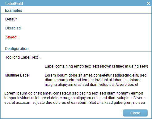
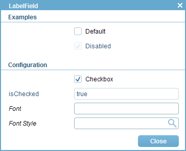
7.1 Label Fields
Label fields are used to place a read only text anywhere in a Scout form. As shown in the configuration
section of Figure 7.1 such texts can occupy the typical area assigned to a label field on the left, the area
typically assigned to data entry on the right or on both sides. The form shown in Figure 7.1 is
implemented in class LabelFieldForm of the Scout widget application.
To set the label text in the default area method getConfiguredLabel is used. If the label text is too
long for the reserved area the label gets truncated with trailing …. The complete label text is then shown
in a tooltip.
As for any form field derived from AbstractFormField, a number of getConfigured* styling
properties exist for label fields. Most of these styling properties can directly be set in the Scout Object
Properties view. A subset of these properties are shown in the list below.
- Label Position
- Label Horizontal Alignment
- Label Foreground Color
- Label Background Color
- Label Font
To display text in the right hand area an empty string can be used as label text and the text for the
value area of the label field can be set with method setValue in method execInitField according to
Listing 7.1.
To display multiline text across both the label and the value area a combination of label field
properties has to be used. See Listing 7.2 for the configuration used in the last label field shown in
Figure 7.1.
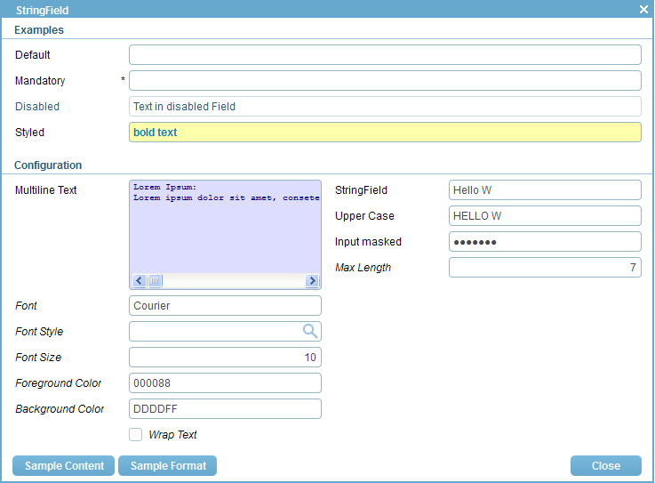
7.2 String Fields
String fields are used to enter simple text strings. In addition, string fields are also useful to enter
multiline text or capture masked input. The form shown in Figure 7.2 is implemented in class
StringFieldForm of the Scout widget application.
Some of the most typical use cases for string fields are represented in the examples section of
Figure 7.2. In the configuration section of the form a multiline text field is shown. As in the case of the
label text, font and color styling possibilities are available for the text shown in a string field. Clicking on
the Sample Format button and on the Sample Content button prefills some of the fields to create
the effect shown in Figure 7.2.
In the case of multi line string fields, the field can be configured to either display text lines as they
have been entered or wrapped to fit into the available width of the field. This property can be set with
the string field’s method getConfiguredWrapText or dynamically with method setWrapText. Please note
that changing this property dynamically at runtime currently only works with the SWT and the Swing
rendering components.
Additional use cases for the string field are shown in the right column of the configuration section of
the string field demo form. Specific string fields are located for the default case, a string field only
accepting upper case letters, and a masked field. To code to represent the masked string field is provided
in Listing 7.3. Independent of what the user is typing the masked field keeps the entered content visually
hidden. In contrast to all other forms of string fields, the content cannot be copied to the system
clipboard. It can only be accessed programmatically with the getValue method of the string
field.
String fields also allow for the configuration of the maximum length of the text that can be entered
into the field. In its default configuration, a maximum number of 4’000 characters can be entered into a
string field. Using method setMaxLength this limit can be updated dynamically at runtime.
Alternatively, this limit can also be set in method getConfiguredMaxLength.
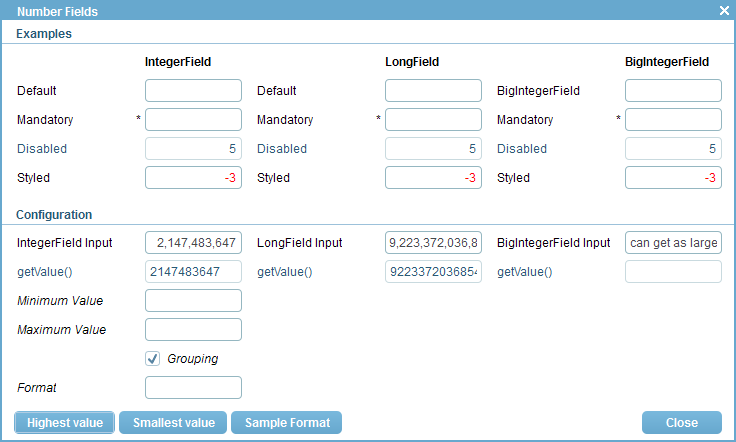
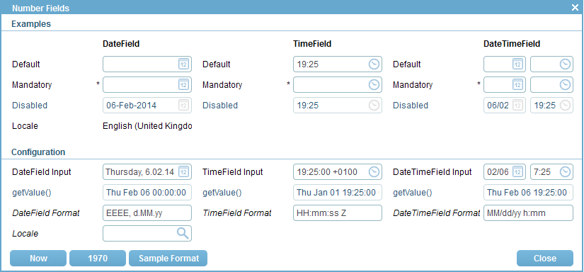
7.3 Number Fields
For entering numbers, Scout provides three different fields. Depending on the valid range of numbers that
may be entered, an integer field, a long field or a big integer field best matches the given use case.
These fields are represented by the classes AbstractIntegerField, AbstractLongField and
AbstractBigIntegerField, each one of them extinding class AbstractNumberField.
The form NumberFieldsForm of the Scout widget application shown in Figure 7.3 contains
examples for all three number field types. Separate buttons are available to demonstrate
the use of the minimum and the maximum value a number field can hold. In the case of
the BigInteger field, arbitrarily large or small values may be entered. See Listing 7.4 for
the code corresponding to the input integer field in the configuration section of the example
form.
As already indicated by the class names of the three number fields, the fields serve to enter values
that fit into the ranges defined by the Java classes Integer, Long and BigInteger. To further
restrict the bounds of valid numbers you may use the methods getConfiguredMinValue and
getConfiguredMaxValue. The effect of setting such bounds can be tested by entering values into the
Minimum Value field and the Maximum Value field of the example form. If, for example, a
minimum value of 0 is entered in the Minimum Value field and the user tries to enter the
value -1 into one of the input fields, an error marker becomes visible on the input field. A
tooltip with the text ”The value is too small; must be between 0 …” further explains the
issue to the user. In such a case the value entered into the user interface is not propagated to
the number field’s value. This is why the read only getValue() field is not updated in such a
case.
To textually format the entered numbers the grouping number field property can be used. In the
example form the Grouping checkbox can be used to control this property. Ticking/unticking this
checkbox will affect the three number input fields in the configuration section of the example
form.
More extensive options to specify the formatting of the numbers is provided by the method
setFormat of class AbstractNumberField. Method setFormat is accepting an argument of the
Java class DecimalFormat. To demonstrate an example for such a format click on Sample
Format button in the example form. For more information please consult the Javadoc for class
DecimalFormat.
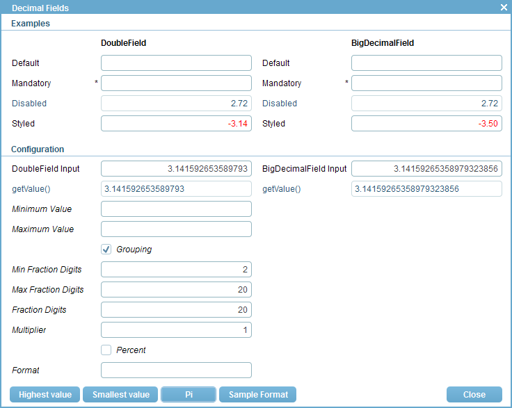
7.4 Decimal Fields
Scout provides two different form fields for entering decimal values. Depending on the required precision
and range of values to be entered a double field or a big decimal field can be used. The two field types
are represented by Scout’s classes AbstractDoubleField and AbstractBigDecimalField
and can hold values of the Java types Double and BigDecimal respectively. Both the double
and the big decimal field extend class AbstractDecimalField which in turn extends class
AbstractNumberField.
The example form shown in Figure 7.4 demonstrates the usage and some of the available options to
configure Scout’s decimal fields. This example form is defined in class DecimalFieldsForm of the Scout
widget application.
The styled double field in the example section of the form displays negative values in
red and postive values in the default black color. This behaviour is implemented in method
execChangedValue according to Listing 7.5. The sample value shown initially is provided in the
execInitField method. Setting the red foreground color explicitely is needed in method
execInitField as the execChangedValue is only triggered after the initial form is displayed on the
screen.
For displaying and storing the fraction digits of decimal values three different properties exist. Two
of them, the getConfiguredMinFractionDigits and the getConfiguredMinFractionDigits affect the
optical representation of the decimal value. To configure the amount of fraction digits that is effectively
represented the property getConfiguredFractionDigits is used. The need for three different properties
might not be immediately clear. To illustrate the concept, let us look at an example use case
where a decimal field always has to display exactely 3 fraction digits. Should the user provide
more fraction digits we would like to capture this additional information up to 5 fraction
digits.
To configure this behaviour the following settings for this decimal field may be used.
- Min Fraction Digits: 3
- Max Fraction Digits: 3
- Fraction Digits: 5
If the user enters the text ”3.141592653589793” into this field and tabs to the next field, the field will
then display the text ”4.142” but actually hold the value 3.14159. And if the user just enters a ”3”, the
field will display ”3.000” and hold the value 3.0.
Decimal fields can also be configured to enter percentages in a convenient way. For this use
case the Multiplier property can be set to 100 and the Multiplier property to true. If the
user now enters ”5” into such a decimal field, it will show the text ”5%” and hold the value
0.05.
As in the case of number fields more extensive options to specify the formatting of the numbers is
provided by setFormat method of the decimal field. Method setFormat is accepting an argument of the
Java class DecimalFormat. To demonstrate an example for such a format click on Sample
Format button in the example form. For more information please consult the Javadoc for class
DecimalFormat.
7.5 Date and Time Fields
To work with date and time values Scout offers three dinstinct form fields. The AbstractDateField
allows the user to enter a date and the AbstractTimeField is used to enter a time. The third field
AbstractDateTimeField combines date and time entry into a single form field. Both classes
AbstractTimeField and AbstractDateTimeField are extending the AbstractDateField
field.
The form DateTimeFieldsForm of the Scout widget application shown in Figure 7.5 contains
examples for the date and time fields of Scout. Separate buttons are available to provide samle values and
to demonstrate the formatting options for displaying date and time values. Displaying dates and times is
highly depending on the used locale. That is why the currently used locale is shown in the example
section of the form.
To enter date and time values the user can either click on the date and time icons/buttons provided
by the fields or directly enter text into the fields. For entering dates the key arrows provide a number of
shortcuts. Entering the currnt date can be done by pressing the <Up>. Once a day is entered in a date or
a combined day time field, the <Up> and the <Down> can be used to step to the next/previous day.
Simultaneously pressing the <Shift> or the <Ctrl> allows to step to the next/previous month or
year.
The code of the DateTimeDisabledField field shown in Listing 7.6 represents the disabled combined
date time in the example form. Before the form is opened Scout executes its execInitField method and
sets the fields value to the current date and time.
In the configuration section the local can be used at runtime to test the effect of the locale to
displaying date and time fields. As changing the locale at runtime only works reliably in rich clients the
field is only editable in the Swing or the SWT client. To specify the exact formatting of the displayed
date and time values a specific format can be set in the getConfiguredFormat method of the date and
time fields. Internally, Scout is using the provided string to create a Java SimpleDateFormat
for formatting. Valid examples for the formatting are entered into the format fields of the
example dialog by pressing the Sample Formats button. The string ”EEEE” shown in
date field format field represents the day of the week as shown in configuration section of
Figure 7.5. As expected, the textual representation of the day of the week is depending on the used
locale.
7.6 Checkbox Fields
Check boxes can be used to enter/represent simple boolean values. In Scout, check boxes are derived from
class AbstractCheckBox.
In the Scout widget application the use of check boxes is demonstrated in the form CheckboxFieldForm
that is shown in Figure 7.6. To access the current value, Scout provides the method isChecked for check
box fields. This naming reflects the boolean state of a check boxes and differs from the other Scout value
fields that provide a getValue method.
A coding example is provided in Listing 7.7 for the disabled check box. The initial value is set in
method execInitField using the method setChecked.
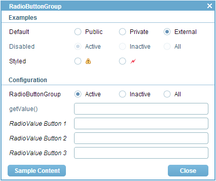
7.7 Radio Button Fields
With radio buttons the user can select a single element out of a number of distinct choices. For this, a
number of radio buttons may be placed into a radio button group field where a radio button group
extends class AbstractRadioButtonGroup. The contained individual buttons are extending class
AbstractRadioButton.
Figure 7.7 demonstrates the use of radio button groups in Scout. It is implemented in class
RadioButtonGroupFieldForm of the Scout widget application. As shown in the example section of the
form, radio buttons may have labes and/or icons assigned.
The simplest way to define the content of a radio button group is by using its configuration
properties getConfiguredCodeType or getConfiguredLookupCall. Listing 7.8 provides the
implementation of ”Default radio button group DefaultGroup. This radio button group is typed by the
generic parameter Long and the individual radio buttons are obtained from the code type
EventTypeCodeType specified in method getConfiguredCodeType. Please note that the Long type
matches the key type of the codes in the EventTypeCodeType. The generic parameter used in the
definition of a radio button group also determines the type that will be returned by the group’s getValue
method.
Alternatively, the individual buttons in a radio button group can also be defined as inner classes.
This approach has been used for the ”Styled radio button group in the example section of
the RadioButtonGroupFieldForm. The corresponding code is provided in Listing 7.9. The
type of the value that is returned by the getValue method is defined on the radio button
group. In the provided listing, the StyledGroupBox is configured to return a value of the
type Long. Consequently, the individual radio buttons are returning radio values of the type
Long as well in the getConfiguredRadioValue methods. The field PlaceholderField in the
radio button group only serves layouting purposes. Without this place holder field, the two
radio buttons of the styled radio button group would be evenly distributed in the available
space.
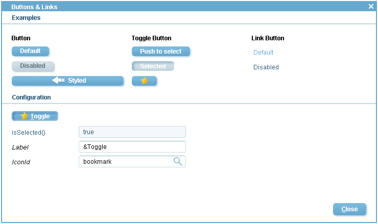
7.8 Buttons and Links
Buttons and links are used to trigger actions in Scout. Buttons come in two variations, normal push
buttons and toggle buttons. While buttons have an associated label and/or icon, links can only have a
label. Buttons extend class AbstractButton and links extend AbstractLinkButton.
Example uses of buttons and links are shown in the form ButtonLinkFieldsForm of the Scout
widget application shown in Figure 7.8.
In it’s simplest form a button just extends class AbstractButton and overrides getConfiguredLabel
to set the label. The example in Listing 7.10 also has an icon assigned and stretches over the whole
column width. In addition, the example button overrides method getConfiguredProcessButton to
return false. This has the effect that buttons (and links) appear at the exact location where they are
defined in a field container. Otherwise, buttons (and links) are placed at the bottom of the container they
are defined in.
The code of the default toggle button in the example form of the widget application is
provided in Listing 7.11. To query the state of a toggle button method isSelected can be
used.
In the configuration section of the example form the use of mnemonics using the character & is
demonstrated. Please note, that this feature is not identically available across the different supported UI
technologies. In the Swing UI shown in Figure 7.8 the label ”&Toggle” has the effect, that pressing the
<alt>+<T> key combination changes the toggle state of this button. In the case of the SWT UI the
<alt> key is not necessary. Pressing the <T> changes the toggle state. In contrast to the Swing UI the
letter ’T’ is not underlined. To optically indicate shortcut letters in the SWT UI it is recommended to
adapt the label from ”&Toggle” to ”[&T]oggle”. The RAP UI does not currently support mnemonics on
buttons.
7.9 Message Boxes
Message boxes are used to provide information to a user or ask the user simple yes/no questions. In
Scout, class MessageBox provides a number of static convenience methods for this purpose.
Additionally, message boxes are shown to the user in the case of a processing exception or a veto
exception .
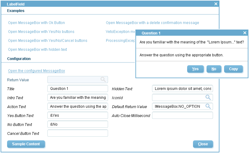
In the examples section of the MessageBoxForm form shown in Figure 7.9 a number of links is
provided. Clicking on any of these links opens a corresponding message box via the static convenience
methods available with class MessageBox. For example, calling MessageBox.showOkMessage(title,
header, info) opens a message box with a title, a header text and some additional information.
In addition to the static convenience methods, message boxes can be configured to meet specific
requirements by a number of parameters. These parameters are shown in Figure 7.9 in the
configuration section of the sample form MessageBoxForm of the Scout widget application.
Clicking on the Sample Content button will fill in example values for the message box
parameters. The configured message box can them be started by clicking on the Open the configured
MessageBox link. This behaviour is implemented in the link’s execClickAction method
according to Listing 7.12. The text below details the purpose of less evident message box
properties.
Message box buttons only appear if an non-emtpy label text is assigned to the Yes Button Text
property, the No Button Text property and Cancel Button Text property. If the hidden text property has
a non-empty text assigned, an additional Copy button will be added to the message box. An example use
case is the case of elaborate error messages (or complete stack traces in cases where this does not
negatively impact the application’s security). Here the copy button allows to transport this text into the
system clipboard. From the clipboard the user may decides to paste this text into an email to the
companys help desk. The default return value property specifies the return value of the message box if the
box closes autmatically after the time provided in the auto close millisecond property has
passed. If the auto close millisecond property is set to -1, the message box will not clause
automatically.
Once a message box is started with method startMessageBox the user interface is blocked until the
user chooses any of the options or clicks the dialog away. The selected option is the provided by the
method’s return value. If the user closes the message box by hitting the <esc> or clicking on the icon to
close a dialog, the start method of the message box will always return the value CANCEL_OPTION of the
IMessageBox interface.