This chapter presents some of the more complex widgets of the Scout framework. This set of widgets includes fields to handle and display list, tree and table data. Also included in this chapter are widgets to display images in both raster and vector formats. As in the previous chapter, for each described widget, screenshots of example use cases and corresponding code snippets are provided.
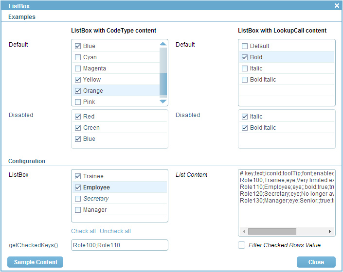
List boxes allow a user to select a subset of a predefined list of elements. The individual elements are displayed in the form of checkable options. To check or uncheck a specific element, the user may click on a element or press the <Space> when an element has the focus. To define the list of elements that are presented in a list box, code types or a lookup calls can be used. Example use cases using both code types and lookup calls for the definition of the presented elements are implemented in class ListBoxForm of the Scout widget application. See Figure 8.1 for a screenshot of the example form.
In the example section of Figure 8.1 the list boxes in the left column retrieve the elements to be displayed from code types. And in the right column, the displayed elements are retrieved from lookup calls. The implementation of the top left Default field is provided in Listing 8.1. List boxes are derived from class AbstractListBox and parameterized by the type of keys of the elements. Please note that the specified key type of a list box must match the key type of the elements provided by code types or lookup calls. In our example, the list box type Color matches the key type of the code type ColorsCodeType configured in method getConfiguredCodeType.
In the List Content field located on the right hand side of the configuration section of Figure 8.1 it is also possible to enter user defined content. After entering some example data and pressing the <Tab>, the user content is parsed and used to update the elements displayed in the ListBox field. To get the initial example data shown in Figure 8.1, use the Sample Content button of the list box example form. Basically, the content of each text row is parsed into a lookup row according to the format provided in the first row of the sample content: # key;text;iconId;.... The resulting lookup rows are then used to dynamically update the content of the lookup call associated with the ListBox field. List boxes can be configured to only display the checked elements. For this, the configuration method getConfiguredFilterCheckedNodes may be used.
To access the currently selected elements of a list box method getCheckedKeys may be used. This is demonstrated in Listing 8.2 using the getCheckedKeys field in the example form. In order to get notified for every change of the list box field, the list box field is registered as the master in method getConfiguredMasterField. The implementation of method execChangedMasterValue is then called whenever the state of the master field is changed. In the case of Listing 8.2, the list of selected keys can be retrieved from the list box and shown in the getCheckedKeys field.
To read or write the content of a list box field from or to a form data on the server side, methods getValue andsetValue have to be used. Both methods work with typed sets, requiring the type defined for the list box field.
Tree box fields allow a user to select a subset of a predefined list of elements. The difference to list boxes lies in the organisation of the presented elements. Instead of presenting the elements as a list, a tree structure is used with tree box fields.
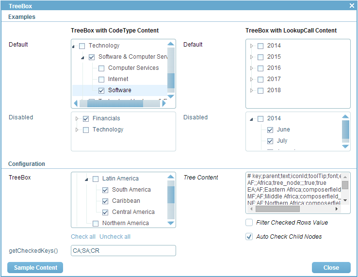
To check and uncheck a specific element, the user may click on a element or press the <Space> when an element has the focus. In addition, tree boxes can also be configured to check or uncheck the complete sub tree when clicking on an element. To define the trees presented in tree boxes, hierarchical code types and lookup calls can be used. Example use cases for tree box fields are implemented in class TreeBoxForm of the Scout widget application. A screenshot of the tree box example form is shown in Figure 8.2.

In the example section of Figure 8.2 the tree boxes in the left column retrieve the elements to be displayed from hierarchical code types. And in the right column, the displayed elements are retrieved from hierarchical lookup calls. The implementation of the top right Default field is provided in Listing 8.3. Tree boxes are derived from class AbstractTreeBox and parameterized by the type of keys of the tree elements. As in the case of list box fields, the the specified type of a tree box must match the key type of the code type or the lookup call. In our example, the tree box type String matches the type of the lookup call YearsMonthsLookupCall configured in method getConfiguredLookupCall.
In the configuration section of the form shown in Figure 8.2 the user may enter any tree data into the Tree Content field. To get the initial tree data shown in Figure 8.2, use the Sample Content button. Tree boxes can be configured in several ways. Using method getConfiguredAutoExpandAll, the element tree will be initially expanded. Configuration method getConfiguredFilterCheckedNodes hides all elements that are not checked. And with method getConfiguredAutoCheckChildNodes, checking or unchecking a tree element automatically updates the elements in the subtree accordingly.
To access the currently selected elements, the tree box method getCheckedKeys returns a typed set of keys. The type of the key set is determined by the type of the tree box. To read or write the content of a tree box field on the server side, methods getValue andsetValue have to be used. Both methods work with typed sets, requiring the type defined for the tree box field.
Smart fields are used to select a single value from a set of named elements. As smart fields offer ”search-as-you-type functionality, the field works well for very large sets of elements. The content of smart fields can either be provided by code types or lookup calls. Consequently, smart fields work with both lists and hierarchical structures and the content may come from a static set of values or is dynamically provided at runtime.
To select an elements in a smart field the user can either use the mouse or the keyboard. Pressing the <Up Arrow> or the <Down Arrow> in the field shows the list of entries when the smart field has the focus. Alternatively, the use can click with the mouse on the smart field icon. By typing a part of the name of the desired entry into the field, the ”search-as-you-type support kicks in and a filtered list of elements is displayed. The selected entry can be confirmed by using the <Enter> or the <Tab>.

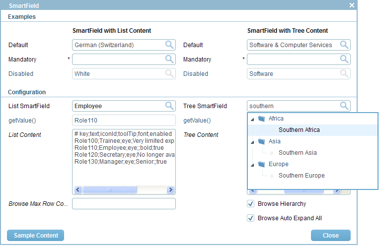
Example use cases for smart fields are provided in class SmartFieldForm of the Scout widget application and a screenshot of this example form is shown in Figure 8.3. The left hand side of the demo form contains smart fields based on list content and on the right hand side smart fields backed with hierarchical content are shown. In the example section of the demo form, some smart fields are backed by code types and others by lookup calls. And in the configuration section the content shown in the smart fields can be entered manually at runtime. To obtain the content shown in Figure 8.3, use the Sample Content button.
Existing Documentation
Each smart field can have menus attached. The menus will be shown when the user clicks on the arrow symbol next to the smart field. Figure 8.4 shows an example of a smart field along with a set of menus.
By default, the menus will only be shown if a value of the smart field has been selected. To show the menus even if the smart field is empty, one has to override the menu’s getConfiguredEmptySpaceAction method:
needs text
needs text
Existing Documentation
needs text
Existing Documentation
needs text
Existing Documentation
needs text
needs text
Existing Documentation
needs text
Existing Documentation