Widget
| This document is referring to a past Scout release. Please click here for the current version. |
A widget is a component which may be rendered. It may be simple like a label, or more complex like a tree or table. A form is a widget and a form field, too. A widget contains the model, which represents the state of the widget. In a Scout Classic application, that model will be sent from the UI server to the browser and the Scout UI will use that model to create the widget. In a Scout JS app, the model may be provided using JSON or directly with JavaScript.
Lifecycle
Every widget has a lifecycle. After a widget is instantiated, it has to be initialized using init. If you want to display it, you have to call the render method. If you want to remove it from the DOM, call the remove method. Removing a widget is not the same as destroying it. You can still use it, you can for example change some properties and then render it again. If it is really not needed anymore, the destroy method is called (typically by Scout itself).
So you see the widget actually has 3 important states:
-
initialized
-
rendered
-
destroyed
The big advantage of this concept is that the model of the widget may be changed any time, even if the widget is not rendered. This means you can prepare a widget like a form, prepare all its child widgets like the form fields, and then render them at once. If you want to hide the form, just remove it. It won’t be displayed anymore, but you can still modify it, like changing the label of a field or adding rows to a table. The next time it is rendered the changes will be reflected. If you do such a modification when it is rendered, it will be reflected immediately.
Destroying a widget means it will detach itself from the parent and destroy all its children. Typically this is done by Scout itself e.g. when closing a form.
If you want to destroy a widget yourself, it is recommended to do that by deleting it in its owner or parent (e.g. a GroupBox has a method deleteField which will destroy the field if the GroupBox is its owner).
If you have attached listeners to other widgets at initialization time, now is the time to detach them. After a widget is destroyed it cannot be used anymore. Every attempt will result in a Widget is destroyed error.
Creating a Widget
A widget may be created using the constructor function or scout.create.
Best practice is to always use scout.create which gives you two benefits:
-
You don’t have to call
initby yourself. -
The widget may be extended (see Object Factory for details).
The following example creates a StringField.
import {scout, StringField} from '@eclipse-scout/core';

let field = scout.create(StringField, {
  parent: groupBox,
  label: 'hello',
  value: 'world'
});
The first parameter is the object type. Typically, it is a class reference pointing to the widget you want to create. When using a class reference, the return value will be typed, so the IDE can assist you with code completion. For this reason, this syntax is recommended.
The object type can also be a string, like the name of the class.
let field = scout.create('StringField', {
  parent: groupBox,
  label: 'hello',
  value: 'world'
});
In that case, the ObjectFactory will look for the class in the namespace object, which is put on the window.
StringField belongs to the scout namespace which is the default and can therefore be omitted.
If the string field belonged to another name space called mynamespace, you would have to write the following:
scout.create('mynamespace.StringField', {})The second parameter of scout.create is the model.
The model is the specification for your widget.
In case of the StringField you can specify properties like the label, the max length, whether it is enabled and visible and more.
If you don’t specify them, the defaults are used. The only needed property is the parent.
To get a list of all available StringField properties, have a look at the interface StringFieldModel.
Such a model definition is available for every widget.
Just add the suffix Model to the widget name and you’ll find it.
Every widget needs a parent.
The parent is responsible to render (and remove) its children.
In the example above, the parent is a group box.
This group box has a property called fields.
If the group box is rendered, it will render its fields too.
You don’t need a group box to render the string field, you could render it directly onto the desktop.
But if you want to use a form, you need a group box and create the form, group box and the field.
Doing this programmatically, meaning creating each widget separately using scout.create, is time consuming, that is why we suggest to use the declarative approach.
Creating a Widget Declaratively
Have a look at the above example again. The second parameter, the model, defines some properties of the string field. This actually already is the declarative approach, because you could also set each property manually after creating the string field using the according methods. In order to create a form, we need to specify multiple widgets, respectively a widget hierarchy, at once. The following example defines a form with a group box and a string field.
import {GroupBox, StringField} from '@eclipse-scout/core';

export default {
  title: 'My first form!',
  rootGroupBox: {
    id: 'MainBox',
    objectType: GroupBox,
    fields: [
      {
        id: 'MyStringField',
        objectType: StringField,
        label: 'hello',
        value: 'world'
      }
    ]
  }
}
To keep things nice and clean we separate the model from the code by putting this description of the form in a separate file called MyFormModel.js.
Typically, you would create a file called MyForm.js as well, which contains the logic to interact with the fields.
But since we just want to open the form it is not necessary.
Instead, you can use the following code to create the form:
import {Form, scout} from '@eclipse-scout/core';
import model from './MyFormModel';
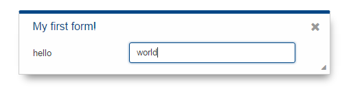
let form = scout.create(Form, $.extend({parent: desktop}, model));Now you can open the form using form.open() and it will look like this:
As soon as you would like to add some code that interacts with the fields or maybe just want to not always load the model manually when creating the form, you should create a file called MyForm.js.
The content of that file would be a class MyForm that extends the Form from Scout and a method called _jsonModel that returns our model.
import {Form} from '@eclipse-scout/core';
import model from './MyFormModel';

export class MyForm extends Form {
  _jsonModel() {
    return model;
  }
}
Creating the form is now possible using the following code.
let form = scout.create(MyForm, {parent: desktop});Using constants in a JSON model
In previous Scout versions, the model was defined in a JSON file. Even though it is still possible, it is not recommended anymore, because writing the model using JavaScript is much more convenient. One advantage is, that you can use constants the same way as in your regular JavaScript code.
import {FormField} from '@eclipse-scout/core';
export default {
  ...
  labelPosition: FormField.LabelPosition.TOP
}
If you use a JSON based model, you cannot reference Scout’s JavaScript enums/constants, and you’d have to write the following to assign the constant value:
{ "labelPosition": 2 }Obviously this makes the JSON code harder to read and understand and the developer has to lookup the enum/constant definition first. This is where the ${const:NAME} tag comes to help. A widget can define a list of properties that can be used with the const-tag. The widget defines in which enum/constant the name provided by the tag is resolved. Using the const-tag, the JSON example now looks like this:
{ "labelPosition": "${const:ON_FIELD}" }When you want to provide const-tag support for a custom widget, you need to call scout.Widget#resolveConsts in the _init function of your widget and for each supported property specify the property name and the object that contains the enum/constant definition.
Finding a Widget
In the example from the previous chapter we have seen how to create a widget, in that specific case we created a form. Typically, it is not sufficient to just create a form, you most likely want to interact with the fields, like reading the values the user entered. In order to do that you need access to the fields. The easiest way is to use the IDs specified in the JSON.
Let’s have a look at our example form again:
export default {
  title: 'My first form!',
  rootGroupBox: {
    id: 'MainBox',
    objectType: GroupBox,
    fields: [
      {
        id: 'MyStringField',
        objectType: StringField,
        label: 'hello',
        value: 'world'
      }
    ]
  }
}
In this example we have 3 widgets: the form, the root group box and a string field. These widgets are linked to each other which enables us to find the string field starting from the form. This can be done by using the following command:
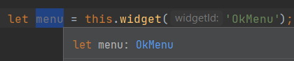
let stringField = form.widget('MyStringField');
Now you can read its value, change properties, add event handlers and so on.
Widget Maps
The result of the widget function to find a widget is a generic Widget, so it is not possible to call a method of a specific widget without casting (at least with TypeScript).
To do the type casting, you can either specify the return type directly at the time of usage.
import {Menu} from '@eclipse-scout/core';

let menu = this.widget('YourId', Menu);import {Menu} from '@eclipse-scout/core';
let menu = this.widget('YourId') as Menu;Or you can use widget maps.
A widget map is a type that maps the ids of the widgets to their object type. This allows TypeScript to determine the return type automatically.
widget functionScout SDK takes care of creating the widget maps, so you don’t have to write them manually. But there is one precondition: your model has to be in a TypeScript file.
Nevertheless, here is how you would do it manually for our example form from above.
-
Create a type called 'MyFormWidgetMap' in the file 'MyFormModel.ts'
-
Link it to the form by re declaring the type of
widgetMap.
export type MyFormWidgetMap = {
  'MainBox': GroupBox;
  'MyStringField': StringField;
}import {Form} from '@eclipse-scout/core';
import {MyFormWidgetMap} from './MyFormModel';
export class MyForm extends Form {
declare widgetMap: MyFormWidgetMap;
}If you’re using JavaScript for your form, you can use JSDoc to link the widgetMap:
import {Form} from '@eclipse-scout/core';
import {MyFormWidgetMap} from './MyFormModel';

export class MyForm extends Form {

  constructor() {
    super();

    /** @type MyFormWidgetMap */
    this.widgetMap = null;
  }
}
Properties
As seen before, every widget has a model representing its state. This model is written onto the widget at the time it is being instantiated. The properties of that model are now available as properties of the widget. So in order to access such a property, just call widget.yourProperty. If you want to modify the property, just call widget.setYourProperty(value).
import {scout, StringField} from '@eclipse-scout/core';

var field = scout.create(StringField, {
  parent: parent,
  labelVisible: false
});
console.log(field.labelVisible); // prints false

field.setLabelVisible(true);
console.log(field.labelVisible); // prints true
It is important to always use the setter to modify a property, because calling it does not just change the value. Instead it will call the method setProperty(propertyName, value) which does the following:
-
It will check if the property has changed at all. If the value is still the same, nothing happens. To compare the values
objects.equalsis used, which uses===to compare and if that returns false, uses the equals methods of the given objects, if available. -
If the values are not equal, the model is updated using the method
_setProperty(notice the_). Beside setting the value it also notifies every listener about the property change. So if another widget is interested in that property it may attach a listener and will be informed on every property change (see also the Events for details). -
In order to reflect the property change in the UI, the
_rendermethod is called, if available. The name of this method depends on the property name, it always starts with_renderand ends with the property name. Example:_renderLabelVisible. If the widget does not implement such a method, nothing happens.
It is worth to mention that the behavior of step 2 may be influenced by the widget. If the widget provides a method called _setPropertyName (e.g. _setLabelVisible, notice the _), that method will be called instead of _setProperty. This may be useful if something other should be done beside setting the property. If that is the case, that new function is responsible to call _setProperty by itself in order to set the property and inform the listeners. That method may also be called by the _init method to make sure the additional code is also executed during initialization (calling the public setter in _init would not have any effect due to the equals check at the beginning).
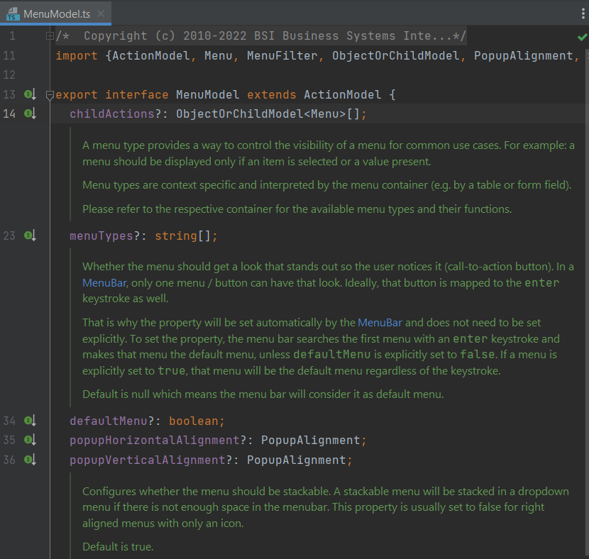
Widget Properties
A widget property is a special kind of a property which references another widget.
Defining a property as widget property has the benefit that the widget is created automatically. Lets take the group box as an example. A group box has a widget property called fields. The fields are widgets, namely form fields. If you create a group box, you may specify its fields directly:
import {scout, StringField, GroupBox} from '@eclipse-scout/core';

var groupBox = scout.create(GroupBox, {
  parent: parent,
  label: 'My Group Box',
  fields: [{
    objectType: StringField,
    label: 'My String Field'
  }]
});
// check if the string field was created as well
console.log(groupBox.fields[0] instanceof StringField);
In the above example the group box is created using scout.create. After creating the group box you can access the property fields and you will notice that the string field was created as well, even though scout.create has not been called explicitly for the string field. This is because the property fields is defined as widget property. During the initialization of the group box it sets the property fields and because the value is not a widget yet (resp. the elements in the array), scout.create will be called.
This will also happen if you use a setter of a widget property. You can either call the setter with a previously created widget, or just pass the model and the widget will be created automatically.
In addition to creating widgets, calling such a setter will also make sure that obsolete widgets are destroyed. This means if the widget was created using the setter, it will be destroyed when the setter is called with another widget which replaces the previous one. If the widget was created before calling the setter, meaning the owner is another widget, it won’t be destroyed.
So if a property is defined as widget property, calling a setter will do the following:
-
It checks if the property has changed at all (same as for regular properties).
-
If the values are not equal,
_prepareWidgetPropertyis called which checks if the new value already is a widget and if not creates it. It also destroys the old widget unless the property should not be preserved (see_preserveOnPropertyChangeProperties). If the value is an array, it does so for each element in the array (only widgets which are not part of the new array will be destroyed). -
If the widget is rendered, the old widget is removed unless the property should not be preserved. If there is a custom remove function (e.g. _removeXY where XY is the property name), it will be called instead of removing the widgets directly. Note that the widget may have already been removed by the destroy function at the prepare phase.
-
The model is updated (same as for regular properties).
-
The render method is called (same as for regular properties).
Events
Every widget supports event handling by using the class EventSupport.
This allows the widgets to attach listeners to other widgets and getting informed when an event happens.
The 3 most important methods are the following:
-
on: adds a listener -
off: removes a listener -
trigger: triggers an event
So if a widget is interested in an event of another widget, it calls the function on with a callback function as parameter.
If it is not interested anymore, it uses the function off with the same callback function as parameter.
The following example shows how to handle a button click event.
import {scout, Button} from '@eclipse-scout/core';

let button = scout.create(Button, {
  parent: parent,
  label: 'click me!'
});
button.render();
button.on('click', event => {
  // print 'Button "click me!" has been clicked'
  console.log('Button "' + event.source.label + '" has been clicked');
});
Every click on the button will execute the callback function.
To stop listening, you could call button.off('click'), but this would remove every listener listening to the 'click' event.
Better is to pass the same reference to the callback used with on as parameter for off.
import {scout, Button} from '@eclipse-scout/core';

let button = scout.create(Button, {
  parent: parent,
  label: 'click me!'
});
button.render();
let callback = event => {
  // print 'Button "click me!" has been clicked'
  console.log('Button "' + event.source.label + '" has been clicked');

  // stop listening, a second click won't print anything
  button.off('click', callback);
};
button.on('click', callback);
If the callback function is bound using bind(), the bound function has to be used when removing the listener using off.
This is because bind() returns a new function wrapping the original callback.
|
In order to trigger an event rather than listening to one, you would use the function trigger.
This is what the button in the above example does.
When it is being clicked, it calls this.trigger('click') (this points to the instance of the button).
With the second parameter you may specify additional data which will be copied onto the event.
By default, the event contains the type (e.g. 'click') and the source which triggered it (e.g. the button).
trigger('click', {
  foo: 'bar'
});

// callback
function(event) {
  console.log(event.foo); // prints bar
}
Property Change Event
A special kind of event is the property change event. Whenever a property changes, such an event is triggered.
The event has the following properties:
-
type: the type of the event which is alwayspropertyChange -
source: the widget which triggered the event -
name: the name of the property -
newValue: the new value of the property -
oldValue: the old value of the property
Listening to such an event works in the same way as for other events, just use the type propertyChange. The listening below shows how to handle the property change event if the selected property of a toggle button changes.
import {scout, Button} from '@eclipse-scout/core';

let button = scout.create(Button, {
  parent: parent,
  label: 'click me!',
  displayStyle: Button.DisplayStyle.TOGGLE
});
button.render();
button.on('propertyChange', event => {
  if (event.propertyName == 'selected') {
    // prints 'Property selected changed from false to true'
    console.log('Property ' + event.propertyName + ' changed from ' + event.oldValue + ' to ' + event.newValue);
  }
});
button.setSelected(true);
The above propertyChange handler ist executed for ALL property changes of that button.
This makes it necessary to check for the right property name inside the listener as it is done here with the if statement at the start of the listener.
Because this is a very common pattern there is a shortcut available.
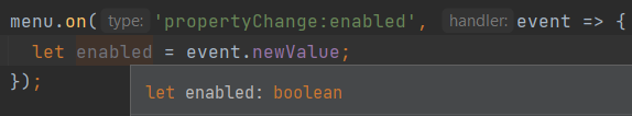
You can listen for a specific property change with the following notation: propertyChange:propertyName.
|
button.on('propertyChange:selected', event => {
  // This listener is only executed when the 'selected' property changes
  console.log('Property ' + event.propertyName + ' changed from ' + event.oldValue + ' to ' + event.newValue);
});
button.setSelected(true);
Event Maps
If you want to know what events are available for a specific widget, you can have a look at its event map.
The event map is a TypeScript interface and named after the widget with the suffix EventMap.
For example, you will find the event map of a Menu under the name MenuEventMap.
Beside having a complete list of the available events, these event maps are also used by TypeScript to provide code completion for the event name when adding an event handler:
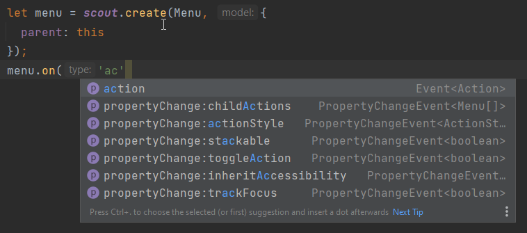
You also get the correct type of the event itself including its members in the handler:
Icons
See chapter Icons for a general introduction to icons in Scout.
Widgets that have a property iconId (for instance Menu) can display an icon. This iconId references
an icon which can be either a bitmap image (GIF, PNG, JPEG, etc.) or a character from an icon-font. An example
for an icon-font is the scoutIcons.ttf which comes shipped with Scout.
Depending on the type (image, font-icon) the iconId property references:
-
Image: iconId is an URL which points to an image resource accessible via HTTP.
Example:
/icons/person.png -
Font-icon: iconId has the format
font:[UTF-character].Example:
font:\uE043, references a character in scoutIcons.ttfExample:
font:fooIcons \uE109, references a character in custom font fooIcons.ttf -
Icon Constants: iconId has the format:
${iconId:[constant]}, where constant is a constant in the moduleicons.js. This format is especially useful when you configure a Scout widget with a JSON model. The value of the constant is again either an image or a font-icon as described above.Example:
${iconId:ANGLE_UP}usesicons.ANGLE_UP, icons predefined by ScoutExample:
${iconId:foo.BAR}usesfoo.icons.BAR, use this for custom icon constant objects
Parent and Owner
As seen in the previous chapters, the creation of a widget requires a parent. This establishes a link between the child and the parent widget which is necessary for several actions.
-
Rendering a widget into the container of the parent
If you callwidget.render()you don’t have to specify the HTML container to which the widget should be appended. It takes the container of the parent widget by default which isparent.$container. You can still pass a custom$parentif you like. -
Removing a widget and its children
Ifwidget.remove()is called, the widget will be removed from the DOM. Even though removing the parent HTML node would be sufficient in order to make the children disappear from the screen, every child widget will be removed as well. This gives the child widgets the possibility to clean up their rendering state and detach listeners. This is necessary because the widgets still exist after removal and their data can still be updated. Such cleanup actions are typically done by overridingwidget._remove(). Remember to call the_removeof the super class as well. -
Finding child widgets
This is something you will have to do very often if you specified your widgets in a JSON file. If you want to access these widgets from JavaScript you need to get them first. This is easy due to the linkage of the widgets. You can just use the functionwidget(id). See also chapter Finding a Widget for more details. -
Establishing a link independent of the DOM structure
Normally a child widget contains HTML elements which are children of the parent’s HTML elements. Even though this is the regular case it is not a must. Amongst others the following widgets have HTML elements appended to the HTML element of the desktop rather than their actual parents: dialogs, popups, tooltips. The main reason is because these widgets lay on top of every other widget. In order to not get into the z-index hell it is a lot easier to put these widgets on the top level of the DOM structure. But since the HTML elements are now separated, the only link is the parent/child hierarchy.
Imagine you have a string field which displays a tooltip. The parent of the tooltip is the string field but the HTML element is appended to the HTML element of the desktop. Removing the string field will now remove the tooltip as well even though their HTML elements are not linked.
Or think about the following case: there is a popup open which contains a smart field. The smart field shows a popup by itself displaying the proposals. The HTML elements of the main popup and the smart field popup are siblings meaning they are on the same level in the DOM. Normally a popup gets closed when an element not belonging to the popup is clicked. But why is the main popup not closed if the user clicks into the smart field popup even though their HTML elements are not linked? Exactly, because the smart field popup is a child of the smart field and therefore a child of the main popup.
So far we have learned what the parent is. But what is the owner? The owner is the only one which is allowed to destroy its children. Normally, the parent and the owner are the same, that is why you don’t have to specify the owner explicitly when creating a widget. The owner will be different if you specify it explicitly or if you use setParent() to temporarily change the parent of a widget. In that case the owner points to the old parent. This means if the new parent were destroyed, the newly linked child would not be destroyed, only removed from the DOM.
This comes in handy if you want to temporarily give the control over rendering/removal to another widget (like a popup) but don’t let the other widget destroy your widget (e.g. when the popup is closed) because you want to use your widget again (e.g. display it on another popup).