Eclipse Scout Release Notes
About This Release
The latest version of this release is: 26.1.18.
You can see the detailed change log on GitHub.
Coming from an older Scout version? Check out the Migration Guide for instructions on how to obtain the new version and upgrade existing applications.
Utility to Modify CSS Classes (Scout JS)
The styles utility was extended with new methods to modify the cssClass-string of objects or check whether a css class is set or not.
These methods are:
-
addCssClass: adds one or more css classes -
removeCssClass: removes one or more css classes -
toggleCssClass: toggles, i.e. adds or removes, one or more css classes depending on a condition -
hasCssClass: checks whether one or more css classes are set -
cssClassAsArray: splits acssClass-string into an array of css classes
In addition, similar methods have been added to the Cell class to easier query and modify the cssClass property: addCssClass, removeCssClass, toggleCssClass, hasCssClass.
Session API changes
As part of the move toward a stateless backend server, the API of the session has been changed. More info can be found in the Migration Guide.
Adding Scout Classic Child Pages to a JsPage
The JsPage enables the use of pages implemented in Scout JS in a Scout Classic outline. It can now use Scout Classic pages as its child pages. The child pages are created by the Java implementation of the JsPage and triggered by its equivalent in Scout JS. For more information see How-To.
User Preferences Moved from Shared to Client
As part of the move toward a stateless server session, IPreferences, IUserPreferencesService, IUserPreferencesStorageService, IPreferenceChangeListener and their corresponding implementations have been moved from shared to client.
Simple Tab Box with Vertical Tabs
The SimpleTabBox has been improved.
The tabs can now be placed on all four sides of the box by adjusting the attribute position on the SimpleTabArea accordingly.
In particular, this allows the tabs to be aligned vertically.
scout.create(SimpleTabBox<SimpleTabView>, {
  parent: this,
  tabArea: {
    objectType: SimpleTabArea,
    position: SimpleTabArea.Position.LEFT
  }
});
Widget: New Properties to Control Focus Behavior (Scout JS)
The following properties have been added to the Widget class and are therefore available for every widget.
-
tabbable: controls whether the widget should be focusable using keyboard.
-
preventClickFocus: set to true if the widget must not be focused when it is clicked.
-
preventInitialFocus: set to true if the widget must not be considered as initial focus candidate, e.g. when opening a form.
Search Outline (Scout JS and Scout Classic)
The SearchOutline now works for both Scout Classic and Scout JS pages.
Executing a search in Scout Classic is still done by overwriting execSearch(String). In addition execResetSearch() may be overwritten to perform an action when the search is reset.
ISearchOutlinepublic class SearchOutline extends AbstractSearchOutline {
private MySearchPageWithTable m_mySearchPageWithTable;
@Override
protected void execCreateChildPages(List<IPage<?>> pageList) {
m_mySearchPageWithTable = new MySearchPageWithTable();
pageList.add(m_mySearchPageWithTable);
}
@Override
public void execSearch(String query) {
execResetSearch();
super.execSearch(query);
m_mySearchPageWithTable.search(query);
}
@Override
protected void execResetSearch() {
super.execResetSearch();
m_mySearchPageWithTable.resetSearch();
}
}In order to update the search status of the outline automatically, the page needs to implement the interface ISearchPage and update its ISearchState whenever the result changes.
ISearchPage.public class MySearchPageWithTable extends MyPageWithTable implements ISearchPage<Table> {
private final LazyValue<ISearchState> m_searchState = new LazyValue<>(this::createSearchState);
@Override
public ISearchState getSearchState() {
return m_searchState.get();
}
public void search(String query) {
// execute search and update rows
// ...
getSearchState().setResultCount(getTable().getRowCount());
getSearchState().setLimited(isLimitedResult());
getSearchState().setPending(false);
}
public void resetSearch() {
getTable().deleteAllRows();
getSearchState().setResultCount(0);
getSearchState().setLimited(false);
getSearchState().setPending(false);
}
}Scout JS pages and hybrid pages simply create a SearchState and listen on the events search and resetSearch of the SearchOutline.
export class MySearchPageWithTable extends MyPageWithTable implements SearchPage {

  searchState: SearchState;

  protected _outlineSearchHandler = this._onOutlineSearch.bind(this);
  protected _outlineResetSearchHandler = this._onOutlineResetSearch.bind(this);

  protected override _init(model: InitModelOf<this>) {
    super._init(model);

    this.searchState = scout.create(SearchState, {parent: this.outline});

    this.outline.on('search', this._outlineSearchHandler);
    this.outline.on('resetSearch', this._outlineResetSearchHandler);
  }

  protected override _destroy() {
    this.outline.off('search', this._outlineSearchHandler);
    this.outline.off('resetSearch', this._outlineResetSearchHandler);

    this.searchState.destroy();
    this.searchState = null;

    super._destroy();
  }

  protected _onOutlineSearch(event: Event<SearchOutline>) {
    // execute search and update rows
    // ...

    this.searchState.setResultCount(this.detailTable.rows.length);
    this.searchState.setPending(false);
  }

  protected _onOutlineResetSearch(event: Event<SearchOutline>) {
    this.detailTable?.deleteAllRows();

    this.searchState.setResultCount(this.detailTable.rows.length);
    this.searchState.setPending(false);
  }

  protected _updateResultCount() {
    const resultCount = this.detailTable.rows.length;
    this.searchState.setResultCount(this.detailTable.rows.length);
  }
}
Hardened Content Security Policy
The Content Security Policy used by Scout applications has been hardened. It now makes use of nonces for JavaScript which may prevent cross-site scripting attacks.
Furthermore, lots of CSP related features are more flexible now and provide new possibilities to harden your CSPs. Please see the Hardening the Content Security Policy migration guide for migration instructions and a list of new features.
Improved Keyboard Navigation and Accessibility
To further improve accessibility, various optimizations have been made to keyboard navigation and screen reader functionality.
Desktop
The following elements on the desktop can now be accessed using the TAB key:
-
Views
-
Tree
-
Desktop tabs
-
Toolbar
-
Table header
-
Table footer
Within these elements, navigation can be done using the arrow keys, similar to what is already possible in the menu bar.

Table
The table header and footer can now be accessed using TAB.
In addition, the TAB order is now more logical: first comes the top menu bar, then the header, then the data, then the bottom menu bar, and finally the footer. To ensure this order also makes sense visually, the focus outline is now drawn only around the data element instead of the entire table when navigating into it using TAB. When clicking into the table with the mouse, it looks the same as before.
On the main table, focus visualization behaves differently than on a form: there is no focus outline around the entire table and the selected row remains blue. This existing behavior has been improved so that the focus is now visible when the table is accessed via the keyboard.
If a table contains no data, it is no longer focusable. If a text filter is active, it can now be reached via TAB.
In the column menu, all elements can now be accessed using the keyboard. In addition, not every individual button is reachable via TAB anymore, only the first button of a group. Navigation within a group is done using the arrow keys.
Through an index and count attribute, the screen reader knows which row is currently selected and how many rows exist in total, even if not all of them are rendered.
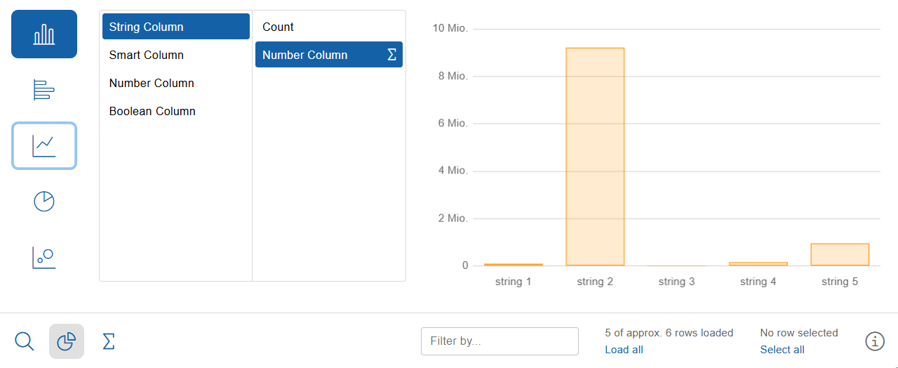
Table Chart
The control elements (chart type, axes) can now be accessed using the keyboard.
Tree
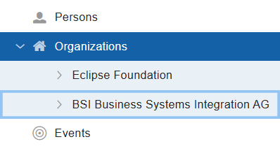
As with the table, the TAB order has been improved so that the data now receives focus. This results in a correct TAB order when other elements are present in the tree, such as the search field in the global search.
The tree has a new mode in which individual nodes are focusable without being selected. In this mode, keyboard navigation moves the focus rather than the selection. This mode is active for the tree on the desktop.
If a tree contains no data, it is no longer focusable. The HOME key no longer collapses all nodes; instead, it simply jumps to the first node. To collapse all nodes, CTRL+HOME can now be used.
Through an index and count attribute, the screen reader knows which node is currently selected and how many nodes exist in total, even if not all of them are rendered.
Tiles
Similar to the table, the focused tile is now visually highlighted when using TAB. Previously, the focus was not visible.
In addition, the TAB order in a tile table has been corrected. The footer row now comes after the tiles. If a tile grid contains no tiles, it is no longer focusable.
If the tiles are selectable, they now receive ARIA attributes and are therefore read correctly by the screen reader. Through an index and count attribute, the screen reader knows which tile is currently selected and how many tiles exist in total, even if not all of them are rendered.
Fields
Fields now receive the necessary ARIA attribute when they are invalid. In addition, the error status is now linked to the field.
Field Menus
Field menus can now be accessed using TAB. If the status icon only contains a tooltip or an error, it is still not included in the TAB list to avoid generating too many TAB stops.
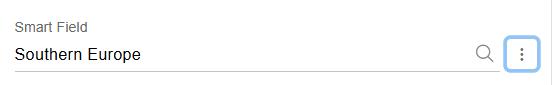
Also, the status now gets the required ARIA attributes for the screen reader.
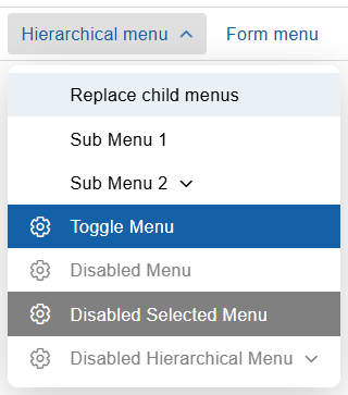
Tooltip with Menus
If a tooltip contains menus, they can now be operated via the keyboard. In addition, the state colors of the menus in the various status tooltips have been slightly optimized.
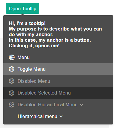
Toggle Menu
A toggle menu in a context menu now has its own style which is different from a focused menu item.
Tab Box
The visualization of the focus has been optimized to make it more visible. It is still displayed only when the keyboard is used to focus a tab.
Action
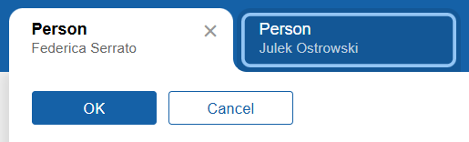
Actions are clickable elements similar to buttons or menus and are often used for custom widgets. They are now keyboard-operable by default and behave similarly to buttons in this regard:
-
They are reachable via TAB
-
They can be triggered using Space/Enter
-
They do not receive focus when clicked
-
They do not receive initial focus, for example when a form is opened
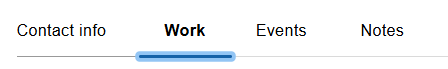
Simple Tab Box
This alternative tab box is used for form tabs. They are now operable via the keyboard and receive ARIA attributes for the screen reader.