How to Create a Chart
| This document is referring to a past Scout release. Please click here for the current version. |
This cheat sheet shows how to create your own chart for a Scout application. In this example we will visualize the sold scoops of an ice cream shop. We assume the ice cream shop already has a running Scout application and a place where it wants to create the chart.
Prerequisites
Everything related to charts has its own Maven and npm modules and is not part of Scout core. Therefore, the following Maven dependencies need to be added to the client-, shared- and ui.html-module of the ice cream shop app.
<dependency>
  <groupId>org.eclipse.scout.rt</groupId>
  <artifactId>org.eclipse.scout.rt.chart.client</artifactId>
</dependency>
<dependency>
<groupId>org.eclipse.scout.rt</groupId>
<artifactId>org.eclipse.scout.rt.chart.shared</artifactId>
</dependency><dependency>
<groupId>org.eclipse.scout.rt</groupId>
<artifactId>org.eclipse.scout.rt.chart.ui.html</artifactId>
</dependency>A npm dependency to @eclipse-scout/chart needs to be added in the package.json of the ice cream shop app and in addition, an import needs to be added to the entry-files icecream.js,
import * as chart from '@eclipse-scout/chart';
Object.assign({}, chart); // workaround so that the imports are not unused
icecream-theme.less and icecream-theme-dark.less.
@import "~@eclipse-scout/chart/src/index";@import "~@eclipse-scout/chart/src/index-dark";Minimal Code for a New Chart
The chart is created using an AbstractChartField and placed inside a GroupBox.
public class ChartField extends AbstractChartField<Chart> {
  public class Chart extends AbstractChart {
  }
}
Add data to the chart
The ice cream shop has sold the following amount of scoops:
| Jan. | Feb. | Mar. | Apr. | May | Jun. | Jul. | Aug. | Sept. | Oct. | Nov. | Dec. | |
|---|---|---|---|---|---|---|---|---|---|---|---|---|
Vanilla |
0 |
0 |
0 |
94 |
162 |
465 |
759 |
537 |
312 |
106 |
0 |
0 |
Chocolate |
0 |
0 |
0 |
81 |
132 |
243 |
498 |
615 |
445 |
217 |
0 |
0 |
Strawberry |
0 |
0 |
0 |
59 |
182 |
391 |
415 |
261 |
75 |
31 |
0 |
0 |
We create a data object and pass it to the chart (e.g. in the execLoad method of our FormHandler).
ChartData data = new ChartData();

List<IChartAxisBean> axis = new ArrayList<>();
Stream.of("Jan.", "Feb.", "Mar.", "Apr.", "May", "Jun.", "Jul.", "Aug.", "Sept.", "Oct.", "Nov.", "Dec.")
    .forEach(label -> axis.add(new ChartAxisBean(label, label)));

data.getAxes().add(axis);

MonupleChartValueGroupBean vanilla = new MonupleChartValueGroupBean();
vanilla.setGroupName("Vanilla");
IntStream.of(0, 0, 0, 94, 162, 465, 759, 537, 312, 106, 0, 0)
    .forEach(value -> vanilla.getValues().add(new BigDecimal(value)));
data.getChartValueGroups().add(vanilla);

MonupleChartValueGroupBean chocolate = new MonupleChartValueGroupBean();
chocolate.setGroupName("Chocolate");
IntStream.of(0, 0, 0, 81, 132, 243, 498, 615, 445, 217, 0, 0)
    .forEach(value -> chocolate.getValues().add(new BigDecimal(value)));
data.getChartValueGroups().add(chocolate);

MonupleChartValueGroupBean strawberry = new MonupleChartValueGroupBean();
strawberry.setGroupName("Strawberry");
IntStream.of(0, 0, 0, 59, 182, 391, 415, 261, 75, 31, 0, 0)
    .forEach(value -> strawberry.getValues().add(new BigDecimal(value)));
data.getChartValueGroups().add(strawberry);

getFieldByClass(ChartField.class).getChart().setData(data);
The chart will now look like this:
It looks like this, because the default type is pie, the default value of maxSegments is 5 and the first three segments in each dataset are 0.
Chart configuration
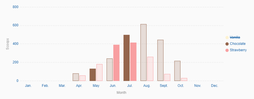
Let’s change it to a bar chart and use another color scheme:
IChartConfig config = BEANS.get(IChartConfig.class)
    .withType(IChartType.BAR)
    .withColorScheme(ColorScheme.RAINBOW);

getFieldByClass(ChartField.class).getChart().setConfig(config);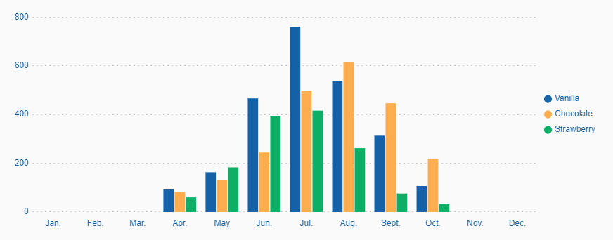
Now we add labels to the scales and set some custom colors.
vanilla.setColorHexValue("#fdf2d1");
chocolate.setColorHexValue("#94654c");
strawberry.setColorHexValue("#f89fa1");

config.withAutoColor(false)
    .withXAxisLabelDisplay(true)
    .withXAxisLabel("Month")
    .withYAxisLabelDisplay(true)
    .withYAxisLabel("Scoops");

getFieldByClass(ChartField.class).getChart().setData(data);
getFieldByClass(ChartField.class).getChart().setConfig(config);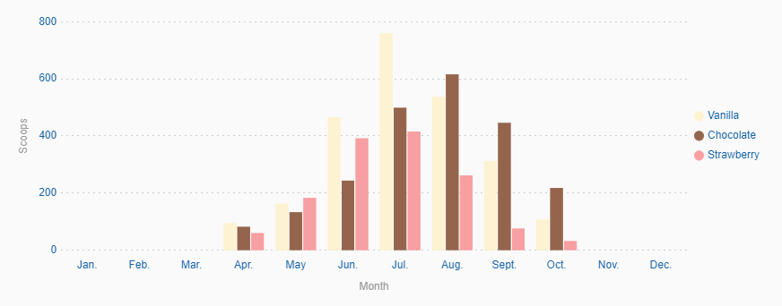
Finally, we want to make the chart interactive.
getFieldByClass(ChartField.class).getChart().extendConfig(BEANS.get(IChartConfig.class)
    .withClickable(true)
    .withCheckable(true)
    .withLegendClickable(true), true);
The chart is now clickable and checkable and datasets can be hidden via the legend.
Events
Each time a segment is clicked an event is triggered. This event can be handled by overriding execValueClick on the chart.
@Override
protected void execValueClick(BigDecimal xIndex, BigDecimal yIndex, Integer datasetIndex) {
  System.out.println("Segment clicked\n" +
      " - datasetIndex: " + datasetIndex + "\n" +
      " - xIndex: " + xIndex + "\n" +
      " - yIndex: " + yIndex);
}
Change colors using CSS
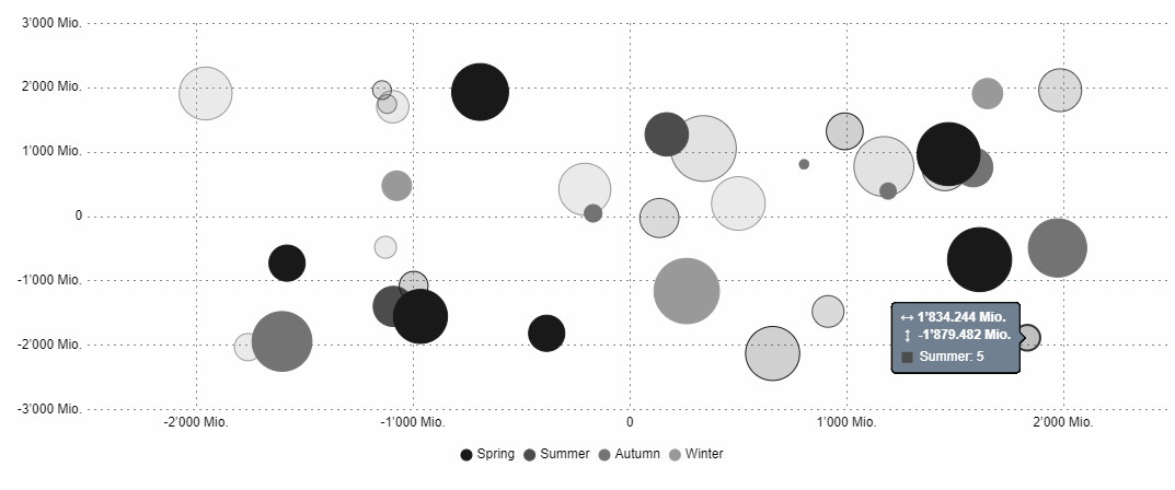
Even if some charts are rendered on a <canvas>-element the colors can be changed via CSS. We add a custom grey color scheme for the bubble chart, which is rendered on a <canvas>.
To achieve this, we need to add a LESS file with the following content:
@chart-grey-1: #191919;
@chart-grey-2: #4C4C4C;
@chart-grey-3: #737373;
@chart-grey-4: #999999;
@chart-grey-5: #BFBFBF;
@chart-grey-6: #D8D8D8;

.color-scheme-grey > .bubble-chart {
  & > .elements {
    > .label {
      fill: black;
    }

    > .grid {
      fill: lightslategrey;
    }

    > .tooltip-border {
      fill: black;
    }

    #scout.chart-auto-colors(@chart-grey-1, @chart-grey-2, @chart-grey-3, @chart-grey-4, @chart-grey-5, @chart-grey-6,
      @opacity: 20);
    #scout.chart-auto-stroke-colors(@chart-grey-1, @chart-grey-2, @chart-grey-3, @chart-grey-4, @chart-grey-5, @chart-grey-6);
    #scout.chart-auto-colors(@chart-grey-1, @chart-grey-2, @chart-grey-3, @chart-grey-4, @chart-grey-5, @chart-grey-6,
      @opacity: 35, @additional-classes: ~".hover");
    #scout.chart-auto-stroke-colors(@chart-grey-1, @chart-grey-2, @chart-grey-3, @chart-grey-4, @chart-grey-5, @chart-grey-6,
      @darken: 10, @additional-classes: ~".hover");

    #scout.chart-auto-colors(@chart-grey-1, @chart-grey-2, @chart-grey-3, @chart-grey-4, @chart-grey-5, @chart-grey-6,
      @additional-classes: ~".legend");
  }

  &.checkable > .elements {
    #scout.chart-auto-colors(@chart-grey-1, @chart-grey-2, @chart-grey-3, @chart-grey-4, @chart-grey-5, @chart-grey-6,
      @additional-classes: ~".checked");
    #scout.chart-auto-colors(@chart-grey-1, @chart-grey-2, @chart-grey-3, @chart-grey-4, @chart-grey-5, @chart-grey-6,
      @darken: 10, @additional-classes: ~".hover.checked");
  }
}
This color scheme can now be used in a config object:
BEANS.get(IChartConfig.class)
    .withType(IChartType.BUBBLE)
    .withColorScheme(() -> "color-scheme-grey");