Styling
| This document is referring to a past Scout release. Please click here for the current version. |
Beside JavaScript for business logic and for the models, every Scout JS app probably needs some CSS code at some point in time. If you are writing custom widgets, you need it for sure. But also if you are just using the given widgets you might have the need to adjust the look here and there.
Scout uses LESS as CSS preprocessor. It has a lot of advantages to pure CSS: variables, mixins, functions, imports etc. If you use the default build infrastructure provided by Scout, you cannot only use LESS easily without getting a headache on how to integrate it in your build system, you get access to all the LESS constructs used by Scout itself. This means you can use variables for colors, icons and sizes, mixins for animations and to avoid browser specific prefixes. You can import whole Scout LESS files for your custom themes, and you get a lot of sample code in the Scout code base because Scout itself uses the same concepts.
Setup Less Files
In order to get started you need a place to put all your LESS code.
The recommendation is to create one LESS file for each widget.
That means if your widget is called MyWidget.js you would create a file called MyWidget.less.
Even if you adjust the look of an existing widget you can create a file called let’s say StringField.less and put the rules there.
If you only have a few rules or non widget specific rules you can create a file called main.less and put them there.
However, these are only recommendations, you can always do it as you like.
The creation of these files won’t make them load automatically.
You have to register them in your index file.
This file should be put into your src/main/js folder and named index.less.
Just include your new files using the LESS @import keyword.
@import "style/colors";In addition to this index file you normally also have a theme file which will be used as entry point in your webpack.config.js and included in the index.html.
The intention of the theme file is to group individual index files and make one file in order to load all rules at once within one request.
Basic Customization
Now that we have all the infrastructure set up, we can start adding some rules.
As already said, you can use all the LESS variables from Scout.
The variables can be found in the scout/style folder of the @eclipse-scout/core module.
If you have a look at the file colors.less you find all the colors you can use or customize.
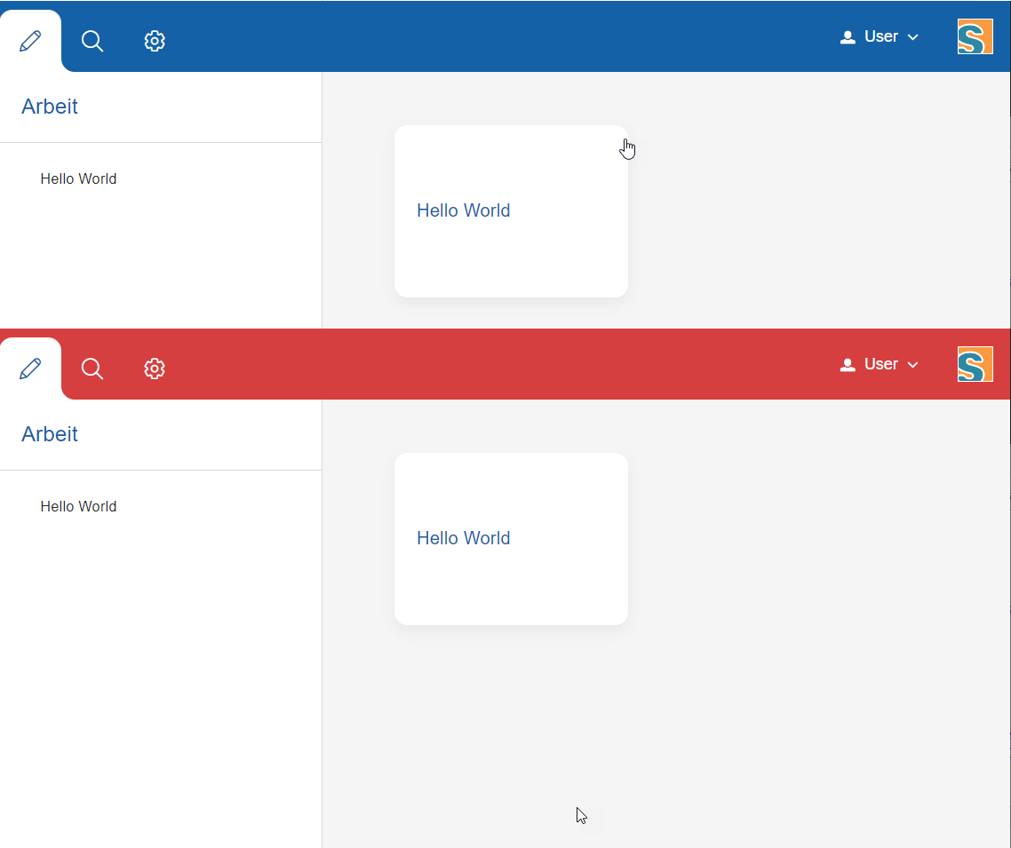
Let’s say you want to change the background color of the header, you can redefine the variable @desktop-header-background-color.
@desktop-header-background-color: @palette-red-4;That’s it! As you can see, changing this variable not only changes the background color of the header, it also changes the background color of the view-buttons on the top left, because they are supposed to have the same color. You could do the same by using CSS rules, but you would have to write several selectors to achieve the same.
In this example a color from the Scout color palette is used.
You can also use a custom hex code instead of @palette-red-4 or define a custom color palette, if you want to use the same colors for different rules.
Beside colors there are some other files in the style folder of the Scout module: animations.less, fonts.less, icons.less, mixins.less and sizes.less.
All these files contain variables or mixins which are used by various Scout widgets and may be used by your project as well.
Accent Colors
In the above example to change the header background color, we adjusted a specific less variable to only change the header. As you may have noticed on the screenshot, the pencil on the top left, the title below and the text on the tile are still blue. This is expected, because they are not related to the header background color. If you want to change these colors as well, you could do it in the same way: Look for the LESS variables and adjust them. But you could also try to adjust the accent colors.
Scout has a dedicated color palette for accent colors. Accent colors are used by many widgets, for titles, for links, for hover states etc. The default accent color of Scout is blue.
So, instead of changing specific colors, you can try to change the accent color palette. For this example we use the slightly adjusted red palette, but you can use your own colors of course:
@accent-color-0: @palette-red-0;
@accent-color-1: @palette-red-1;
@accent-color-2: @palette-red-2;
@accent-color-3: @palette-red-4;
@accent-color-4: @palette-red-5;
@accent-color-5: darken(@palette-red-5, 10%);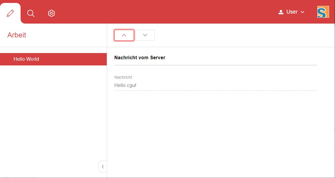
Advanced Customization
Redefining a LESS variable is the simplest way of customizing. If you need more control you can always write a custom CSS rule. Keep in mind that these rules need to be more specific than the default CSS rules of Scout, otherwise they won’t be executed (see https://developer.mozilla.org/en-US/docs/Web/CSS/Specificity for details). We cannot guarantee that your custom rules will still work when migrating to a newer Scout version, because changing only a small part of the rule might make it more specific so that your rule won’t work anymore. That only applies to custom rules which are supposed to change existing look or behavior. If you are writing a custom widget without overriding default Scout rules there shouldn’t be any problems regarding migration.
Themes
Scout applications support styling via CSS/LESS themes. Scout comes with two themes by default: the default theme with blue colors and the dark theme with gray/black colors. Technically a theme has a name and a set of LESS files.
In Scout Classic a theme is activated by calling the method AbstractDesktop#setTheme(String name). This causes the browser to reload the page and loads the CSS theme for that name, like myapp-theme.css for the default theme or myapp-theme-dark.css for the dark theme. The default theme is activated by passing a null value as name.
In Scout JS you do the same thing by calling the method Desktop#setTheme(name).
If you have multiple themes and you want to start with a defined theme by default, you can set a property in the config.properties file on the Scout UI server. In the following example the theme rainbow will be activated, which means the Scout application tries to load the CSS file myapp-theme-rainbow.css on start-up:
scout.ui.theme=rainbow
Note that Scout only provides an API to switch between themes. If the user of your Scout application should switch between various themes, your application must provide an UI element to do that. Scout provides no standard UI element for that. However, the Widgets apps for Scout Classic and Scout JS give you an idea of how you could implement that feature.
You have two options to customize CSS styles in your Scout project:
-
Change CSS properties (or LESS variables) by overriding styles from the default theme
-
Provide your own theme with a unique name like
rainbow
If your Scout application should have only a single theme, option 1 is the way to go. If users should have the option to switch between various themes, you should go with option 2. In this chapter we will focus on the latter option.
In order to understand Scout themes, take a look at the myapp-theme.less file which has been generated for your project by the Scout archetype. In the following examples we assume that the name of your project is myapp.
@import "~@eclipse-scout/core/src/index";
@import "./src/main/js/index";
As you can see the theme bundles various LESS modules. Line 1 imports the LESS module from the Scout core. This module contains style definitions for all UI elements provided by Scout. Line 2 imports the LESS module from your application. This module contains style definitions for custom widgets used in your project. The build creates a single CSS file myapp-theme.css, which is used as theme for your project.
We recommend making an index file for each Scout module. These index files import each single LESS file which belongs to that module. This excerpt from Scouts index.less shows how we import all distinct LESS files required to style the desktop or the LESS variable definitions for all colors used in the stylesheet:
@import "desktop/Desktop";
@import "desktop/DesktopLogo";
@import "desktop/DesktopDense";
@import "desktop/bench/DesktopBench";
@import "desktop/bench/BenchColumn";
@import "style/colors";
How does the dark theme for your Scout application look like? Like for the default theme, we create a LESS file myapp-theme-dark.less, but this time we import the index-dark modules.
@import "~@eclipse-scout/core/src/index-dark";
@import "./src/main/js/index-dark";
Let’s take a look at the details in the index-dark.less file from the Scout core:
@import "index";
@import "style/colors-dark";
@import "style/sizes-dark";
As you see, the first thing we do on line 1 is to import the default theme 'index'. This means the dark theme inherits all style definitions from the default theme.
The dark theme only extends new additional style and LESS variables or overrides styles or LESS variables from the default theme.
This is what happens on line 2: colors-dark.less overrides some variables defined in the colors.less file from the default theme, like the gray colors:
@palette-gray-0: @palette-white;
@palette-gray-1: #F5F5F5;
@palette-gray-2: #E9EBEB;
@palette-gray-3: #BFC2C3;
@palette-gray-4: #A7ACAD;
@palette-gray-5: #7E8588;
Note that all variables except @palette-gray-2-1 override variables from colors.less. @palette-gray-2-1 is a variable which is only defined and used in the dark theme.
Build and Runtime
Scout uses Webpack to run the LESS parser and build the CSS themes.
Your application needs at least one default theme.
The Scout archetype adds this theme to your webpack.config.js.
If your application needs to work with multiple themes you must add them to the list of config entries.
In this example we add the two themes dark and rainbow:
config.entry = {
  'bsicrm': './src/main/js/myapp.js',
  'login': './src/main/js/login.js',
  'logout': './src/main/js/logout.js',
  'myapp-theme': './src/main/js/myapp-theme.less',
  'myapp-theme-dark': './src/main/js/myapp-theme-dark.less',
  'myapp-theme-rainbow': './src/main/js/myapp-theme-rainbow.less'
};
When you use a Scout UI server as backend for your Scout JS application the class WebResourceLoader is responsible for supplying the requested CSS theme file to the browser.
This class uses the current theme name as provided by the UiThemeHelper, which checks if a theme name is set by a cookie, the HTTP session or by an HTTP request parameter.
These are good starting points for debugging, in case something unexpected happens while developing themes.