Widget Reference
| This document is referring to a past Scout release. Please click here for the current version. |
This chapter describes some of the widgets available in Scout. At the moment most of the widgets are not described yet, but they are already available at the Scout JS Widgets Application. With this application you can try the widgets out and get a feel of what they are capable of and how they are used.
Smart Field
A Smart Field provides a list of proposals the user can choose from to pick one single value. In contrast to a common drop down list, the Smart Field provides search as you type which is especially useful for large lists. A very common case is to call a REST service and lookup the proposals while typing. This combination of a drop down list and a search field is the reason why it is called smart.
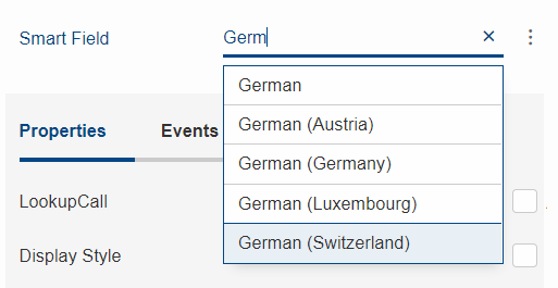
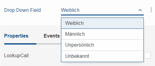
If you don’t need the search as you type feature, you can switch it off by setting the property displayHint to dropdown so that it behaves like a regular drop down list. This means the user cannot filter the values anymore using key board and can choose the values only by mouse / touch.
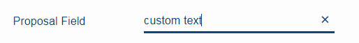
Another type of Smart Field is the so called Proposal Field. A Proposal Field does not require the user to choose from the available proposals but allows him to enter custom text as well.
In order to provide the proposals you can either use a Lookup Call or a Code Type.
In a Scout JS application you can use SmartFields like in a classic Scout application. Any REST service can be used to provide results for a SmartField lookup call. However, the SmartField expects the result to have a defined structure. If the REST service API is in your hands, you can simply return a JSON response with the right structure. This means less work to do for you in the JavaScript layer, because you don’t have to transform the response to a structure the SmartField can process. If you must use a service which API you cannot change, you have no other choice than doing some kind of transformation in JavaScript.
Here’s how the response for a lookup call should look like in order to be processed by the SmartField:
{
  "queryBy": "ALL|TEXT|KEY|REC", # lookup type, as requested by the client
  "text": "foo", # [optional] only set when queryBy=TEXT, contains the requested search text
  "key": "123",  # [optional] only set when queryBy=KEY, contains the key of the requested lookup row
  "rec": "234",  # [optional] only set when queryBy=REC, contains the key of the requested parent lookup row
  "lookupRows": [ # the result set of this lookup, contains 0-n lookup rows
    {
      # key and text are mandatory properties, all other properties are optional
      "key": "unique lookup row key",
      "text": "lookup row text",
      "iconId": "person.svg",
      "tooltipText": "foo",
      "enabled": false,
      "active": false,
      "cssClass": "special-format",
      "backgroundColor": "#cc00ee", # deprecated, use cssClass instead
      "foregroundColor": "#333333", # deprecated, use cssClass instead
      "font": "Dialog-PLAIN-12",    # deprecated, use cssClass instead
      "parentKey": "234",           # only used for hierarchical smart fields
      "additionalTableRowData": [   # only used for table like lookup results with multiple columns
                                    # contains 0-n objects with arbitrary properties
        {
          "foo": "bar"
        }
      ]
    }
  ],
  "exception": "something went wrong" # [optional] only set when an error occurred during the lookup request
}
Here’s how the request for a Scout JS SmartField lookup call could look like. Your request to a REST API can look completely different. This example just gives you an idea of how to implement your own LookupCall.
{
  "type": "lookupByAll|Text|Key|Rec", # lookup type
  "text": "foo", # [optional] only set when type=lookupByText, contains the requested search text
  "key": "123",  # [optional] only set when type=lookupByKey, contains the key of the requested lookup row
  "rec": "234",  # [optional] only set when type=lookupByRec, contains the key of the requested parent lookup
}
Chart
A Chart visualizes data in several ways like bars, lines or a pie. The Chart has two main properties, a data and a config object.
Imagine you are an ice cream shop, and you want to display how many scoops you sold in which month.
The data object holds the data about the sold scoops, their flavours and the date you sold them.
The config object defines how your chart should be styled, e.g. it should be a bar chart and the axes should get an extra label like 'month' and 'flavour'.
Depending on the type that is set on the config object the Chart picks a renderer to display the chart. The renderer is now creating a <canvas>- or <svg>-element and renders the chart.
Each time you update the data or the config it is rerendered.
Most of the charts are rendered using chart.js and the config object is handed over so you can use all properties chart.js provides to style your chart. In addition to the chart.js-properties we added custom properties, some of them only have an impact on certain charts:
-
options.autoColorWhether the colors should be computed automatically. -
options.colorSchemeA specific color scheme for the colors, also inverted ones are possible for dark backgrounds. -
options.transparentWhether the chart should be transparent or opaque. -
options.maxSegmentsMax. number of segments for radial charts like pie, doughnut, radar, polar area. -
options.clickableWhether a chart is clickable. -
options.checkableWhether a chart is checkable. -
options.otherSegmentClickableWhether the consolidated others segment is clickable. -
options.plugins.legend.clickableWhether the legend is clickable. -
options.xLabelMapandoptions.yLabelMapLabel mapping for discrete values. -
options.handleResizeWhether the chart should handle resizing itself (not necessary if the containers size is updated). -
options.numberFormatterA custom number formatter, e.g. 1000000 → 1 Mio. €. -
options.reformatLabelsWhether the data labels should be reformatted. It is assumed that data labels (incl. numeric labels) are correctly formatted. If one wants to have the data labels formatted using the number formatter, this flag can be used. Consider a bar chart and the x-axis displays the years 2010-2020, these labels should not be reformatted. However, if the x-axis displays the prices 250, 500, 750 and 1000, these labels should be reformatted to 250 €, 500 €, 750 € and 1.000 €. -
options.plugins.tooltip.cssClassCustom css class for additional styling of the tooltip
Bubble:
-
options.bubble.sizeOfLargestBubbleThe size to which the largest bubble is scaled. -
options.bubble.minBubbleSizeMin. size of a bubble.
Fulfillment:
-
options.fulfillment.startValueWhere the animation should start.
Salesfunnel:
-
options.salesfunnel.normalizedDefines if the bars should be rendered smaller from top to bottom or if they get a size according to their values. -
options.salesfunnel.calcConversionRateWhether the conversion rate should be rendered.
Speedo:
-
options.speedo.greenAreaPositionDefine where the green area is located.
Venn:
-
options.venn.numberOfCirclesBetween 1 and 3.
The colors used for grid lines, axes, etc. and the auto colors for datasets can be overridden using CSS.
For a more detailed example see How to Create a Chart for Scout JS resp. How to Create a Chart for Scout Classic
Filter Field
The widgets Table.js, Tree.js, TileGrid.js and TileAccordion.js share a common filter API which includes a filter field.
This filter field is enabled by default and can be turned off using the property textFilterEnabled.
This filter field will filter the rows, nodes or tiles by their display text.
This is simple for rows and nodes but quite complicated for tiles due to the large number of different types of tiles.
Therefore, it is possible to provide a strategy to the TileGrid.js and TileAccordion.js how to create a text filter for the tile type used in this case and how to update the text this filter accepts.
Consider a tile CustomTile with a property relevantTextForFilter. A filter for this tile type might look like this:
import {objects, strings} from '@eclipse-scout/core';

class CustomTileFilter {

  constructor() {
    this.acceptedText = null;
  }

  setAcceptedText(acceptedText) {
    acceptedText = (acceptedText || '').trim().toLowerCase();
    if (objects.equals(this.acceptedText, acceptedText)) {
      return false;
    }
    this.acceptedText = acceptedText;
    return true;
  }

  accept(tile) {
    if (strings.empty(this.acceptedText)) {
      return true;
    }
    let filterText = strings.toLowerCase(tile.relevantTextForFilter);
    if (strings.empty(filterText)) {
      return false;
    }
    return filterText.indexOf(this.acceptedText) > -1;
  }
}
This CustomTileFilter is now passed to a TileGrid via
tileGrid.createTextFilter = () => scout.create('CustomTileFilter');
tileGrid.updateTextFilterText = (filter, text) => filter.setAcceptedText(text);
The common filter API which Table.js, Tree.js, TileGrid.js and TileAccordion.js share can also be implemented by all other widgets.
A minimal example of a widget implementing the filter API looks like this
class FilterWidget extends Widget {
  constructor() {
    super();
    this.elements = [];

    this.filters = [];
    this.textFilterEnabled = true;
    this.filterSupport = this._createFilterSupport();

    this.filteredElementsDirty = false;
  }

  _init(model) {
    super._init(model);
    this.setElements(this.elements);
    this.setFilters(this.filters);
  }

  _createKeyStrokeContext() {
    return new KeyStrokeContext();
  }

  _render() {
    this.$container = this.$parent.appendDiv();
    this.htmlComp = HtmlComponent.install(this.$container, this.session);
  }

  _renderProperties() {
    super._renderProperties();
    this._renderTextFilterEnabled();
  }

  _remove() {
    this.filterSupport.remove();
    super._remove();
  }

  setElements(elements) {
    this.setProperty('elements', elements);
    this.filter();
  }

  setTextFilterEnabled(textFilterEnabled) {
    this.setProperty('textFilterEnabled', textFilterEnabled);
  }

  _renderTextFilterEnabled() {
    this.filterSupport.renderFilterField();
  }

  isTextFilterFieldVisible() {
    return this.textFilterEnabled;
  }

  /**
   * @returns {FilterSupport}
   */
  _createFilterSupport() {
    return new FilterSupport({
      widget: this,
      $container: () => this.$container,
      getElementsForFiltering: () => this.elements,
      getElementText: element => element.text
    });
  }

  addFilter(filter, applyFilter = true) {
    this.filterSupport.addFilter(filter, applyFilter);
  }

  removeFilter(filter, applyFilter = true) {
    this.filterSupport.removeFilter(filter, applyFilter);
  }

  setFilters(filters, applyFilter = true) {
    this.filterSupport.setFilters(filters, applyFilter);
  }

  filter() {
    this.filterSupport.filter();
  }

  updateFilteredElements(result, opts) {
    this.filteredElementsDirty = false;
  }
}

class Element {
  constructor() {
    this.text = null;
    this.filterAccepted = true;
  }

  setFilterAccepted(filterAccepted) {
    this.filterAccepted = filterAccepted;
  }
}
The widget creates a FilterSupport and passes all filter-related calls to this object. This FilterSupport manages the filters and the filter field.
It only needs a small amount of information from the widget:
-
widgetWidget that created the support -
$containerjQuery element that will be used for the visualization. It may be a function to resolve the container later. If this property is not set the $container of the widget is used by default. -
getElementsForFilteringGet all elements to which the filters should be applied. -
getElementTextGet text of an element.
There are several other options that can be passed to the FilterSupport, e.g. a strategy to create a custom text filter. For a complete list of the options please see the JS-Doc of the FilterSupport.
The methods addFilter(filter, applyFilter = true), removeFilter(filter, applyFilter = true) and setFilters(filters, applyFilter = true) of the FilterSupport work with filter objects containing an accept-function and accept-functions directly.
These methods will check if the list of filters really changed and then apply the new filters if applyFilter is set to true. The filters are stored in the widgets filters property.
The widget needs to implement a updateFilteredElements(result, opts) method, which is called after the filters were applied if the list of filtered elements changed.
Before this method is called the widgets filteredElementsDirty is set to false and the values passed are
-
resultAn object containing thenewlyHiddenandnewlyShownelements. -
optsAn object containing additional information, e.g. the text from the text filter.
The elements that are filtered needs to have a setFilterAccepted(filterAccepted)-method which is used by the FilterSupport to indicate whether this element is accepted by the filters or not.
In order to use the filter field the widget needs an isTextFilterFieldVisible()-method and a KeyStrokeContext.
The isTextFilterFieldVisible()-method is used to determine whether the filter field needs to be added to or removed from the $container when filterSupport.renderFilterField() is called.
The KeyStrokeContext is needed to register KeyStrokes that move the focus towards the filter field while typing.