Mobile Support
| This document is referring to a past Scout release. Please click here for the current version. |
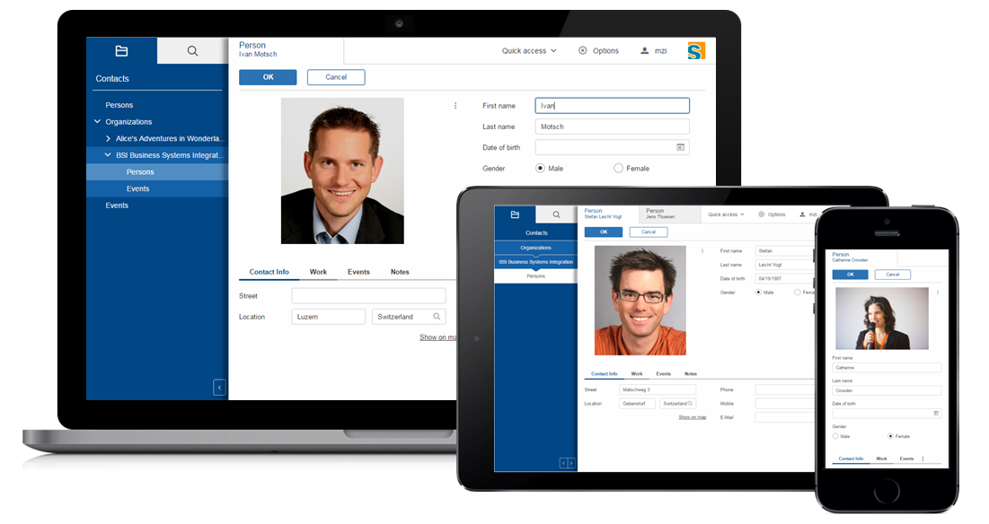
Scout applications are mobile capable, meaning that they can be used on portable touch devices like smartphones and tablets. This capability is based on 2 main parts:
-
Responsive and Touch Capable Widgets
-
Device Transformation
Responsive and Touch Capable Widgets
Responsive design in context of a web application means that the design reacts to screen size changes. A Scout application does not use responsive design for the whole page, but many widgets itself may change the appearance when they don’t fit into screen.
One example is the menu bar that stacks all menus which don’t fit into an ellipsis menu.
Beside being responsive, the widgets may deal with touch devices as well. This means they are big enough to be used with the finger. And they don’t need a mouse, especially the right mouse button.
One example is the tooltip of a form field which is reflected by an info icon on the right side of the field. Instead of hovering over the field the user can press that info icon to bring up the tooltip. This approach not only provides an indicator where tooltips are available, it also works for mouse and touch based devices.
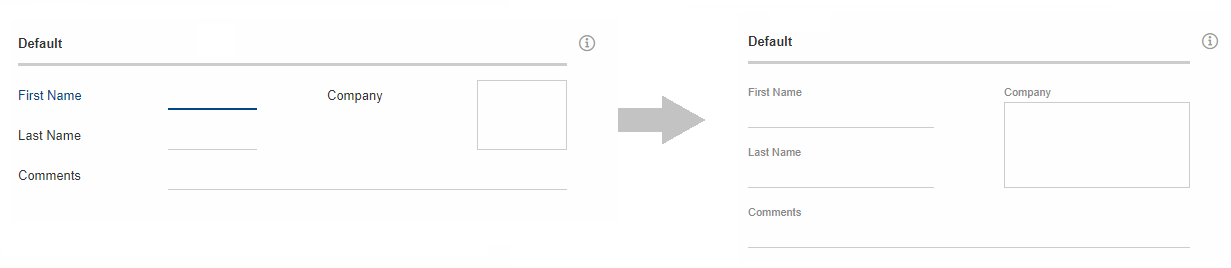
GroupBox
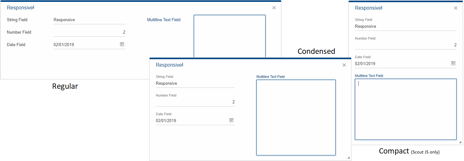
Another widget that will react to changing sizes is the group box. Once a group box becomes smaller than its preferred width it will transform its internal fields. Example: For all internal fields the labelPosition will be set to 'top' to give the field more horizontal space.
Those transformations are handled by scout.GroupBoxResponsiveHandler and managed by scout.ResponsiveManager. The manager decides when to switch to a responsive mode and back. If desired, the responsive transformations can be completely disabled by calling scout.responsiveManager.setActive(false).
By default, all the main boxes will be responsive. In order to exclude a group box from the responsive transformations you could do the following:
@Order(20)
@ClassId("98af1bc6-2d62-4132-9953-55e08492f65f")
public class MyGroupBox extends AbstractGroupBox {

  @Override
  protected TriState getConfiguredResponsive() {
    return TriState.FALSE;
  }
}
The handler is called when the manager detects a changed responsive state to perform its transformations. There are three responsive modes, of which only the first two are supported in scout classic.
-
Normal (e.g. width >= 500): Regular case, no transformations are applied.
-
Condensed (e.g. 300 ⇐ width < 500): Sets the label position to 'TOP'.
-
Compact (e.g. width < 300): This mode is only supported in scout js. Sets grid column count to 1 and ensures labels and status are set to 'TOP'.
Add a Custom Handler
If a different widget is required to react to screen size changes, you can create your own handler by subclassing scout.ResponsiveHandler and registering it by calling scout.responsiveManager.register(widget, handler). Each handler can define the thresholds when to switch from one responsive mode to another by implementing scout.ResponsiveHandler.prototype.getCompactThreshold or scout.ResponsiveHandler.prototype.getCondensedThreshold.
Device Transformation
The second part of the mobile support is called device transformation. Transformation means the adaptation of model properties for different devices. Example: Setting the property labelPosition from 'left' to 'top' in order to move the label to the top.
Please note that this device transformation feature is not available for pure Scout JS apps.
In return, they profit from a better responsive handling, see Compact state at GroupBox.
|
Such transformations are done on the UI server by so-called device transformers. Currently, 2 device transformers are available:
-
Mobile Device Transformer
-
Tablet Device Transformer
Which transformer is active depends on the used user agent.
The mobile transformer is active if the Scout app is used on a smart-phone, the tablet one is active if it is used on a tablet.
The order in which these transformers are processed is defined using the @Order annotation which is possible because they are regular Scout beans.
This also means you can add your own transformer if you need custom transformations.
The transformations are mainly limited to the adjustment of properties, although some properties have a bigger effect than others.
The property displayStyle of the desktop for example controls the look of the desktop and setting it to COMPACT rearranges the desktop in a mobile friendly way.
For details see chapter Compact Desktop
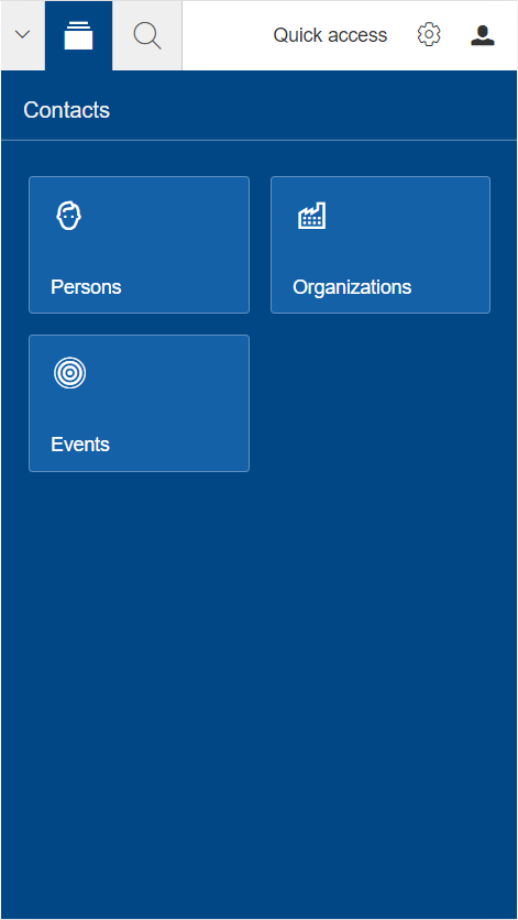
Compact Desktop
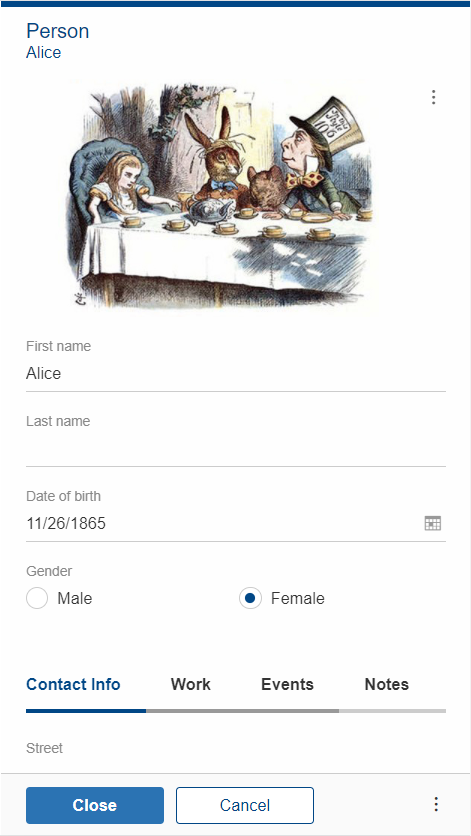
If the display style of the desktop is set to compact (done by the MobileDeviceTransformation.MAKE_DESKTOP_COMPACT),
the desktop will either show the navigation or the bench, but never both at the same time.
Whether the bench is visible depends on whether a view (form with displayHint='view') is visible. If no view is open, the navigation with the outline is shown. As soon as a view is shown it will switch to the bench and back when the view is closed again.
When the navigation is shown the tool box which normally is in the desktop header will be moved into the navigation beside the view buttons.
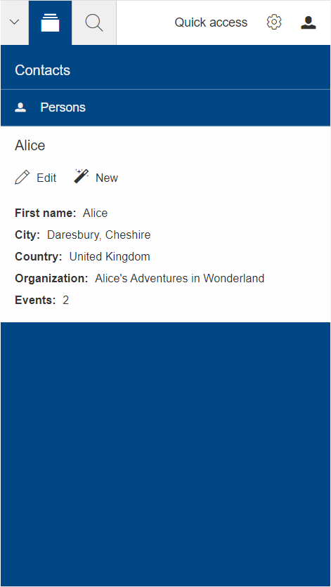
The MobileDeviceTransformation.MAKE_DESKTOP_COMPACT not only transforms the desktop but also adjusts the outline and its components like pages and detail forms.
The result is that the outline will be displayed in bread crumb mode and, most importantly, will display some content that is normally shown in the bench.
This includes detail forms (incl. default detail forms), outline tiles, menus, table controls and table row summaries.
If no detail form is configured, the detail content will be automatically generated based on the selected table row (TableRowDetail.js).
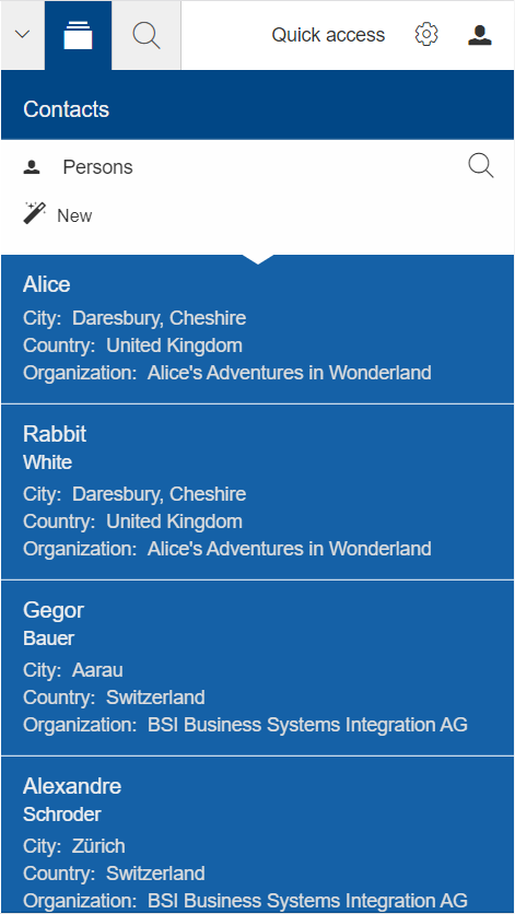
Adjusting Summary Cells
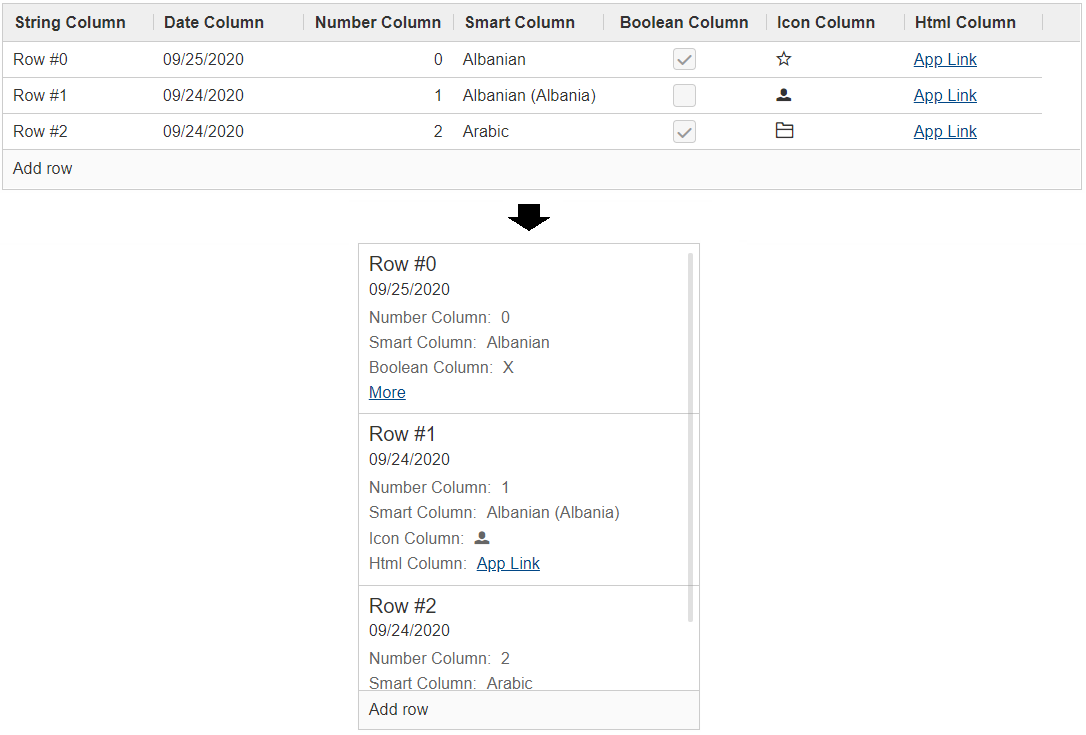
Whenever a table page is selected, the table rows are converted to table pages which are displayed as child nodes of the selected table page. The text in such nodes is based on a table row and called summary cell. The default behavior in a regular Scout app is to build that summary cell based on the summary columns. If there are no summary columns, the first displayable column is used.
Even though this maybe sufficient for desktop apps where the table itself is visible too, it may not be sufficient for mobile apps with a compact outline.
To include more details about the row, the ITableCompactHandler is used to build the summary cell.
This is done by the MobileSummaryCellBuilder.
If you need to adjust the created summary cell, you can use the same mechanism as described in Compact Table.
Just override the method createCompactHandler and adjust the handler if you like to modify the general compact style of that table.
Or override the method createSummaryCompactHandler if you only want to modify the summary cell style.
Compact Table
Since Scout 11, the table got a new mode called compact.
This will hide all columns and insert a new one containing the content of every other column.
The content will be displayed vertically which means the cells of a row will be put below each other.
This mode won’t be set automatically by a device transformer because it does not work for editable tables and may not be desired for every table. But if you like the mode you can easily activate it by setting the property 'compact' to true.
By default, the table uses the visible columns in the order they are configured and creates a compact cell for each row.
This is done by a so called ITableCompactHandler.
If you don’t like how the content is arranged you can control the conversion by adjusting the compact handler.
public class Table extends AbstractTable {
  @Override
  protected ITableCompactHandler createCompactHandler() {
    return super.createCompactHandler()
        .withTitleColumnSupplier(this::getAColumn)
        .withSubtitleColumnSupplier(this::getAnotherColumn);
  }
With this mechanism you can easily reorder and hide columns, limit the initially visible content columns or hide the "more link".
If this is not sufficient you can always set a custom CompactBeanBuilder or replace the compact handler completely by your own implementation.
public class Table2 extends AbstractTable {
  @Override
  protected ITableCompactHandler createCompactHandler() {
    return super.createCompactHandler()
        .withBeanBuilder((columns, row) -> {
          CompactBean bean = new CompactBean();
          bean.setTitle("custom title");
          bean.addContentLine(new CompactLine("label", "text"));
          return bean;
        });
  }
}
Form Transformation
If the MobileDeviceTransformer is active, the responsive feature of the GroupBox will be disabled.
Instead, some transformations will be applied like moving the label and status to top,
reducing the column count to one, disabling cancel confirmation and more.
Have a look at MobileDeviceTransformation and at MobileDeviceTransformer to learn more about it.
Disable Transformations
Since the transformers are plain Scout beans, you can easily replace them and adjust their behavior. To disable some transformations just get the configuration and disable the unwanted ones.
@Replace
public class CustomMobileDeviceTransformer extends MobileDeviceTransformer {

  @Override
  protected void initTransformationConfig() {
    super.initTransformationConfig();
    getDeviceTransformationConfig().disableTransformation(MobileDeviceTransformation.MOVE_FIELD_LABEL_TO_TOP);
  }
}
Have a look at the class MobileDeviceTransformation to get a list of all available transformations.
All these transformations are triggered by extensions to components like form fields or the desktop.
These extensions are registered by DeviceTransformationPlatformListener.
If you don’t want any of these transformers to be active you could simply replace that listener and do nothing.
@Replace
public class CustomDeviceTransformationPlatformListener extends DeviceTransformationPlatformListener {

  @Override
  public void stateChanged(PlatformEvent event) {
    // Do nothing to not register any extension so no transformation will happen
  }
}
Adapt Specific Components
The device transformers take care of global transformations which should be applied for most of the components. If you need to adapt a specific component you can do it at the component itself. Let’s say you want to hide a field if the application is running on a smart-phone, you could do the following.
@Order(20)
@ClassId("032f5ffb-bb1a-477a-95c8-f185e930a977")
public class MyField extends AbstractStringField {

  @Override
  protected void execInitField() {
    if (UserAgentUtility.isMobileDevice()) {
      setVisibleGranted(false);
    }
  }
}
Sometimes a transformation done by a device transformer is not desired, but you don’t want to turn it off globally. If that is the case you can disable that transformation for a specific form or form field.
@Override
protected void execInitField() {
  BEANS.get(IDeviceTransformationService.class).excludeFieldTransformation(this, MobileDeviceTransformation.REDUCE_GROUPBOX_COLUMNS_TO_ONE);
}
Or you can exclude a specific form or form field from all transformations.
@Override
protected void execInitField() {
  BEANS.get(IDeviceTransformationService.class).excludeField(this);
}
Optimize the Look
Once you have done your adjustments on the model and transformations, and you are still
not pleased how your app looks, you still have the possibility to add some custom CSS.
To do so, just add a CSS class to your component and define the rules in a Less file.
Also have a look at the Java file CssClasses. Scout provides a few predefined css classes for some specific use cases.
@Override
protected void execInitField() {
  if (UserAgentUtility.isMobileDevice()) {
    addCssClass("mobile");
  }
}
For details on how to write the Less code please see Styling.
If you just want to reduce some padding maybe it is sufficient to adjust the gaps of a group box.
To do so just override the method getConfiguredBodyLayoutConfig of your group box and do the adjustments.
@Override
protected LogicalGridLayoutConfig getConfiguredBodyLayoutConfig() {
  return super.getConfiguredBodyLayoutConfig()
      .withVGap(0);
}
User Agent
The class UserAgent is essential for the mobile support.
It stores information about the running device like the used browser or OS.
The user agent is available on the UI server as well as on the backend server and can be accessed using the static method UserAgent.get().
The class UserAgentUtility provides some useful helper methods to check which type of device is running, like if it’s a mobile phone, a tablet, or a desktop device.
Best Practices
When creating a Scout application which should run on touch devices as well, the following tipps may help you.
-
Focus on the essential. Even though most of the application should run fine on a mobile device, some parts may not make sense. Identify those parts and make them invisible using
setVisibleGranted(false). The advantage of using setVisibleGranted over setVisible is that the model of the invisible components won’t be sent to the client at all, which might increase the performance a little. But remember: The users nowadays might expect every functionality to be available even on a mobile phone, so don’t take them away too much. -
Limit the usage of custom HTML. Custom HTML cannot be automatically transformed, so you need to do it by yourself. Example: You created a table with several columns using HTML. On a small screen this table will be too large, so you have to make sure that your table is responsive, or provide other HTML code when running on a mobile device.
-
Don’t use too large values for gridH. GridH actually is the minimum grid height, so if you set gridH to 10 the field will always be at least 10 logical grid rows height. This may be too big on a mobile device.
-
Use appropriate values for table column width. Tables are displayed the same way on a mobile phone as on the desktop device (unless
compactis set to true), if the content is not fully visible the user can scroll. If you have tables withautoResizeColumnsset to true, you should make sure that the column widths are set properly. Just check how the table looks on a small screen and adjust the values accordingly. -
Know the difference between small screens and touch capable. If you do checks against different device types, you should be aware that a touch device is not necessarily a small device. That means
UserAgentUtility.isTouchDevice()may be true on a laptop as well, so use it with care. -
If you use filler fields for layouting purpose, make sure you use the official
IPlaceholderField. Such filler fields normally waste space on a one column layout, so the mobile transformer will make them invisible.